
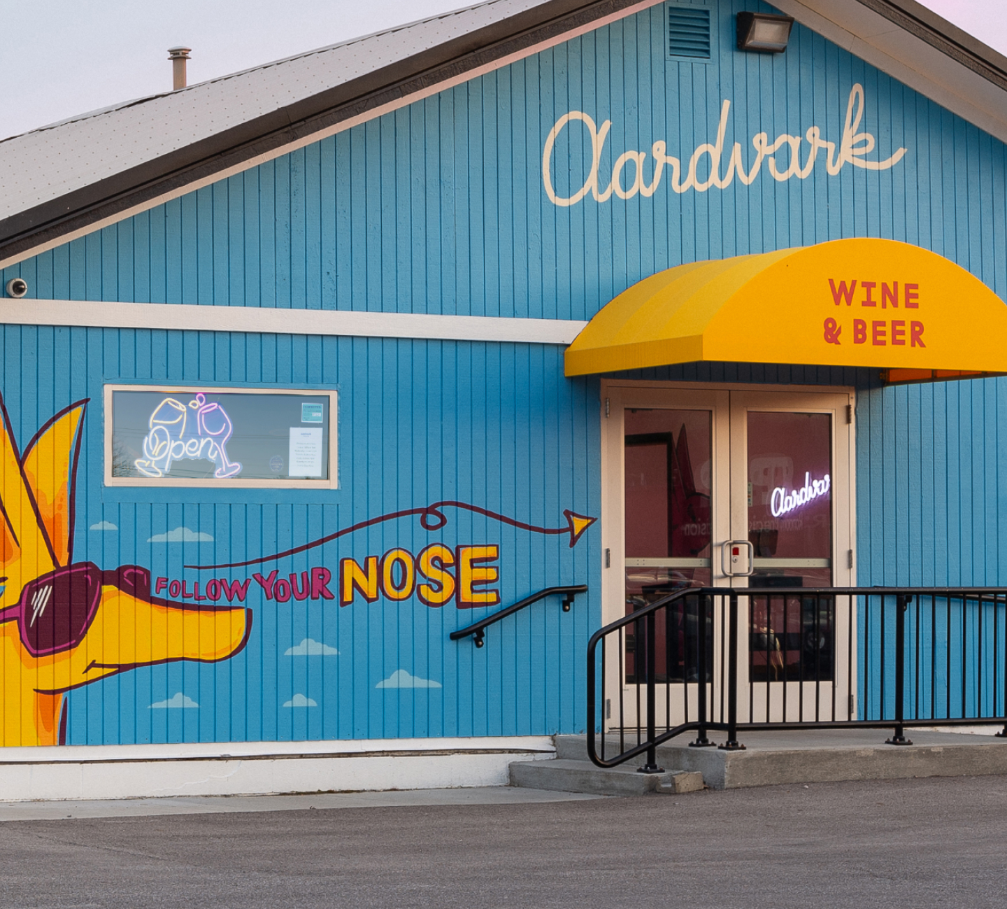
Aardvark Wine & Beer
Aardvark Wine & Beer
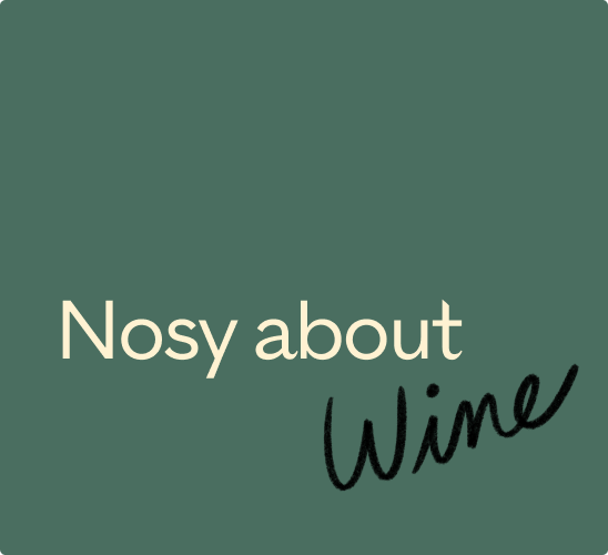
Nosy about wine?
Nosy about wine?
Client
Scope of work
Identity, Strategy, Writing, Web Design + Dev, Print, Social, Environmental
Aardvark Wine & Beer is a boutique shop created to take the snobbery out of wine. Founded by a self-taught connoisseur turned certified sommelier, Aardvark brings a humble, community focused approach to learning about and loving wine. They arrived with an idea and an off kilter name. We took it from there and created the visual system, character and illustration, and tone of voice that make Aardvark a destination.
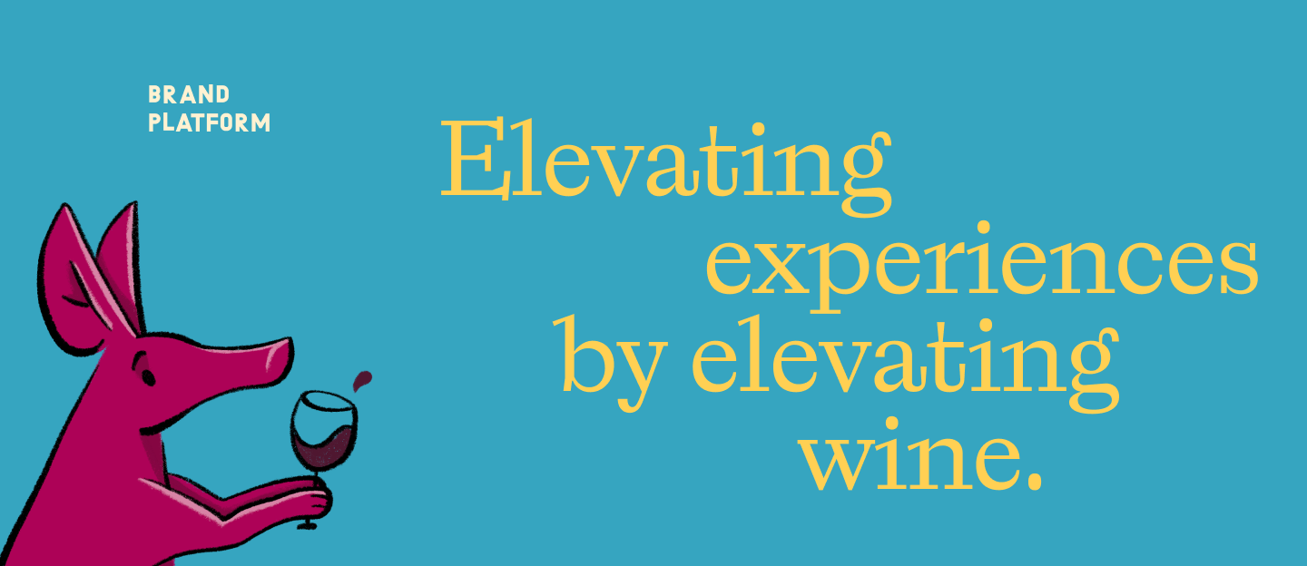
Strategy & Brand Platform
We started with Aardvark’s dream, a wine shop that builds real community and culture around remarkable wine, and created a brand strategy to keep them consistent on what they stand for, how they're different, and why people should care. It all flowed naturally from the owners' focus on family-owned producers and collaboration with local producers and neighbors.
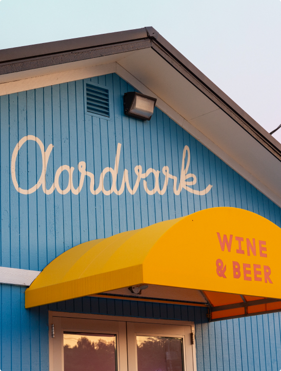
Brand Identity
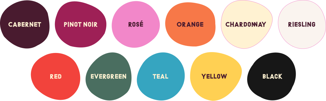
Let’s admit it: Aardvark is a weird name for a wine shop. That’s why we love it. We took that name and built an identity system around it, embracing the quirk with funky typography, a wine-inspired color palette, and a layer of hand-written humanity.
Primary Logo
If an aardvark was a font, this would be it. We started with an off-beat typeface, then modified it to reflect the brand personality and, yes, feel Aardvark-ian.
Secondary Logo
One logo wasn’t enough. We created a bodega-and-neon inspired word mark to use in secondary applications and bring depth to the brand system.
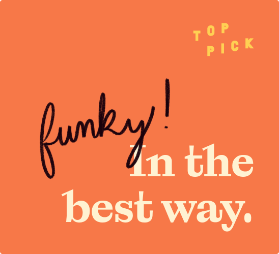
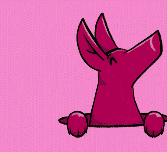
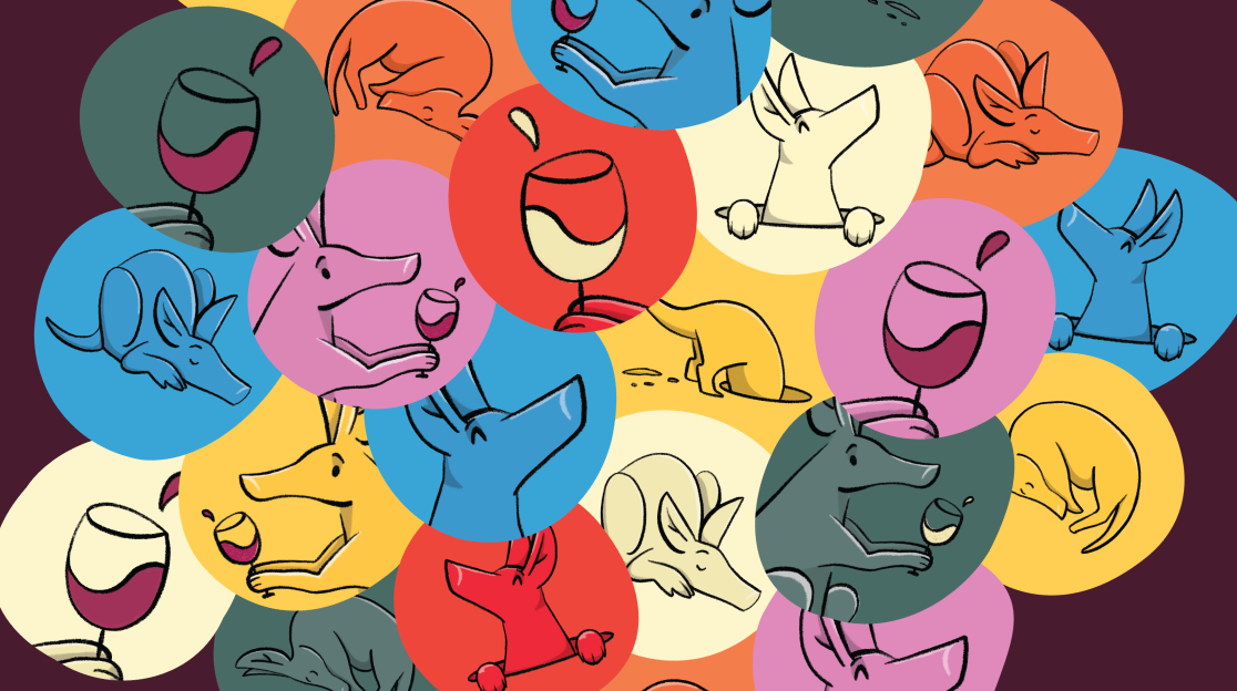
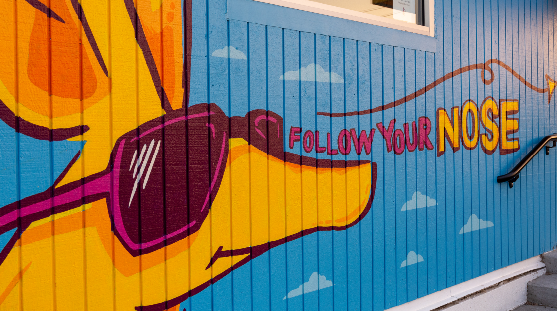
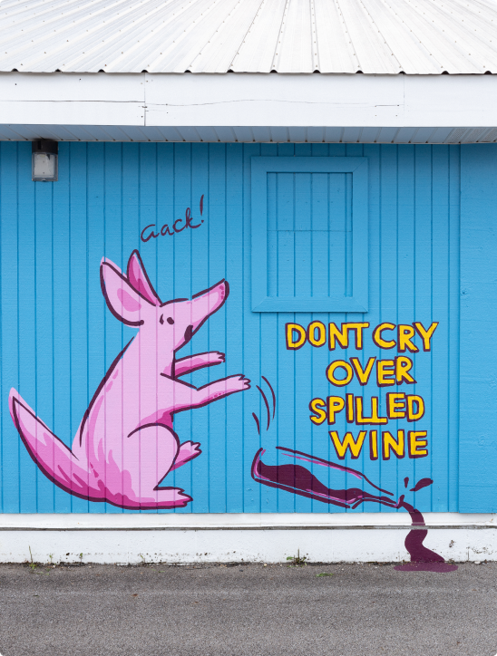
Illustration
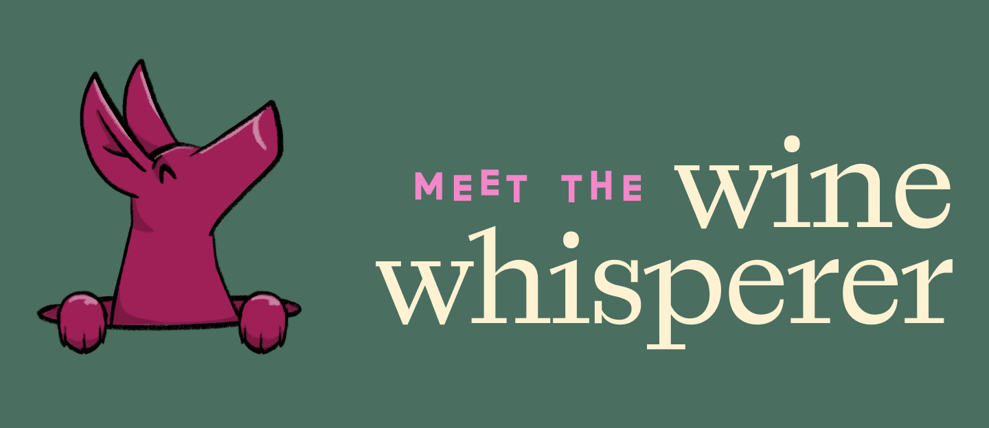
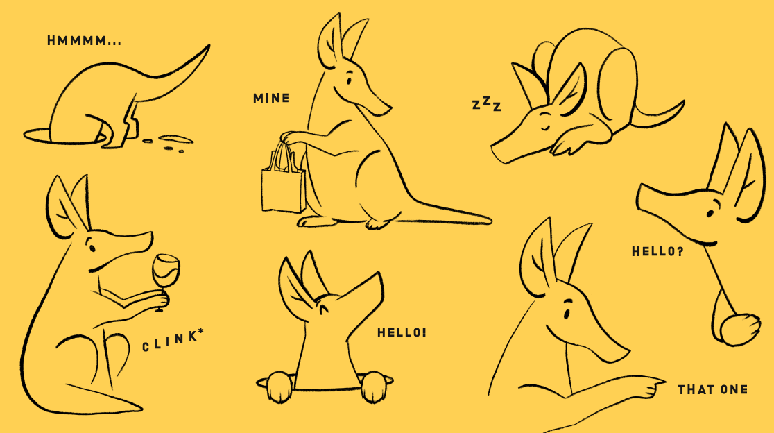
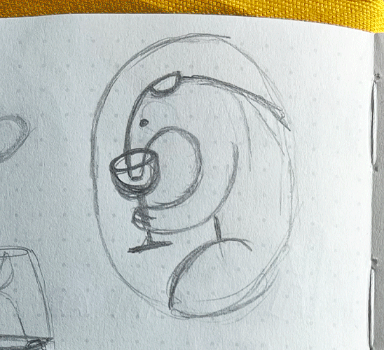
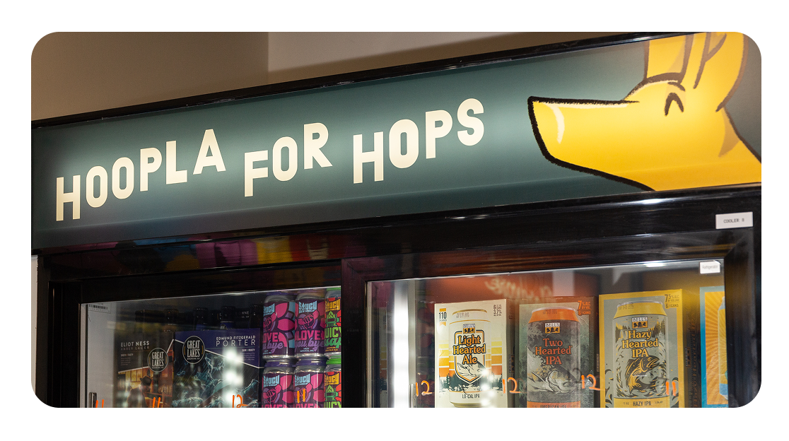
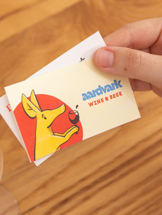
Meet Aaron. He’s the curious fella that forms the face of Aardvark’s branding. We created a library of poses and versions that connect the real world animal to the Aardvark experience: curious, putting his nose to good use, and sometimes getting a bit tipsy in the best way.
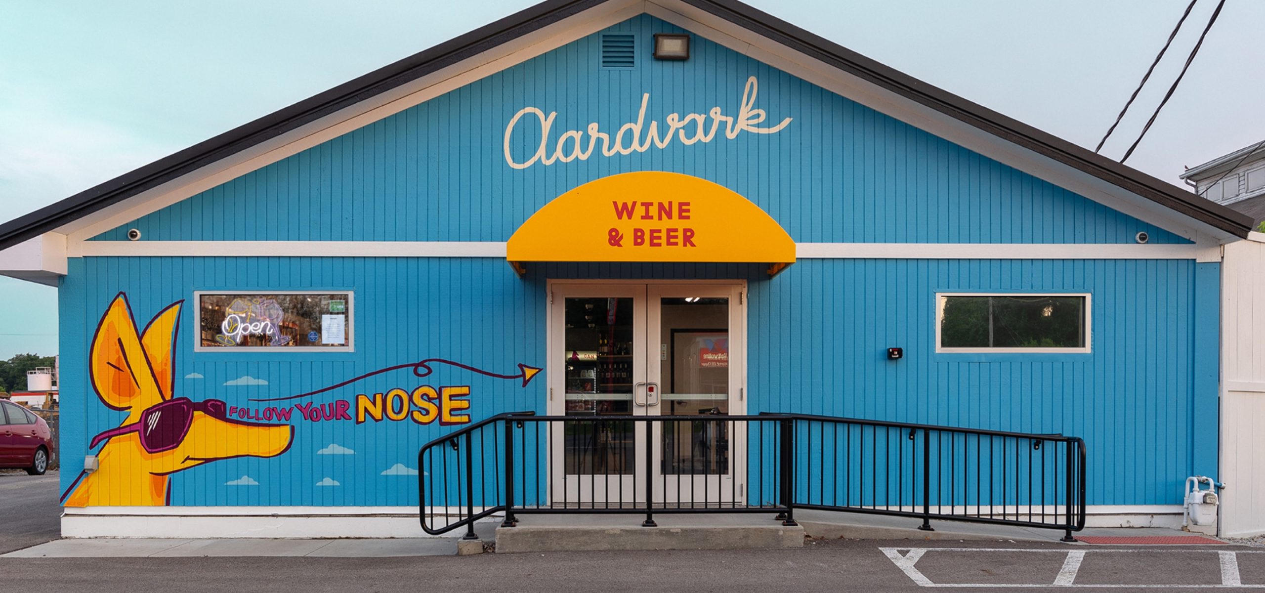
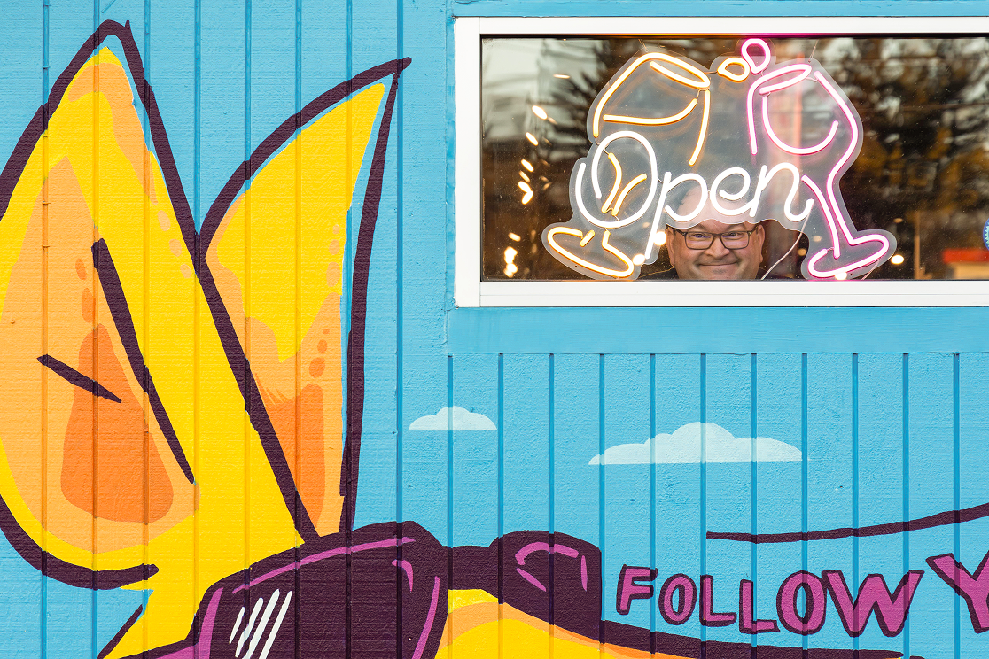
Environmental
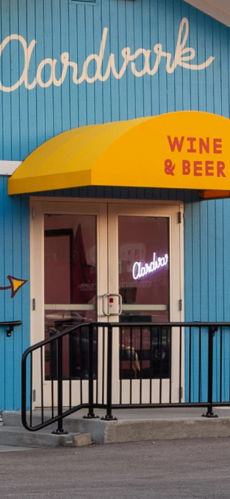
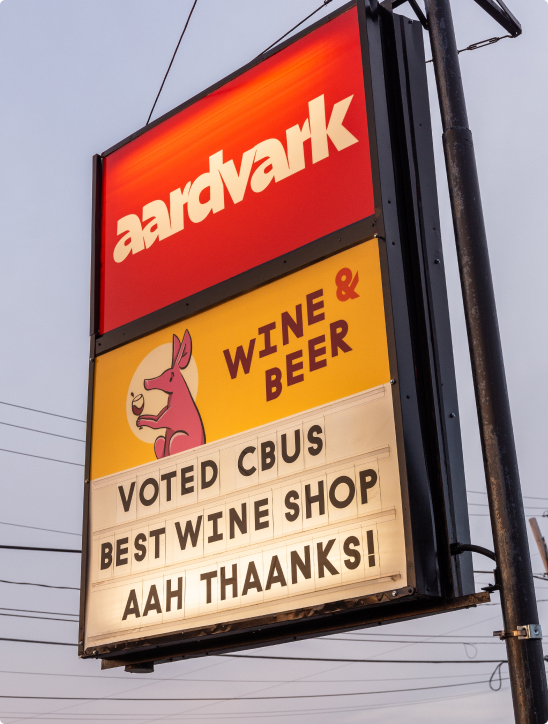
Aardvark’s shop, while located on a well-trafficked thoroughfare, blended into a row of nondescript white buildings. The building needed to be immediately recognizable and attention grabbing. We used bold brand colors for paint and worked with local mural artist Nick Stull to put Aaron front and center. Now, you truly can’t miss it.
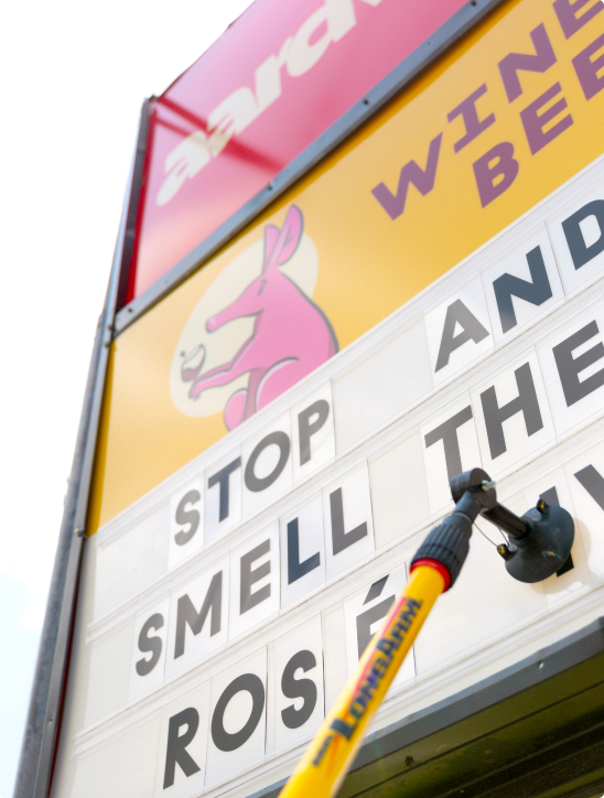
Custom lettering and signage bring the brand out to the street. We were able to salvage the vintage letter board portion of the road sign, and produce custom letterboard slides using Aardvark’s jaunty brand typography.
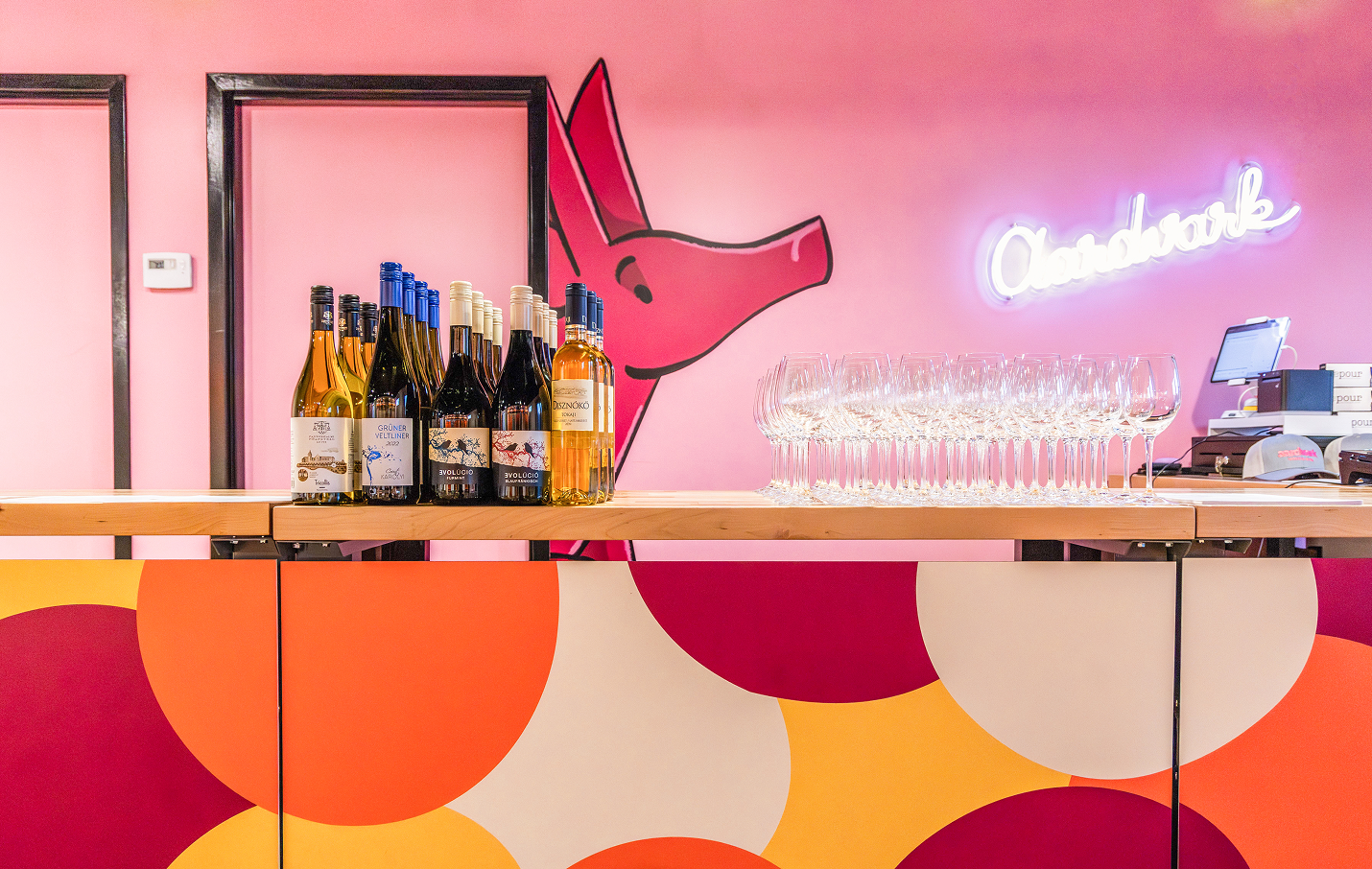
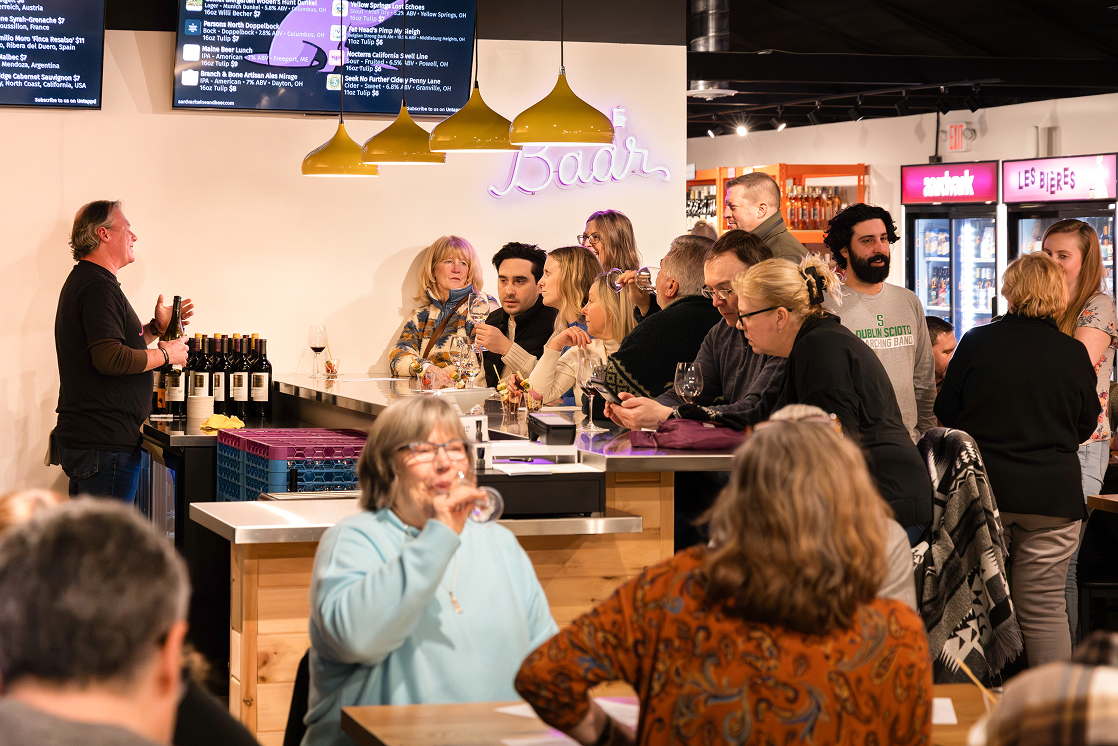
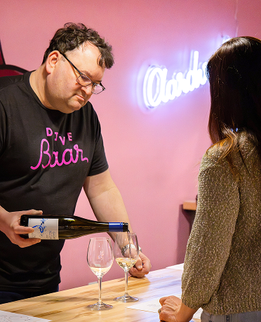
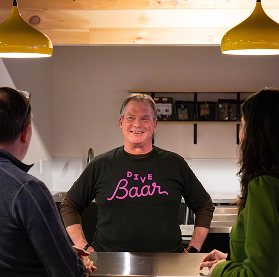
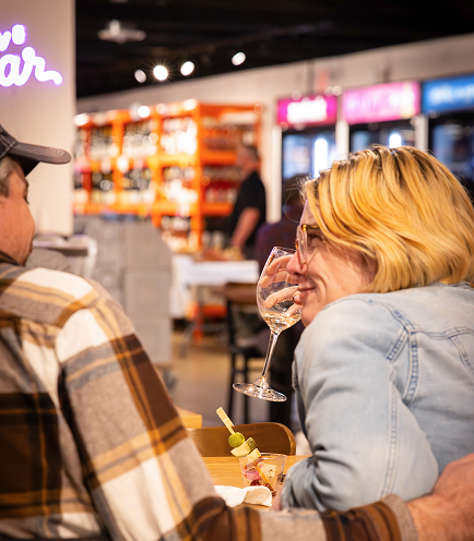
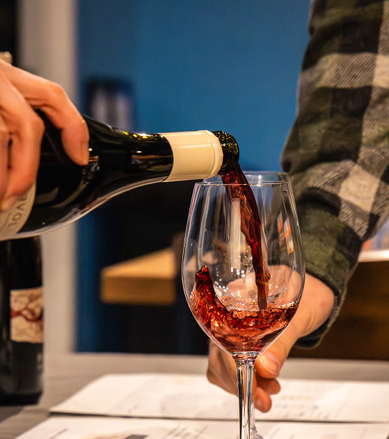
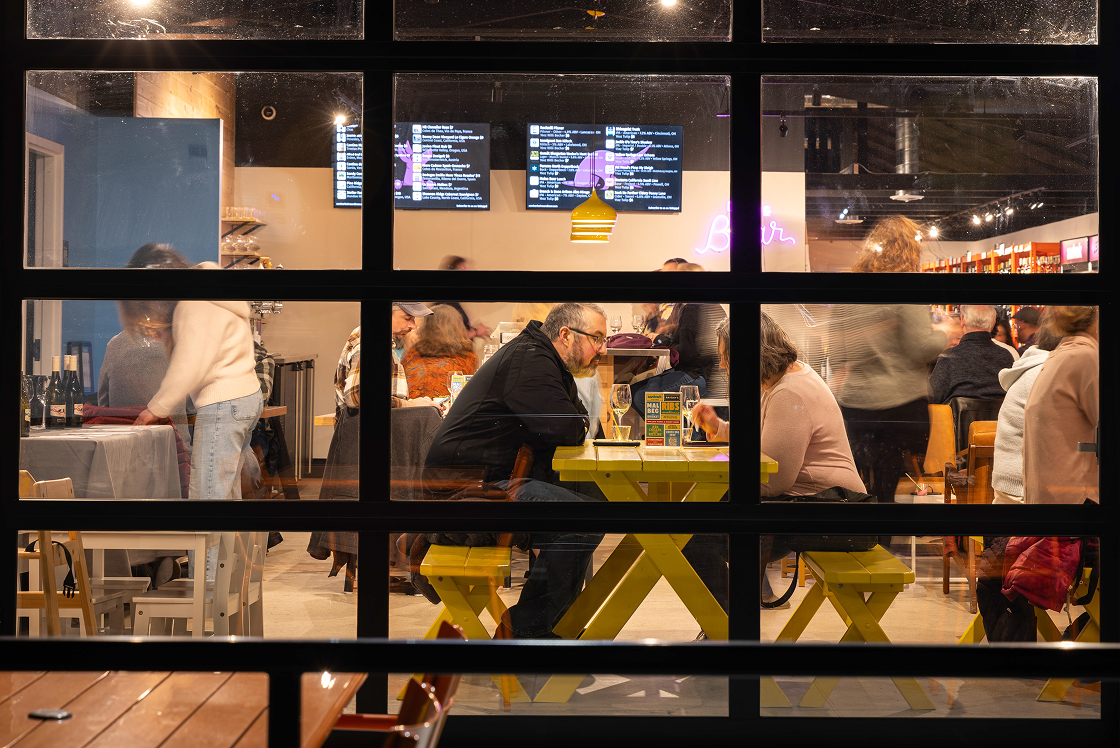
Interiors and The Dive Baar
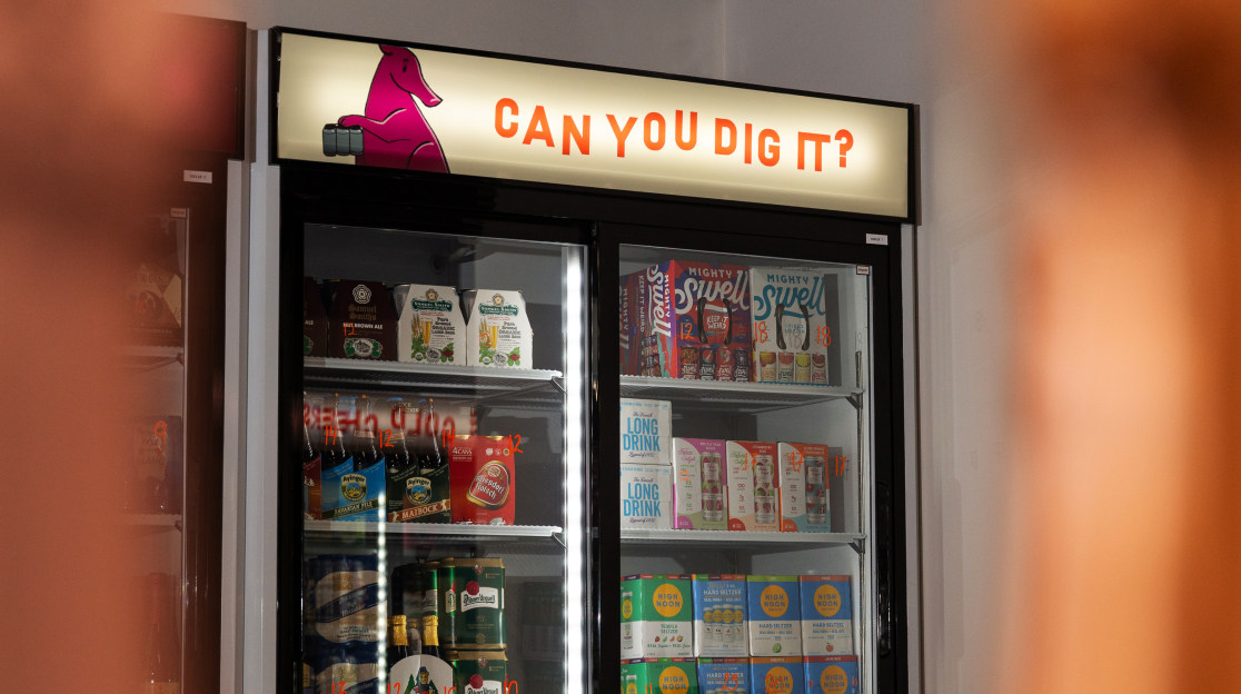
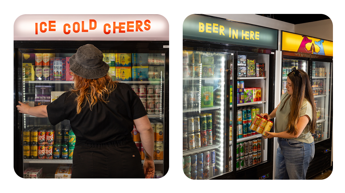
Next, we helped the Aardvark team bring the brand to life in the physical space, through environmental branding, signage, more functional printed materials for the space, and even recommendations on finishes and color moments for the space.
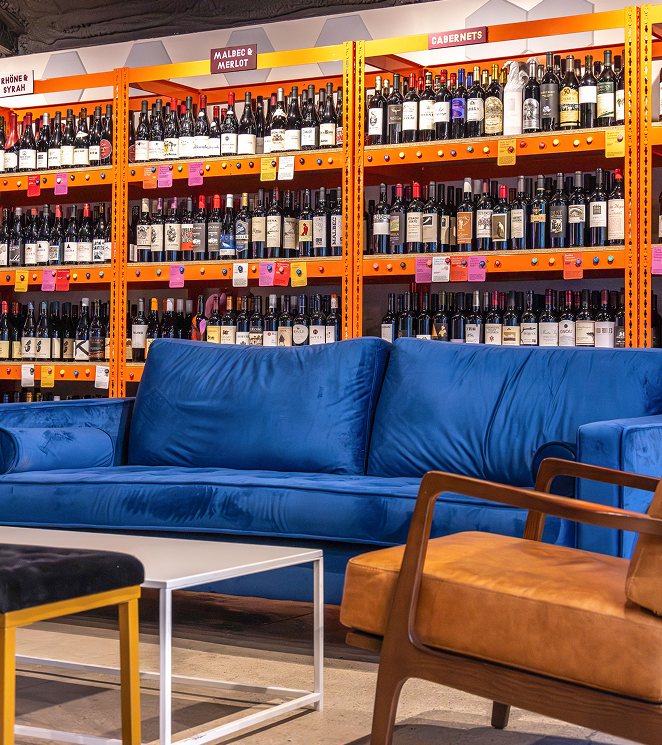
Working with inherited coolers for the beer selection and wine shelving, we explored ways to keep bringing Aardvark’s personality to life in tandem with clear navigation throughout the shop. They bring color and energy to the aardvark’s burrow.
This work was implemented slowly as the business got up and running over the course of about a year and a half. When they were ready to build out The Dive Baar (the building used to be a diving school!) I was able to connect them with interior designers to help with that project as well.
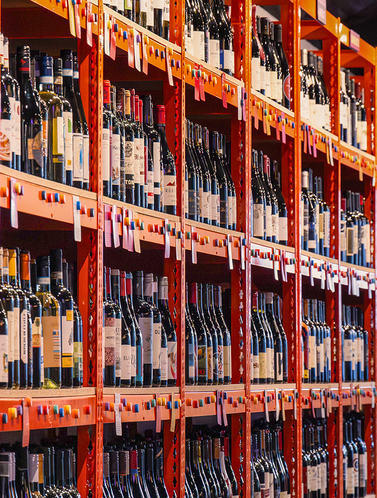
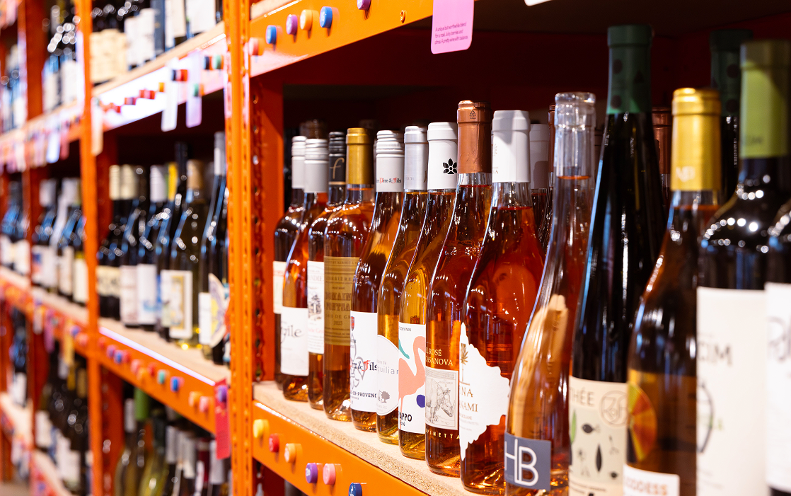
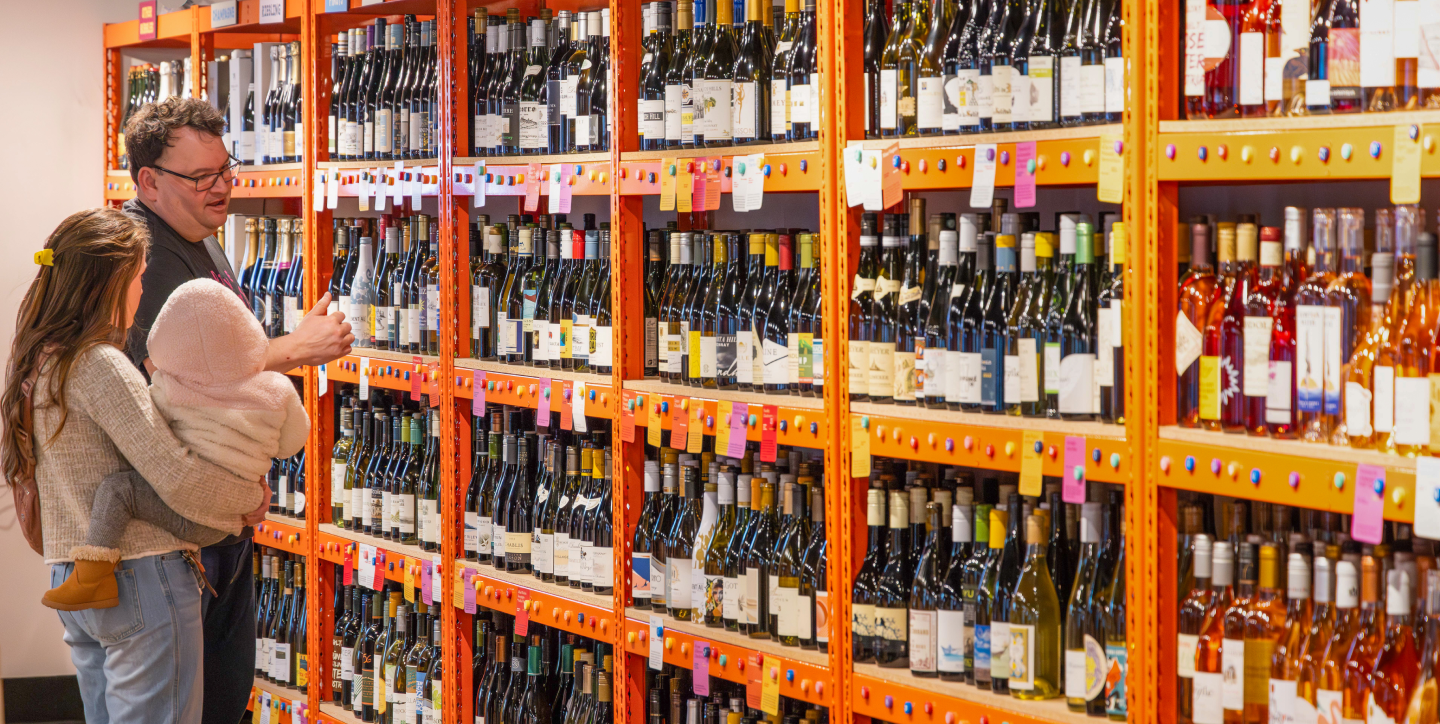
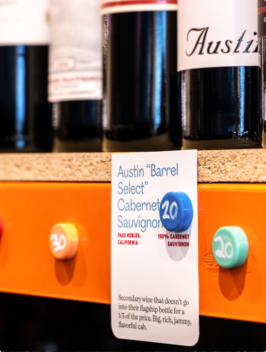
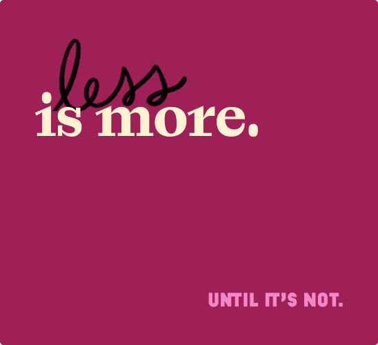
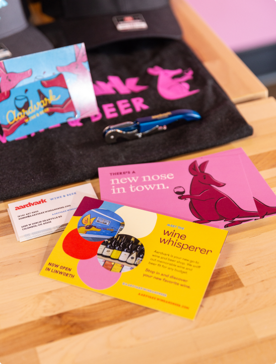
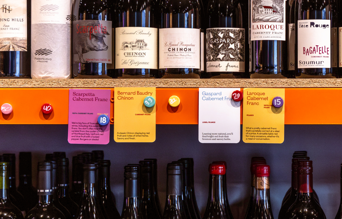
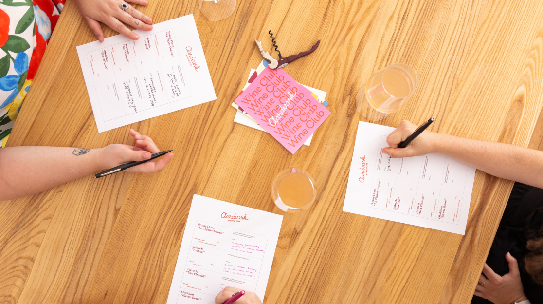
Shelf Talkers
Aardvark’s attitude is all about making the wine shop less intimidating and more approachable. Shelf talkers have the potential to help a shopper quickly find their way, but in most wine shops they are so complex—full of arbitrary or proprietary “rankings”, obscure certifications, dense text—that they end up being more confusing than helpful.
Instead, we re-imagined what a talker should be; The voice of the sommelier when they haven't made it over yet to recommend something personally, a place to show personality, and a way to spotlight great wine in a more relatable, creative way. A set of flexible templates for the talkers made it easy for the Aardvark team to execute the design well without feeling repetitive.
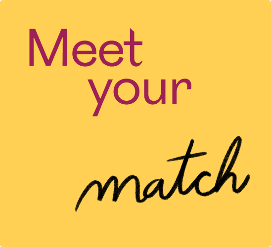
Brand Extension
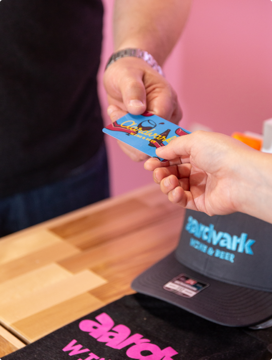
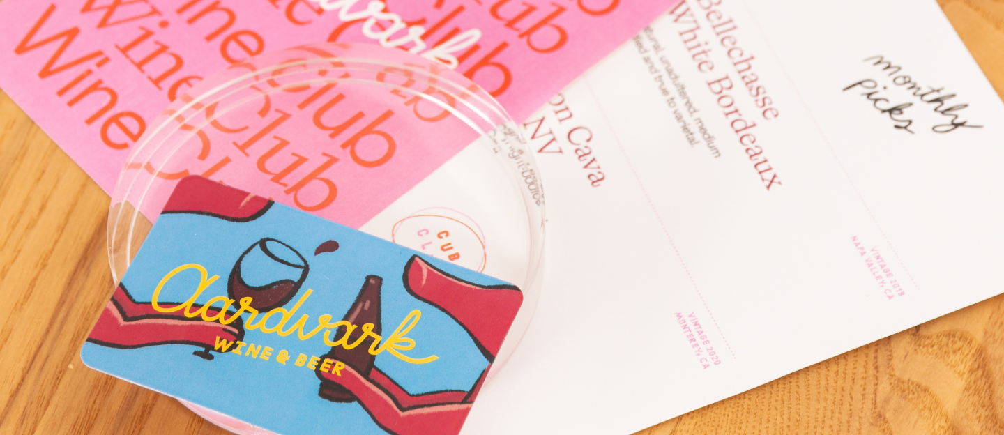
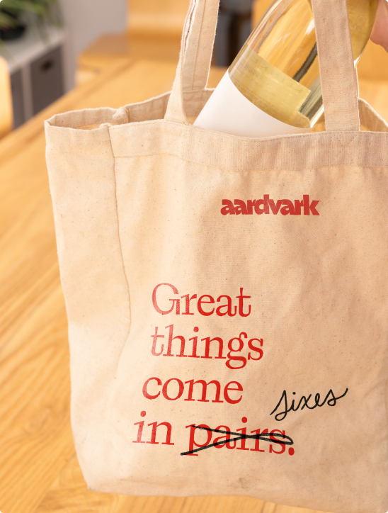
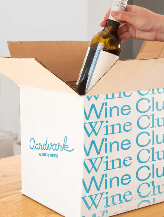
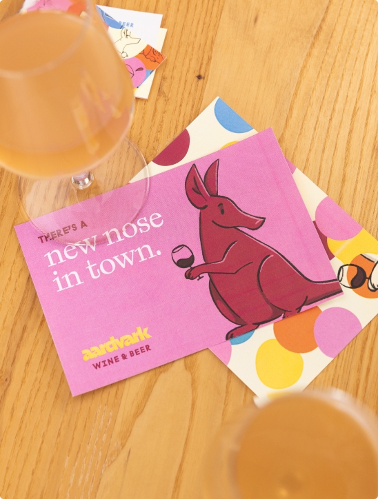
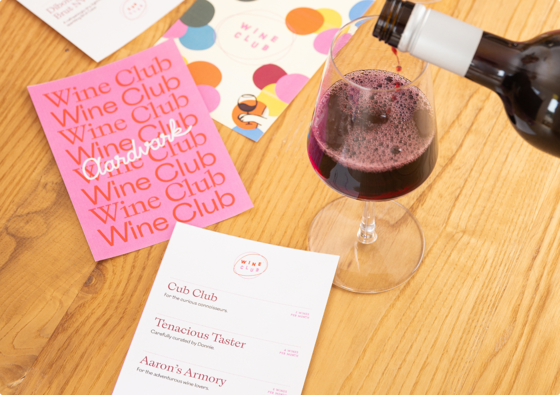
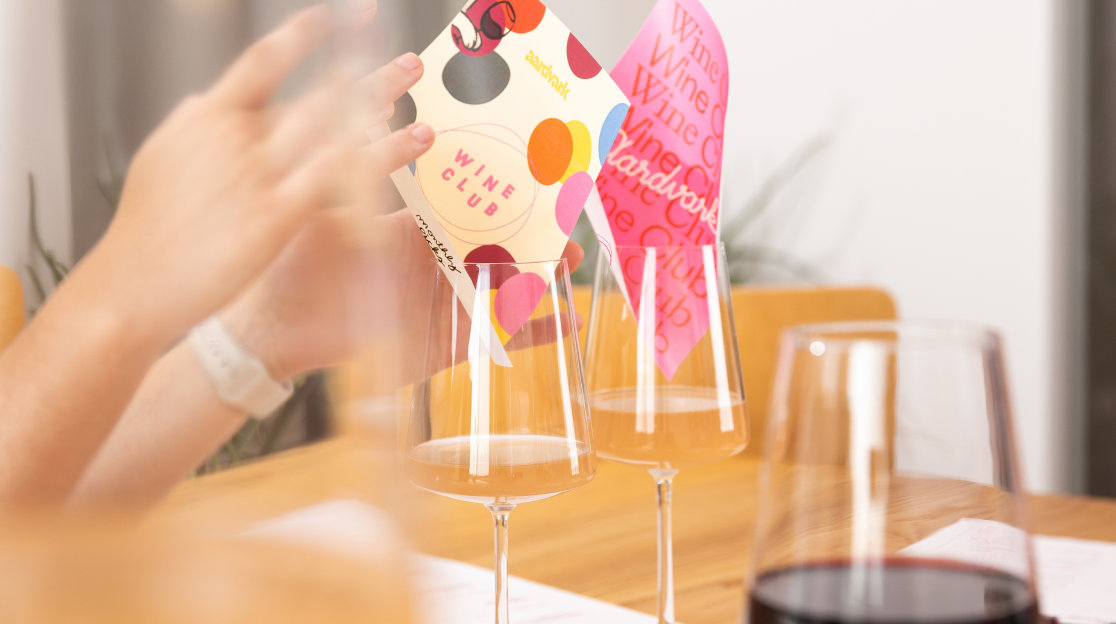
We extended the Aardvark identity system to critical brand touchpoints: social templates, business and gift cards, packaging, swag, tasting note templates, and collateral for Aardvark’s first wine clubs.
Later, I returned to the project to improve the shop’s digital presence through a landing page design, built in Webflow.
Notes
Brand created at Nonfiction. Continued activations developed independently.
Collaborators
Amanda Caskey — Design + Animation
Anne Knellinger — Design + Illustration
Jacob Strous — Design
Jeff Packard — Strategy
Neil Wengerd — Creative Direction
Nick Stull — Exterior Murals
Sarah Mapel — Environmental Design
Creative Palette — Environmental
Tonic Studios — Apparel
Role
Creative lead; Art Direction, Design, Webflow Design + Dev, Strategy, Photography
Date
2022—Present
© wilkeworks, llc 2026
© wilkeworks, llc 2026