Haystack Editions
Haystack Editions
Bringing fine art down to earth.
Scope of work
Naming, Strategy, Identity, eComm Web Design, Social, Print
Haystack curates and produces high-quality, limited-edition prints from established and emerging artists around the world. They came to us with a simple, yet complex question: How do we de-mystify and democratize contemporary art? To many of us, the contemporary art world feels inaccessible and intimidating. Newcomers don’t know how to discern quality and it can be hard to discover new artists when you don’t know where to look. We led Haystack through a naming and branding process intended to make contemporary art accessible for everyone – intellectually and financially.
Naming
Haystack is about education, accessibility, and fun. The new name speaks to the feeling of discovery that comes with finding art that you understand, and therefore art that you love. It evokes a feeling of exploration, like an improvisational collector who goes where inspiration takes them. The greatest art collections are built by heart, not by hand. Kind of like finding a needle in a haystack.
Brand Identity
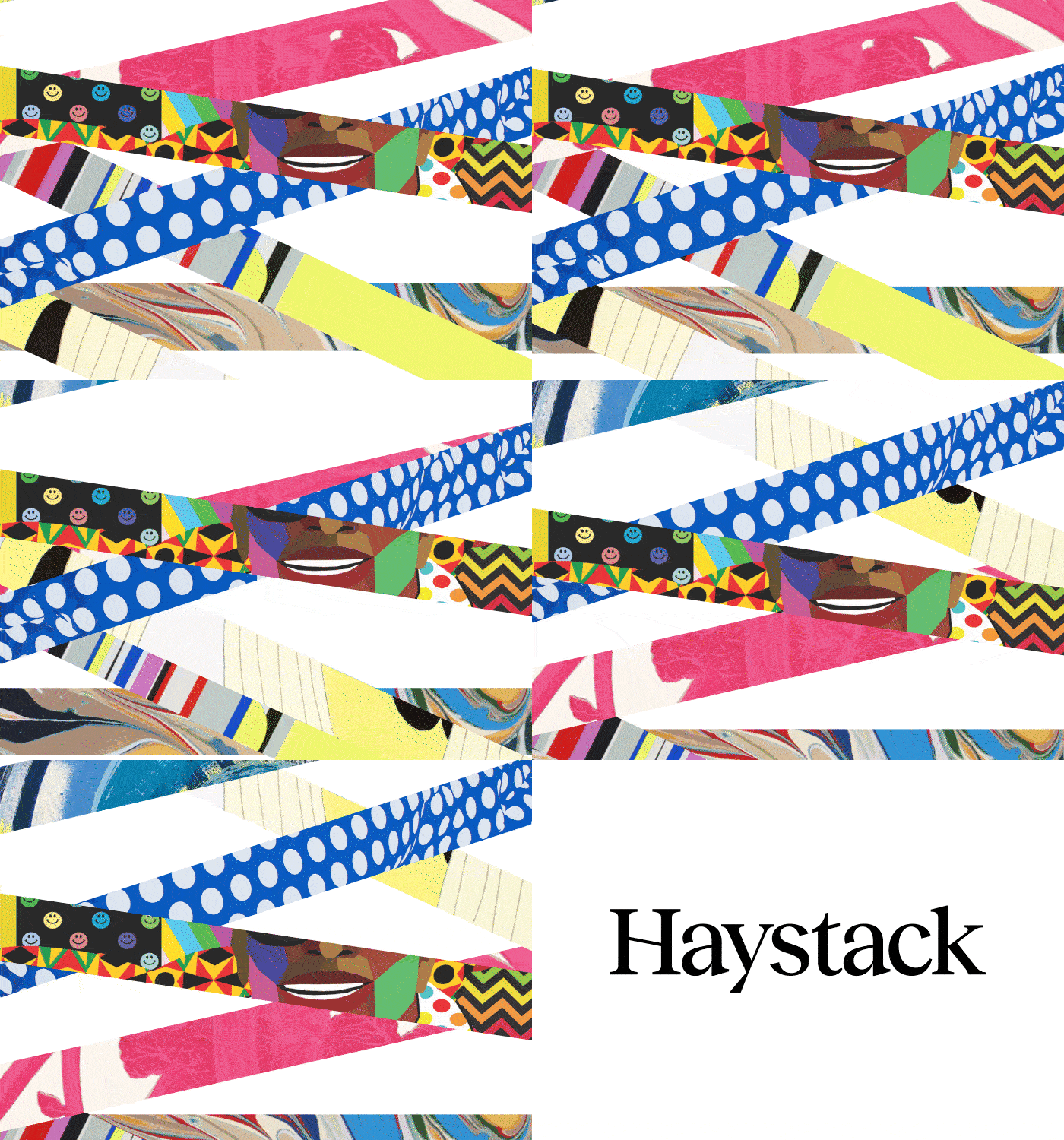
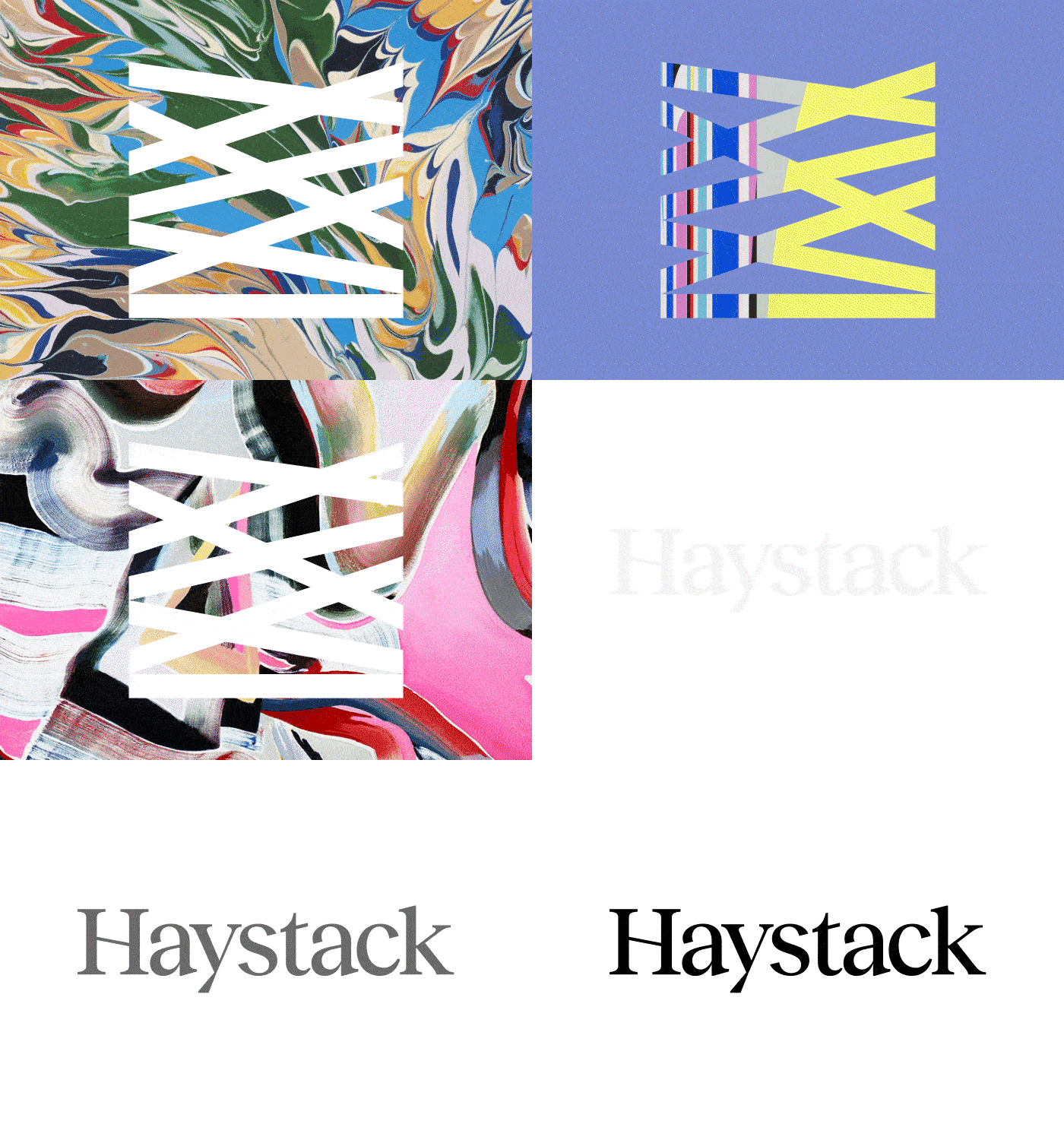
The identity channels the best qualities of great art; it’s whimsical, unexpected at times, and creates an experience around each edition that feels immersive. Each interaction with the brand feels like you’re discovering something new, learning a little more, and building a love for art—not just getting caught up in its value.
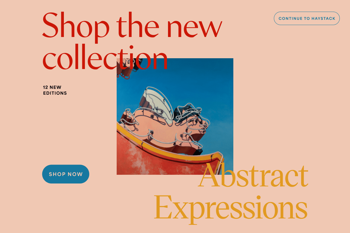
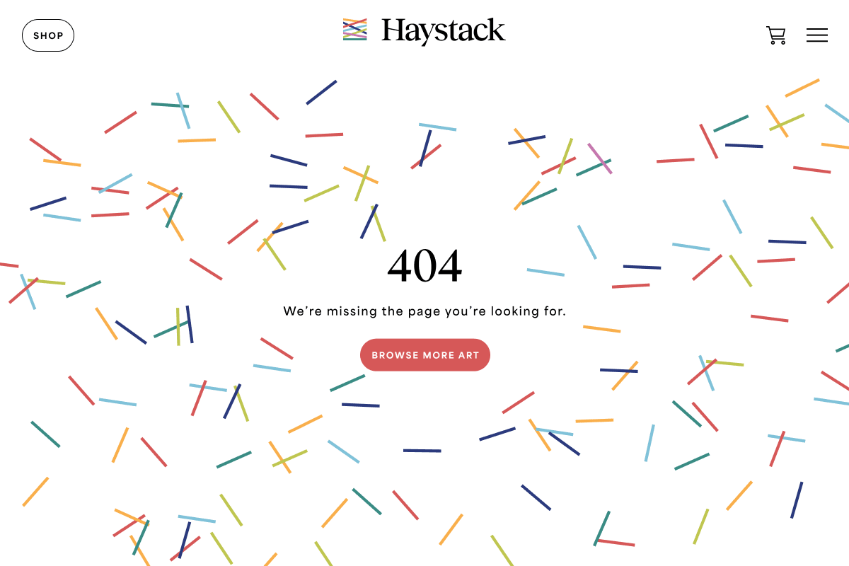
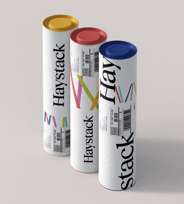
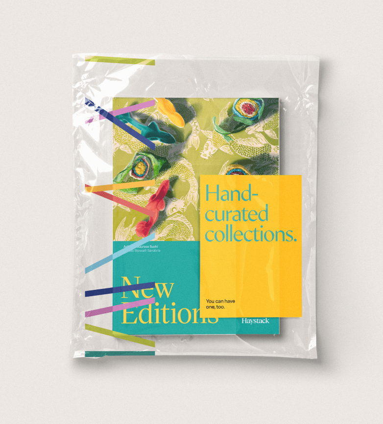
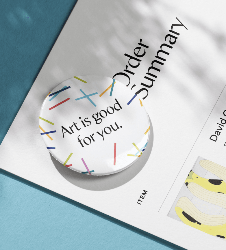
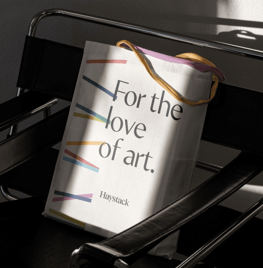
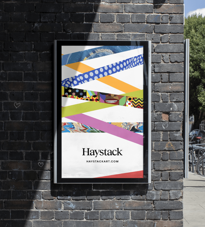
This begins with a logo that’s always in motion, and an identity system that rejects a uniform approach to color in favor of a vivid spectrum, used at random. When the artwork needs to be the star, new color palettes are built around each piece.
Website
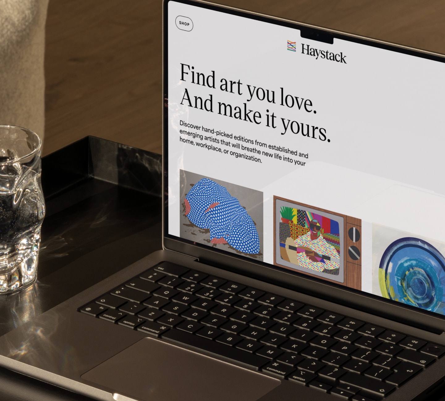
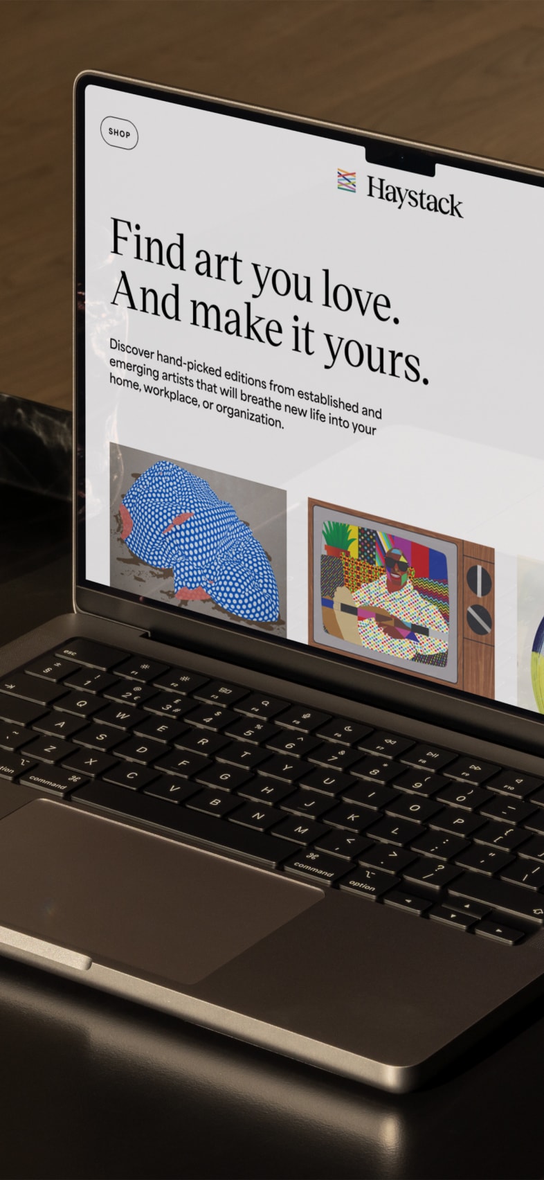
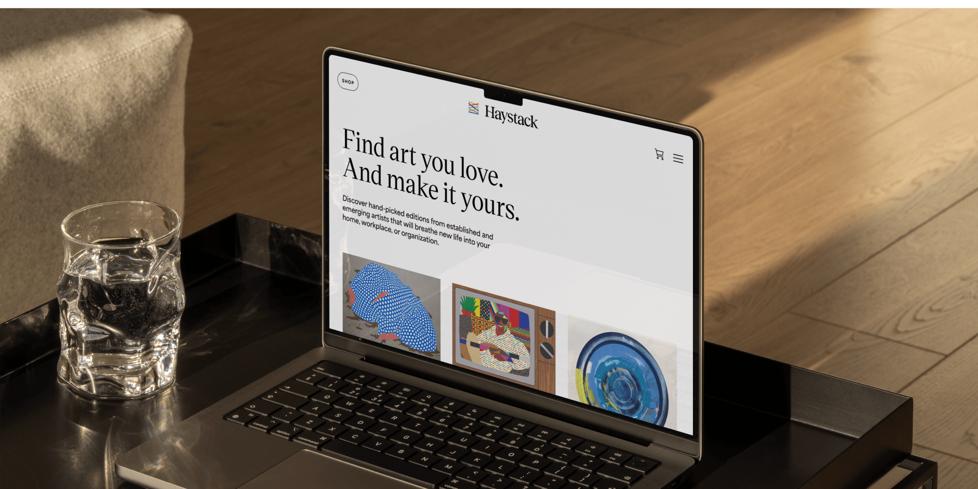
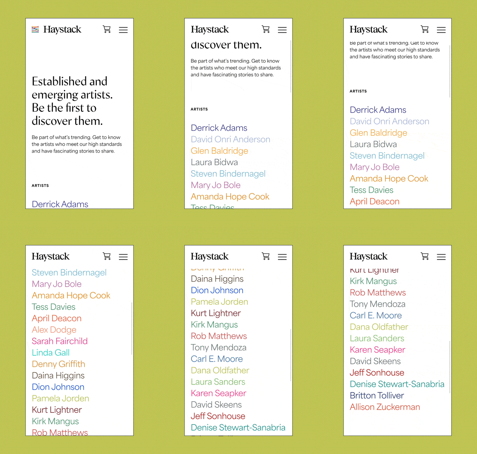
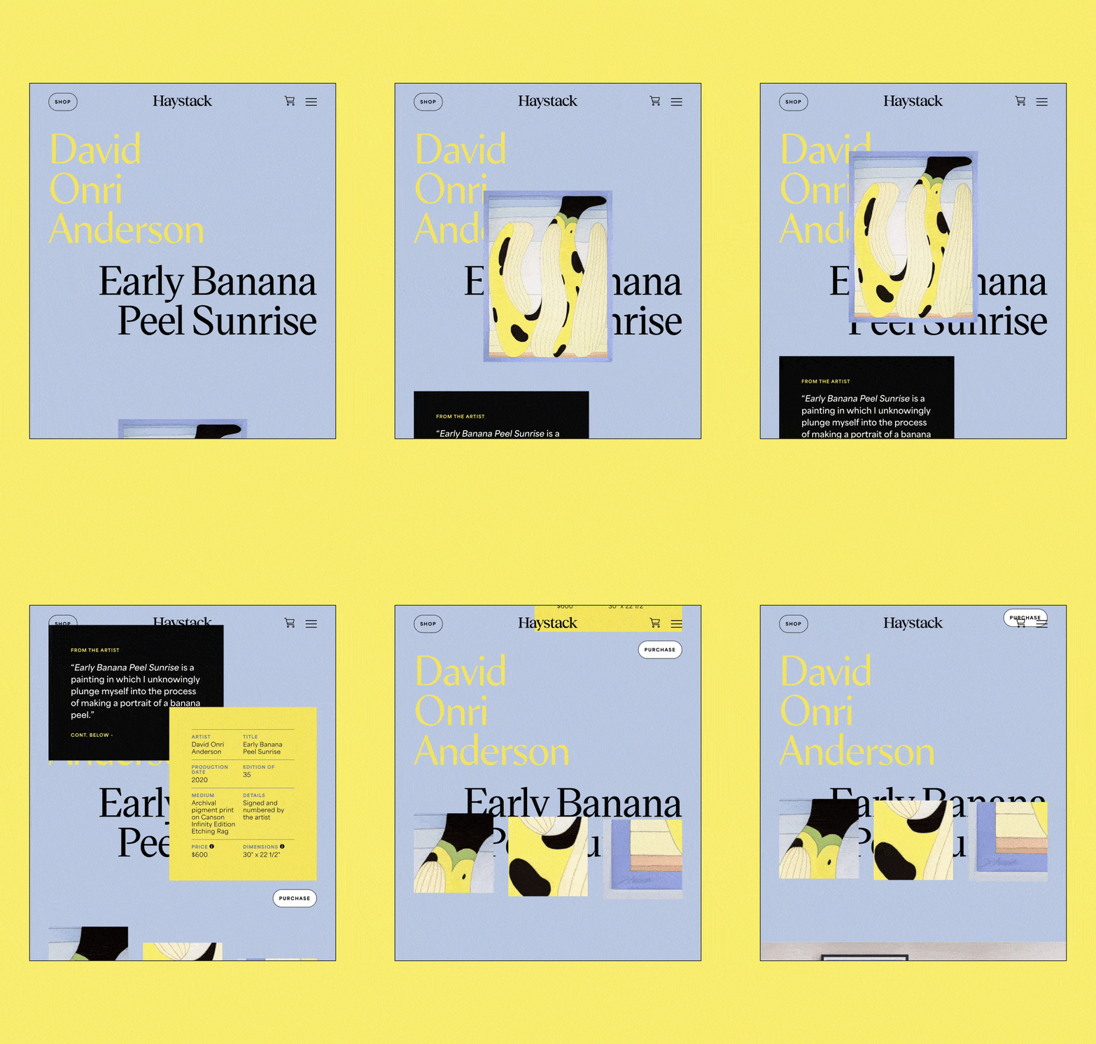
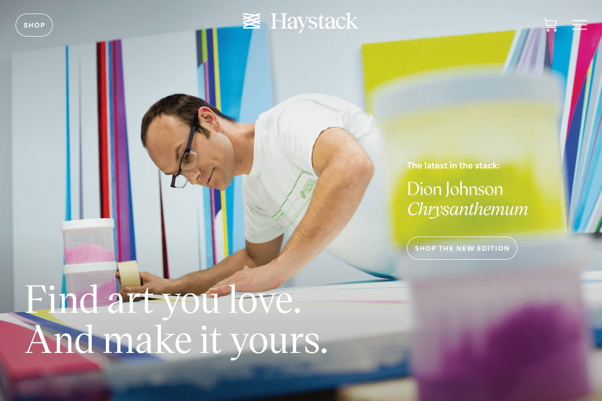
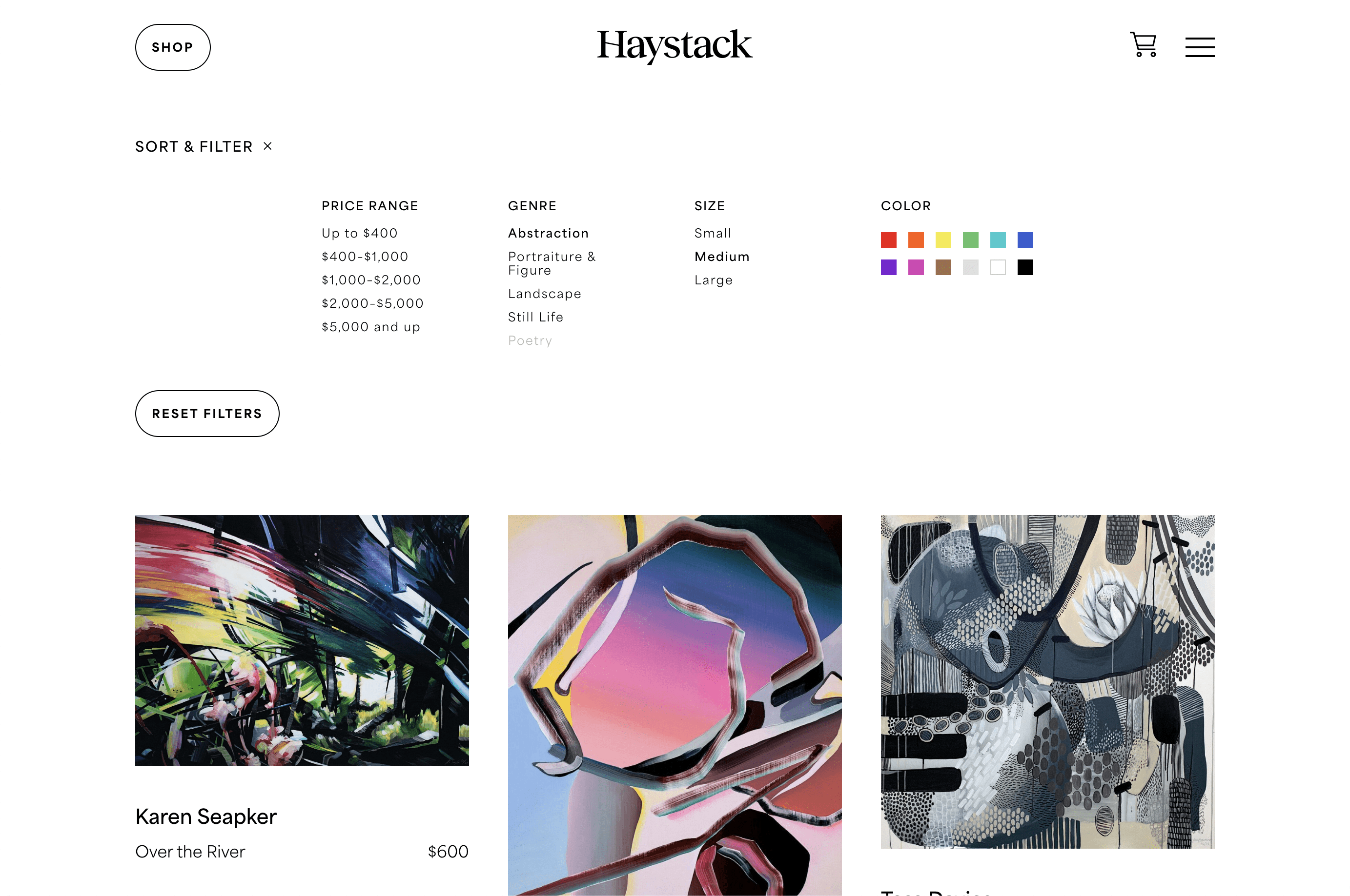
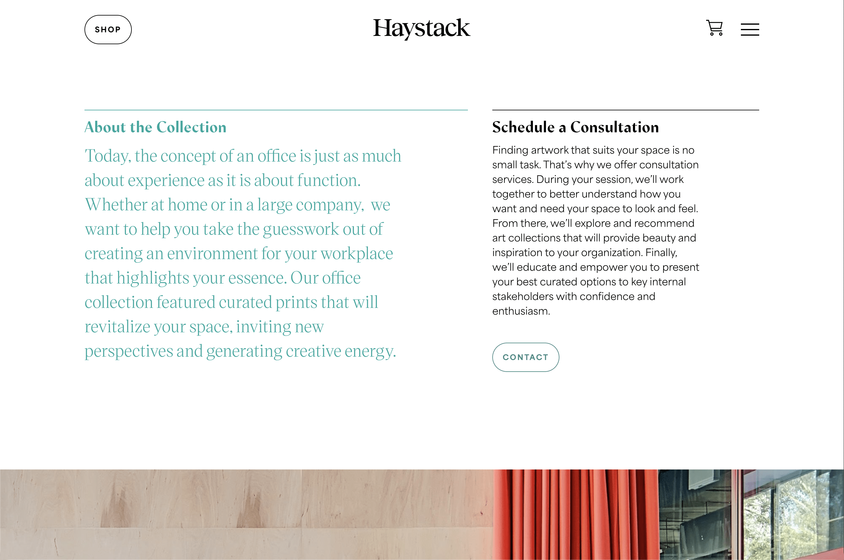
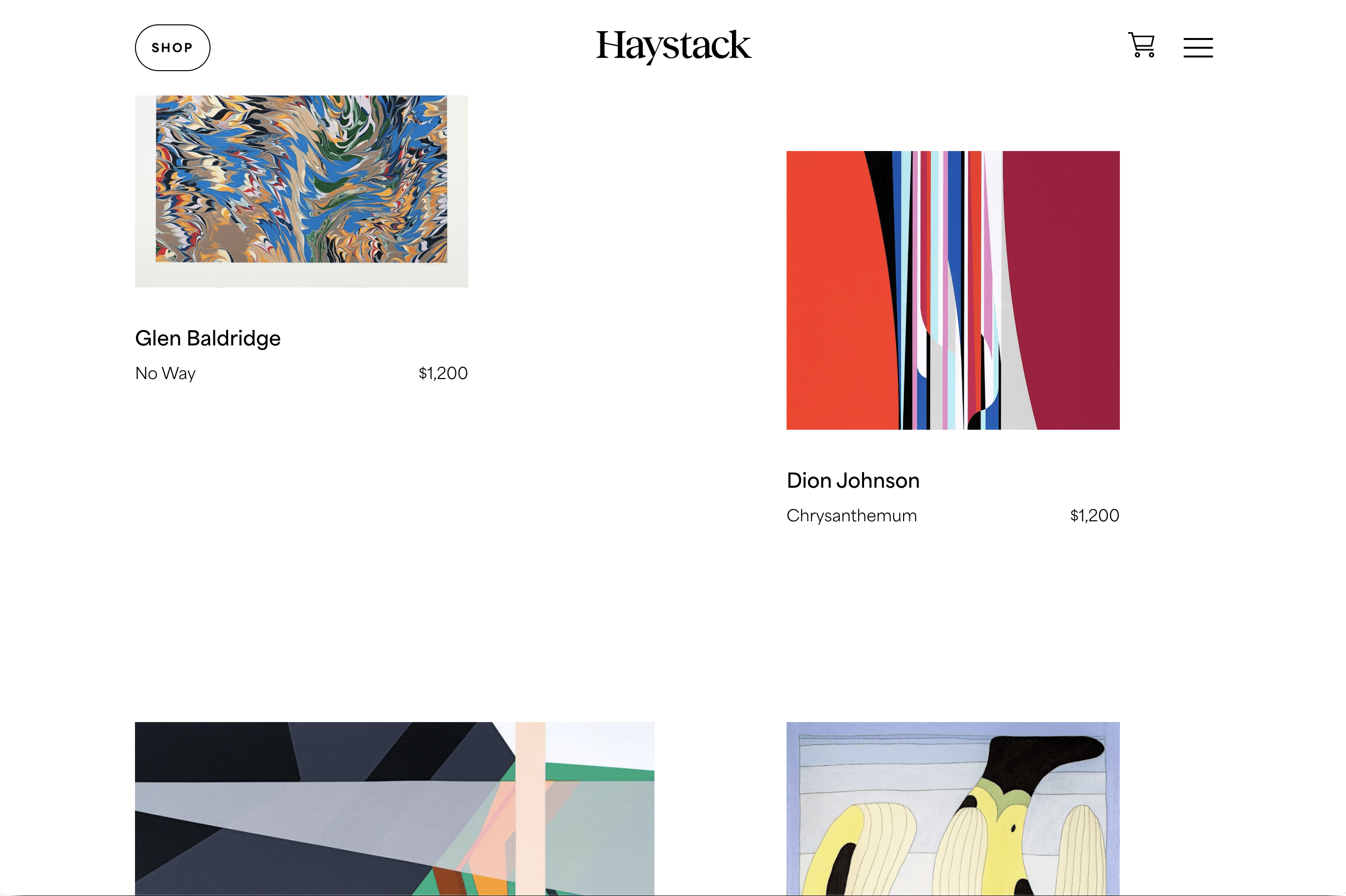
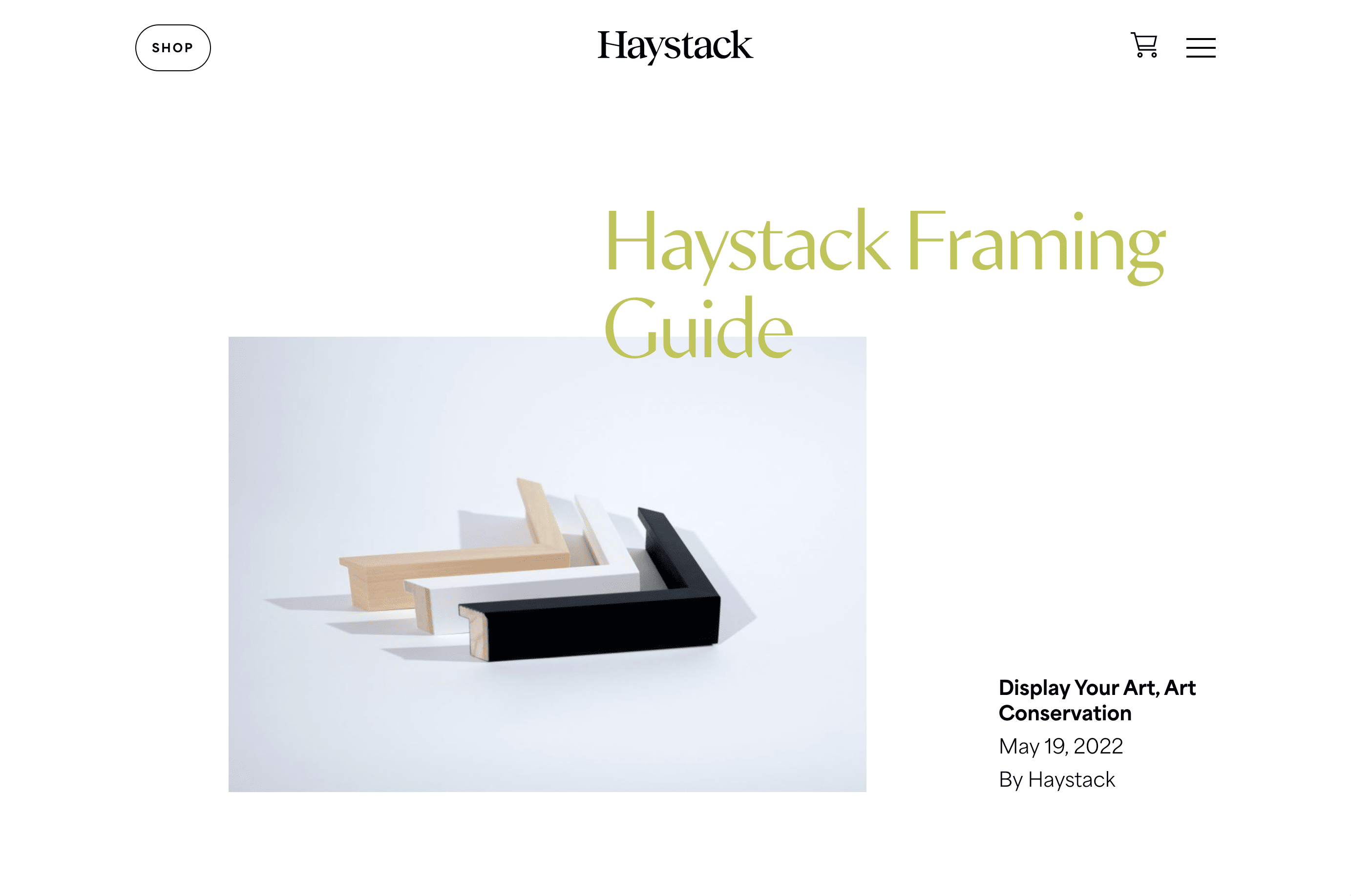
As an ecommerce-led business, Haystack’s site is all about discovery. Whether you’re browsing logically and filtering down art you might like, or jumping from piece to piece impulsively, the site is built to make it easy to find art you love. Shopping each edition is a unique visual experience that educates new collectors through in-depth writing and information about the artists and production. And the site makes it easy to see how a few pieces look together, always keeping the new collector in mind.
Brand Extension
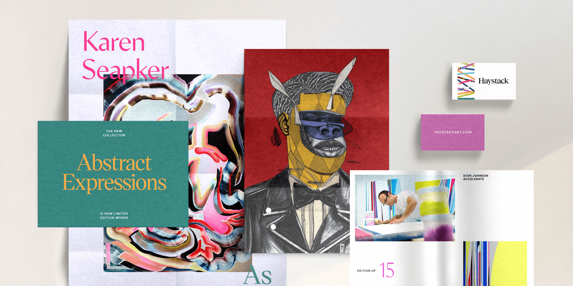
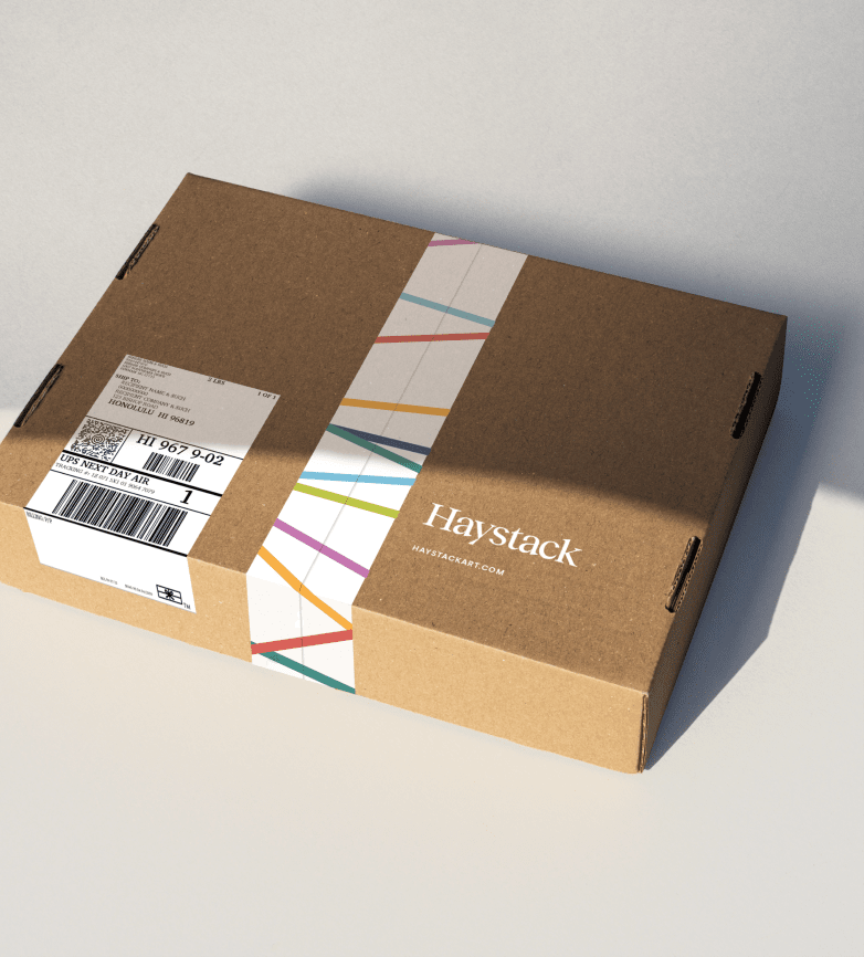
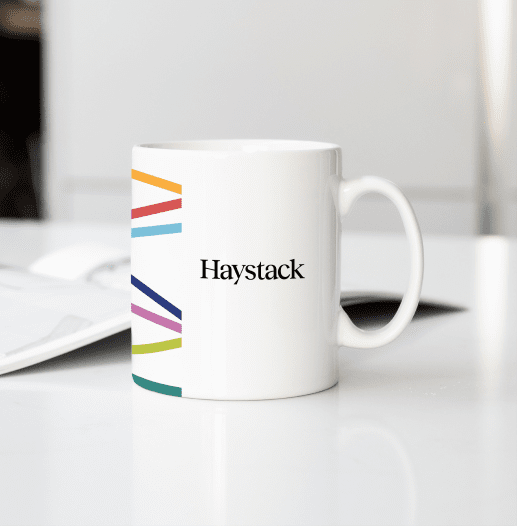
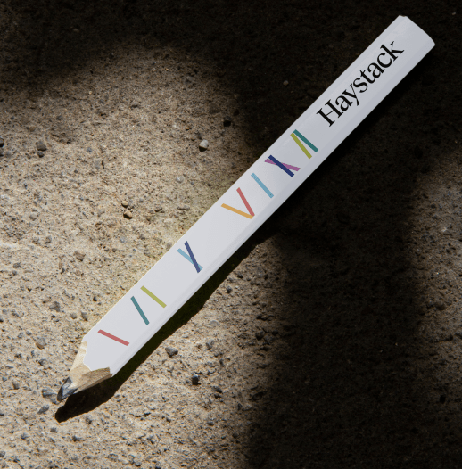
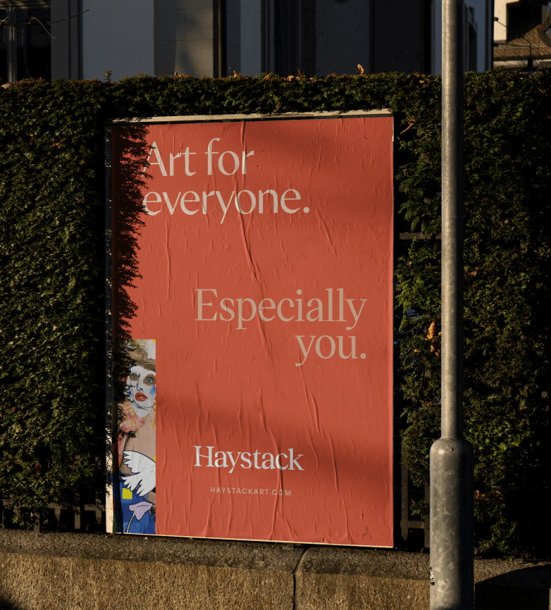
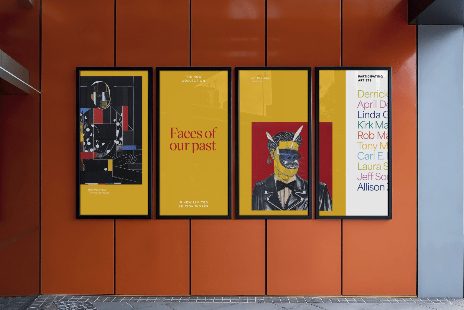
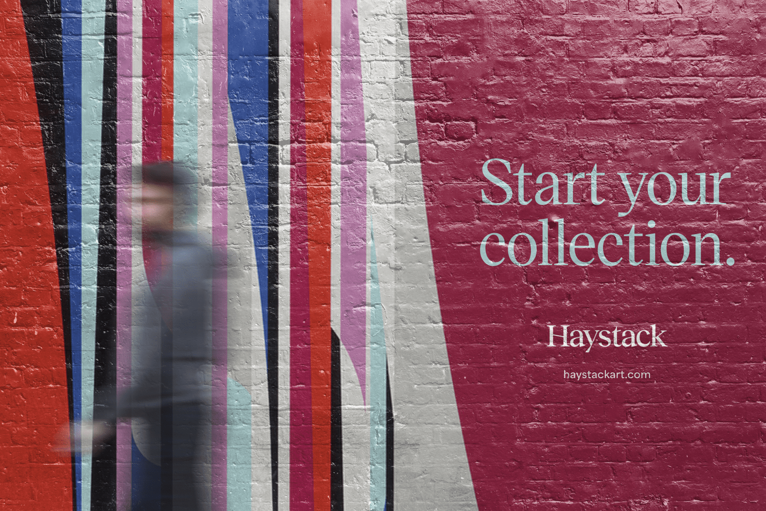
Moving into touchpoints beyond the website, the whimsy and spontaneity of Haystack’s design system gets turned up a notch. Using the logo and wordmark separately mean they can flex and stretch in fun ways across packaging and merchandise. Brand and artwork colors and imaginative layout make for an eye-catching social feed. And all of this paves the way for approachable language rarely seen in the context of fine art.
Notes
Created at Nonfiction
Collaborators
Lauren Haase — Design
Anne Knellinger — Design
Amanda Caskey — Design, Animation
Kimmy Alexander — Project Management
Neil Wengerd — Creative Direction
Jeff Packard — Strategy
Brit Eaton — Writing
Triple G Interactive — Development
Role
Lead Design, Art Direction
Date
2021—2024
© wilkeworks, llc 2026
© wilkeworks, llc 2026