
Echo Spirits Distilling
Echo Spirits Distilling
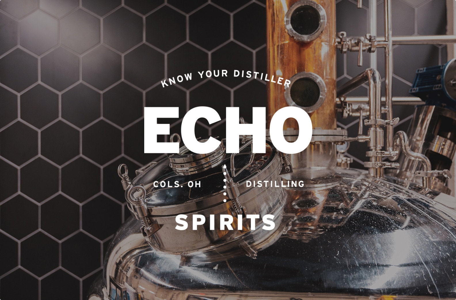
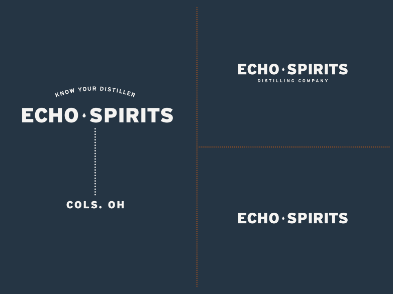
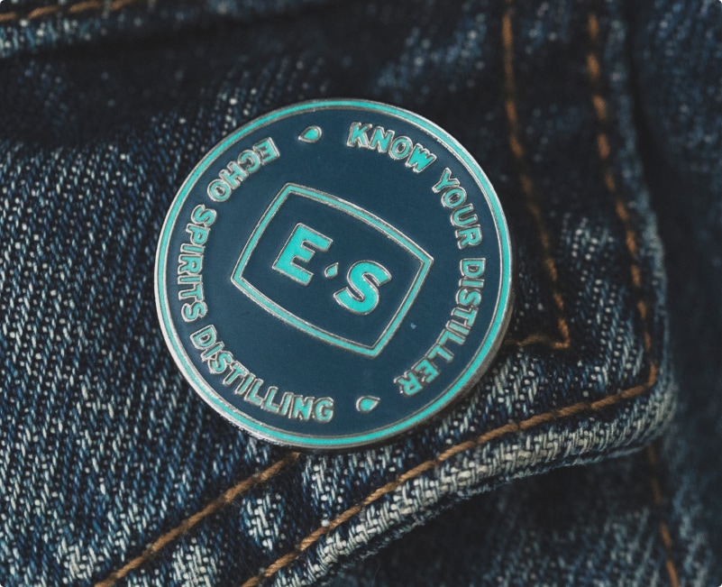
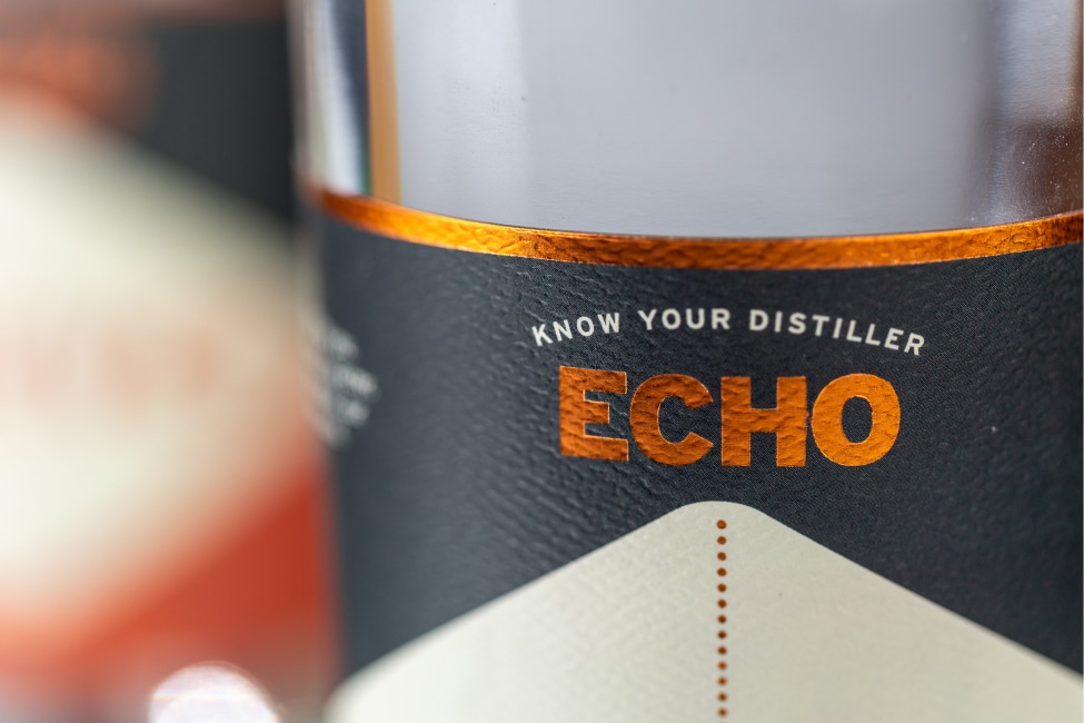
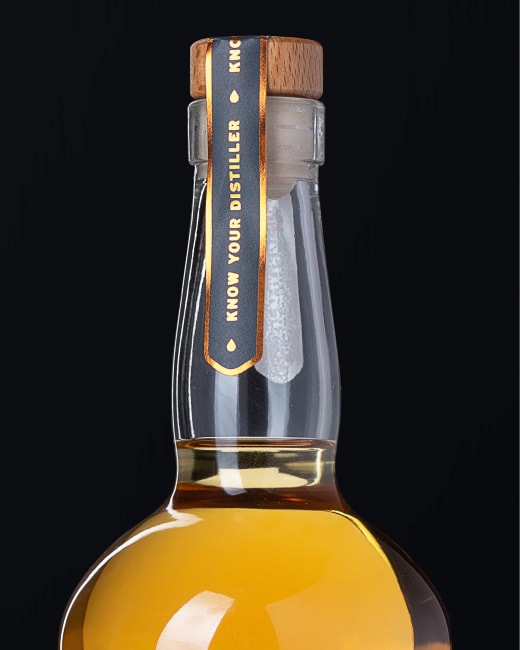
Know Your Distiller.
Client
Echo Spirits Distilling
Columbus College of Art & Design (CCAD)
Scope of work
Identity System, Packaging, Web Design, Print, Social, Brand Photo Library
Strategy, Identity System, Web Design, Print, Art Direction, Environmental
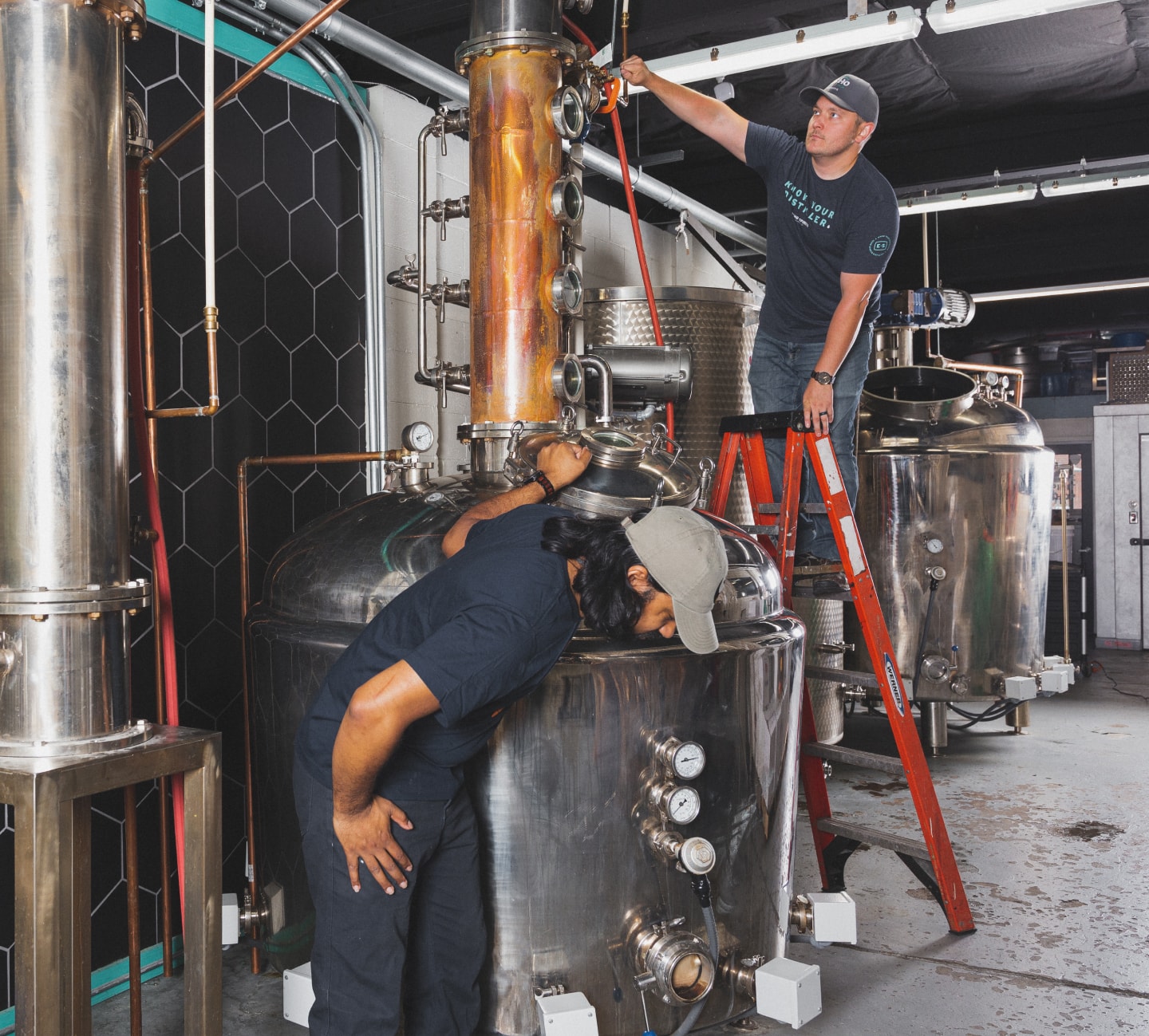
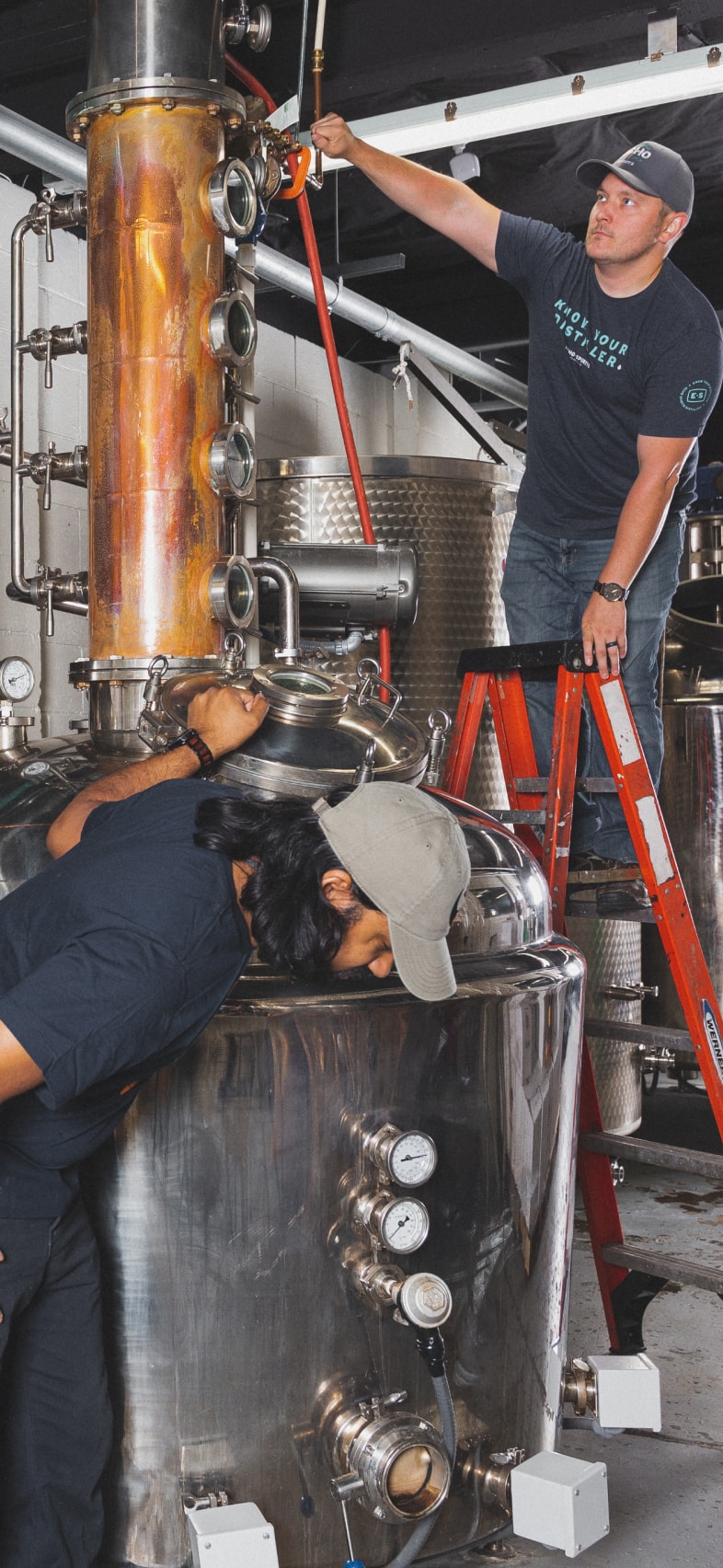
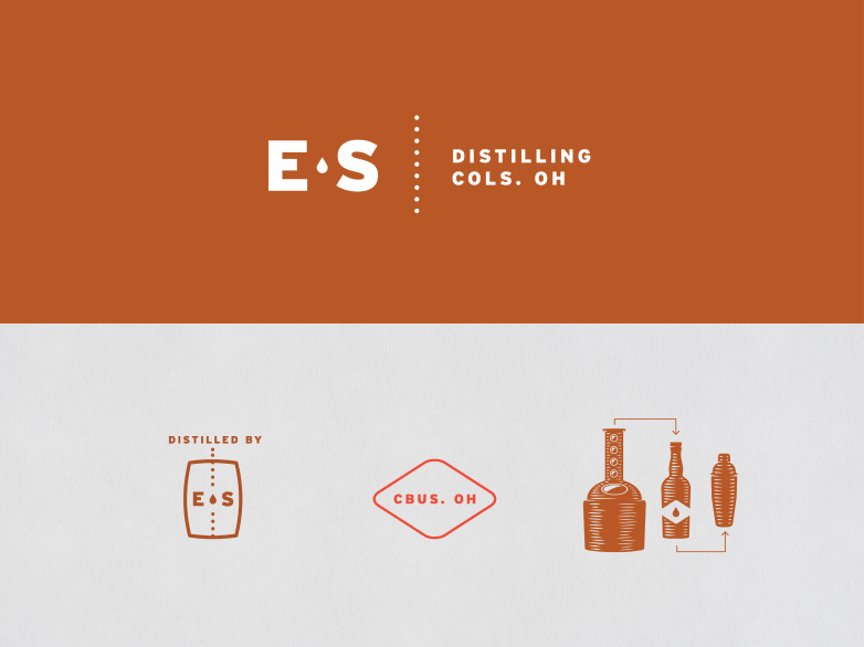
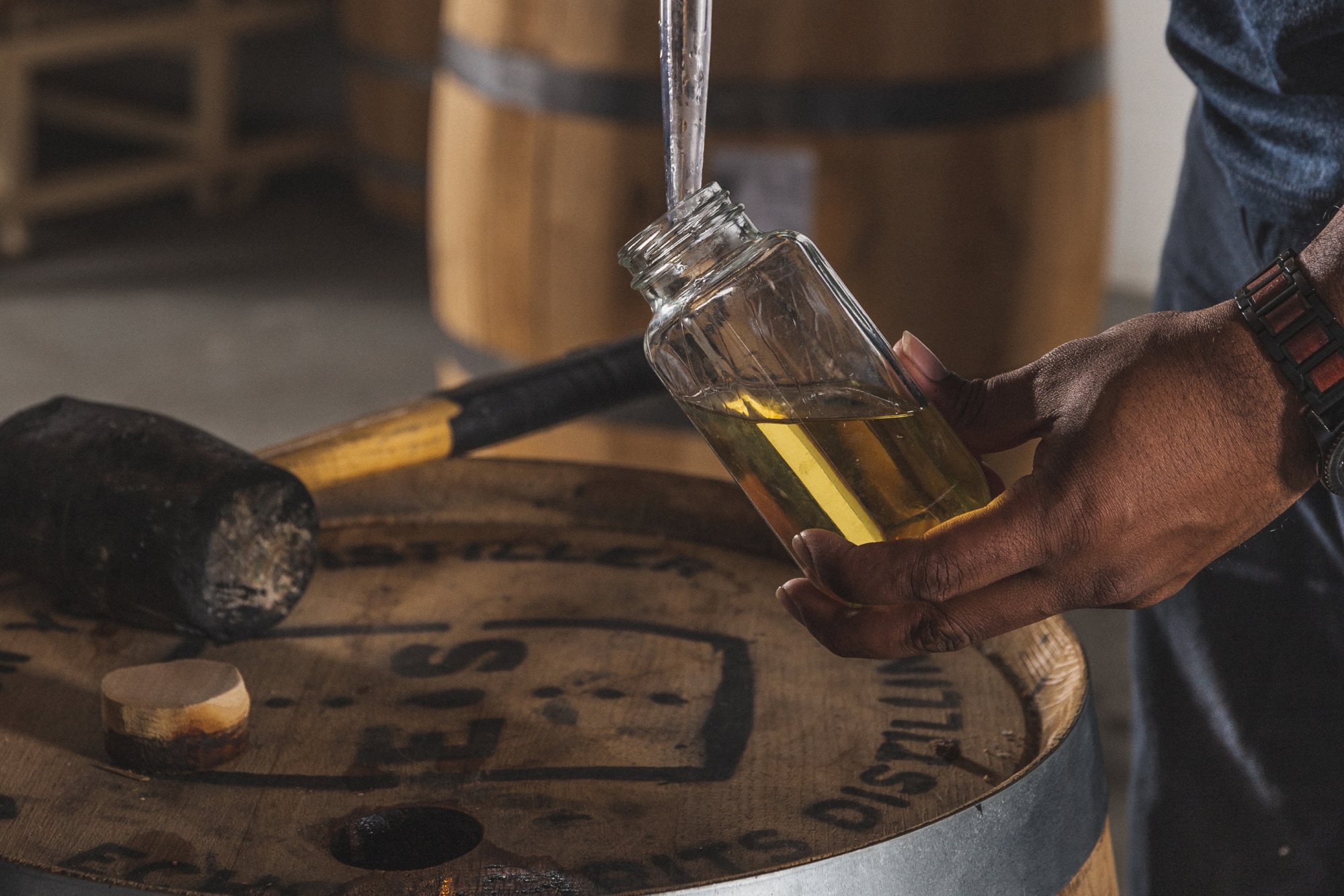
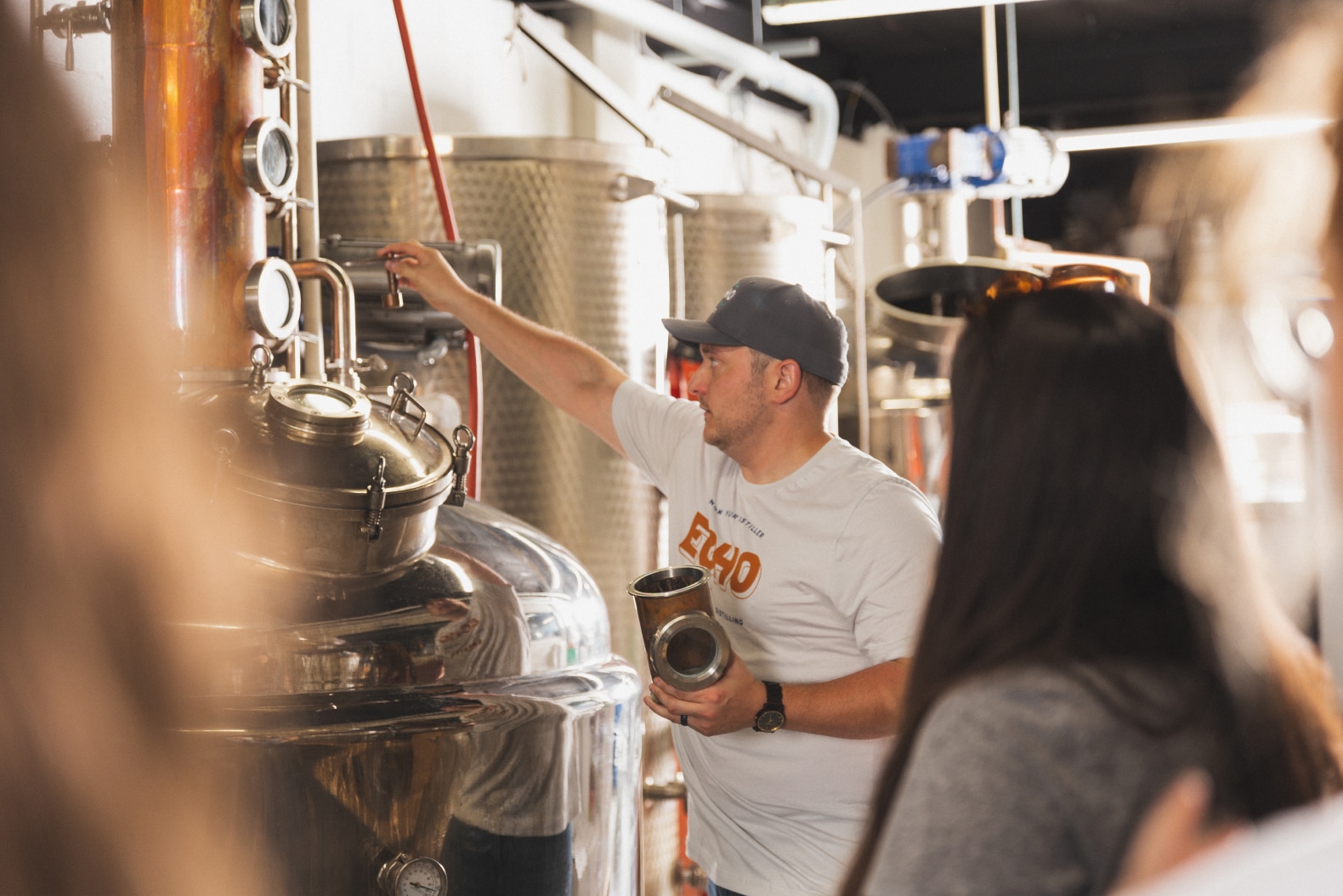
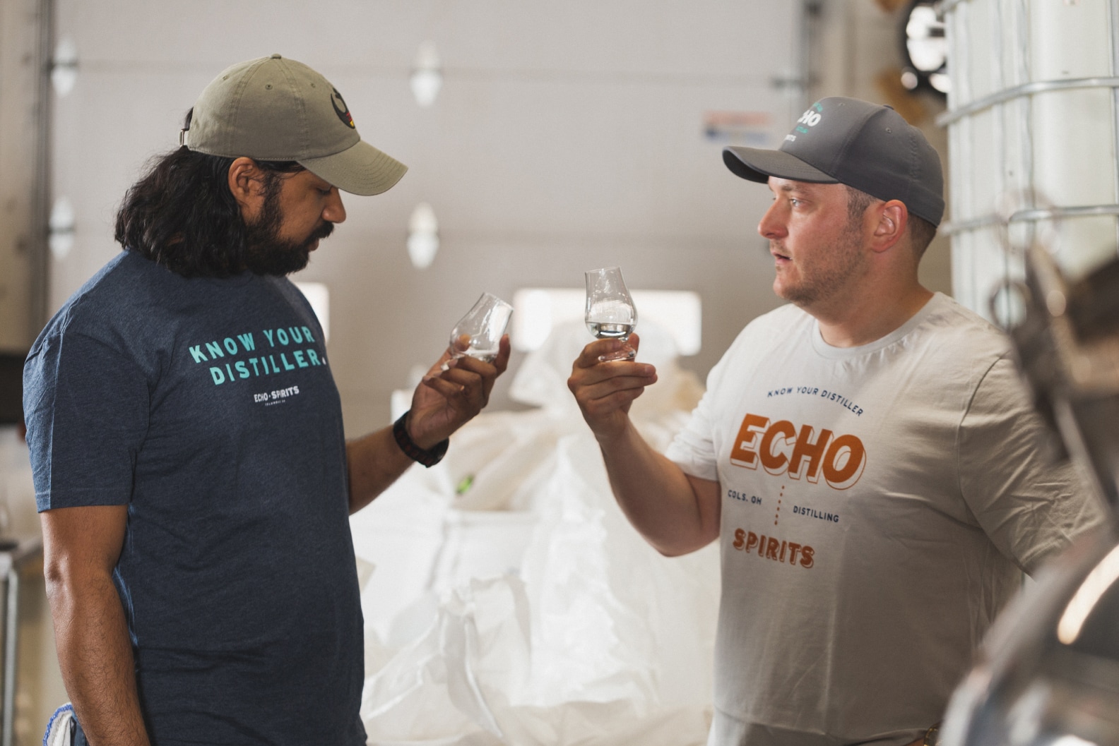
Echo Spirits, a distillery and cocktail bar in Grandview, Ohio, is about connections: past to present, process to product, and curious connoisseurs to the craftsmen behind the still. In the past, everyone knew their tailor, their grocer, their banker. Why shouldn’t people know their distiller? It’s on this idea that we developed a flexible, classic brand identity for Echo.
The Columbus College of Art and Design is nearly 150 years old. It's vital part of the community and sits at the center of Columbus's creative economy. CCAD created a new strategic plan and launched a fundraising initiative aimed at scholarships, faculty endowments, and infrastructure. Building upon their theme, Here for Change, we created a brand campaign that has the confidence and boldness that only CCAD can have.
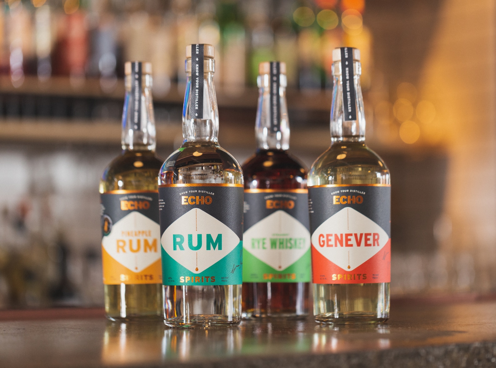
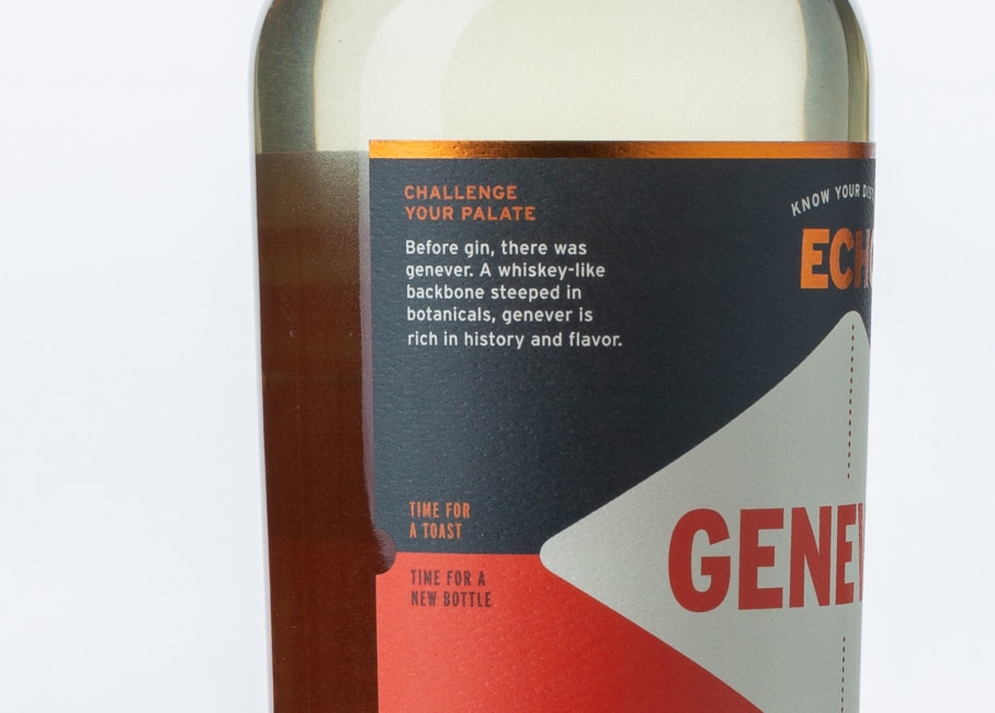
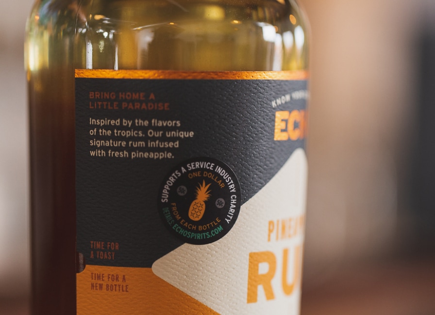
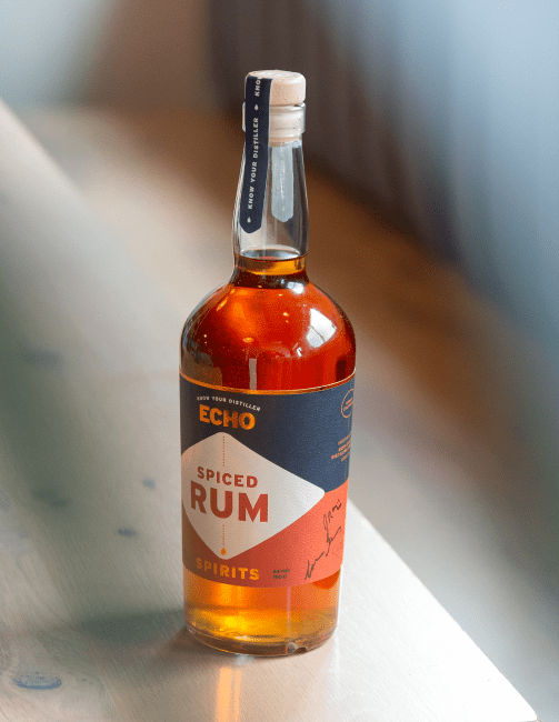
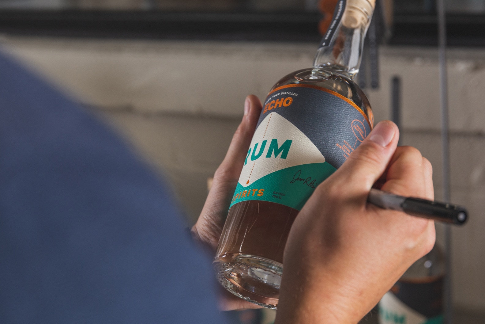
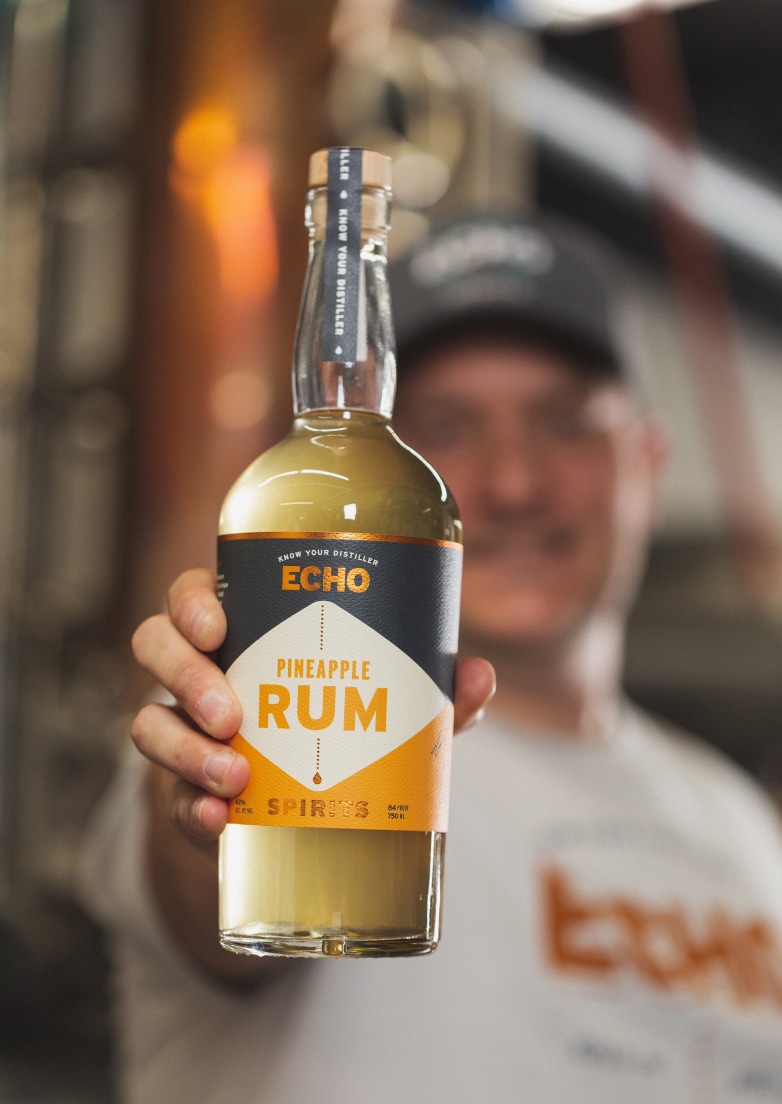
Core Labels & Unaged Spirits Packaging
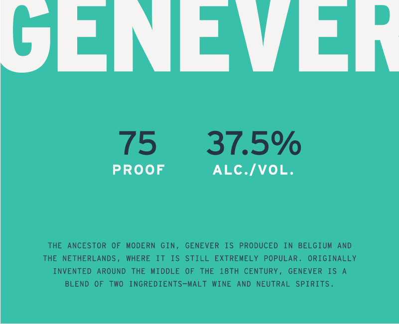
The first packaging we designed was for Echo’s core lineup of unaged spirits. The labels are made to stand out where they matter most, according to bartenders and liquor sales reps: six feet away in a dimly lit bar. The labels use simple, bold design to achieve striking visibility, standing out from all of the bottles next to them; vitally important for a new distillery. And we chose lightweight, ergonomic bottles that are more sustainable and bartender-friendly.
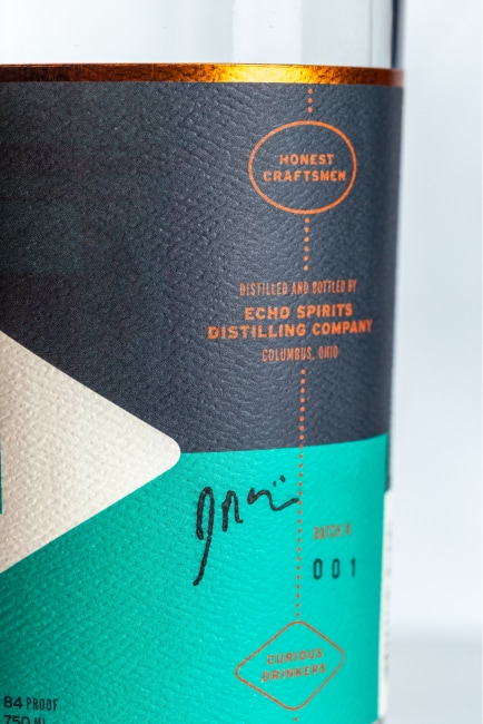
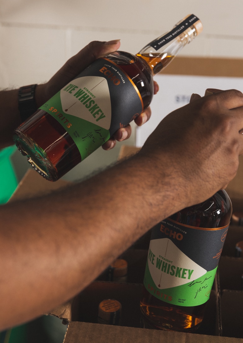
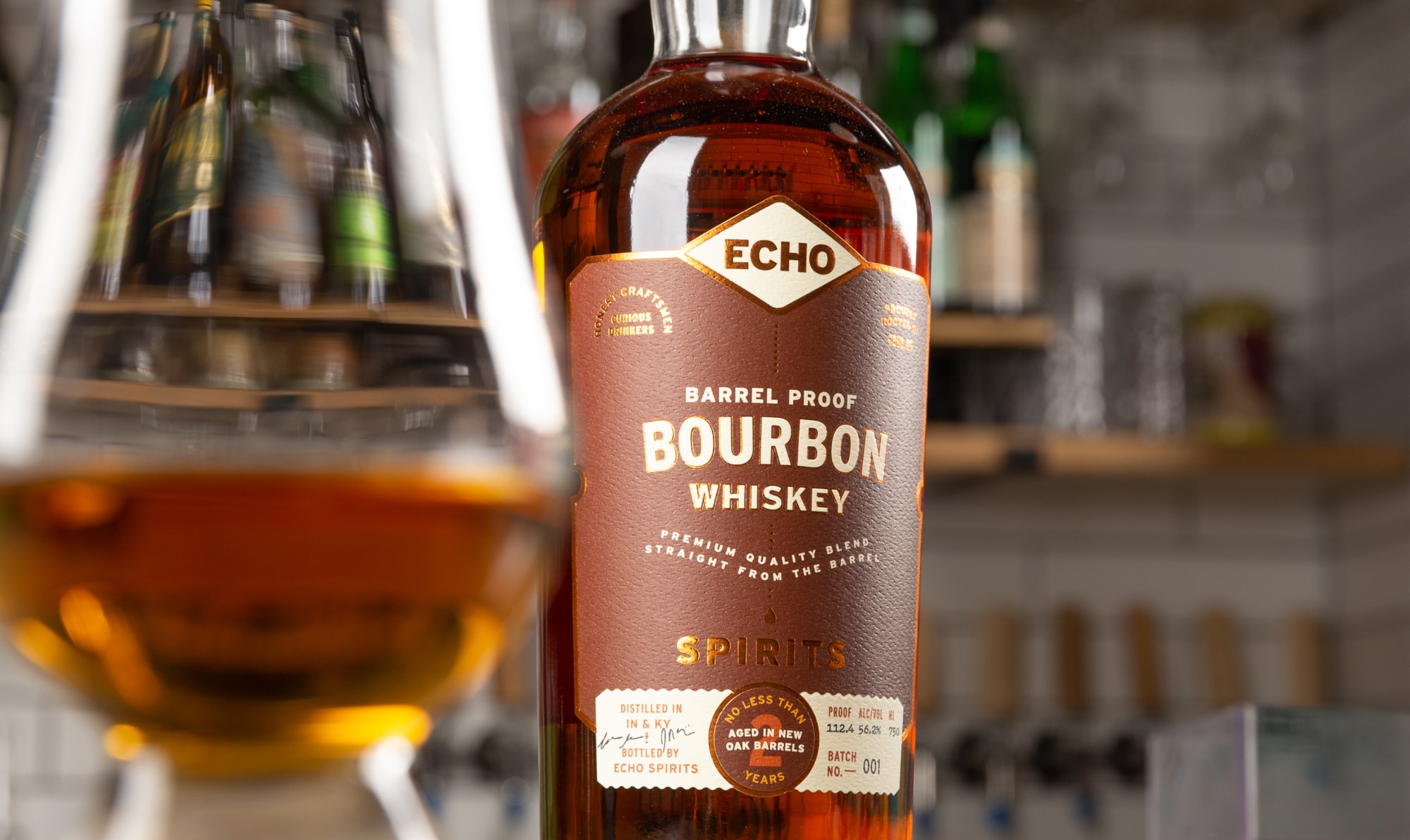
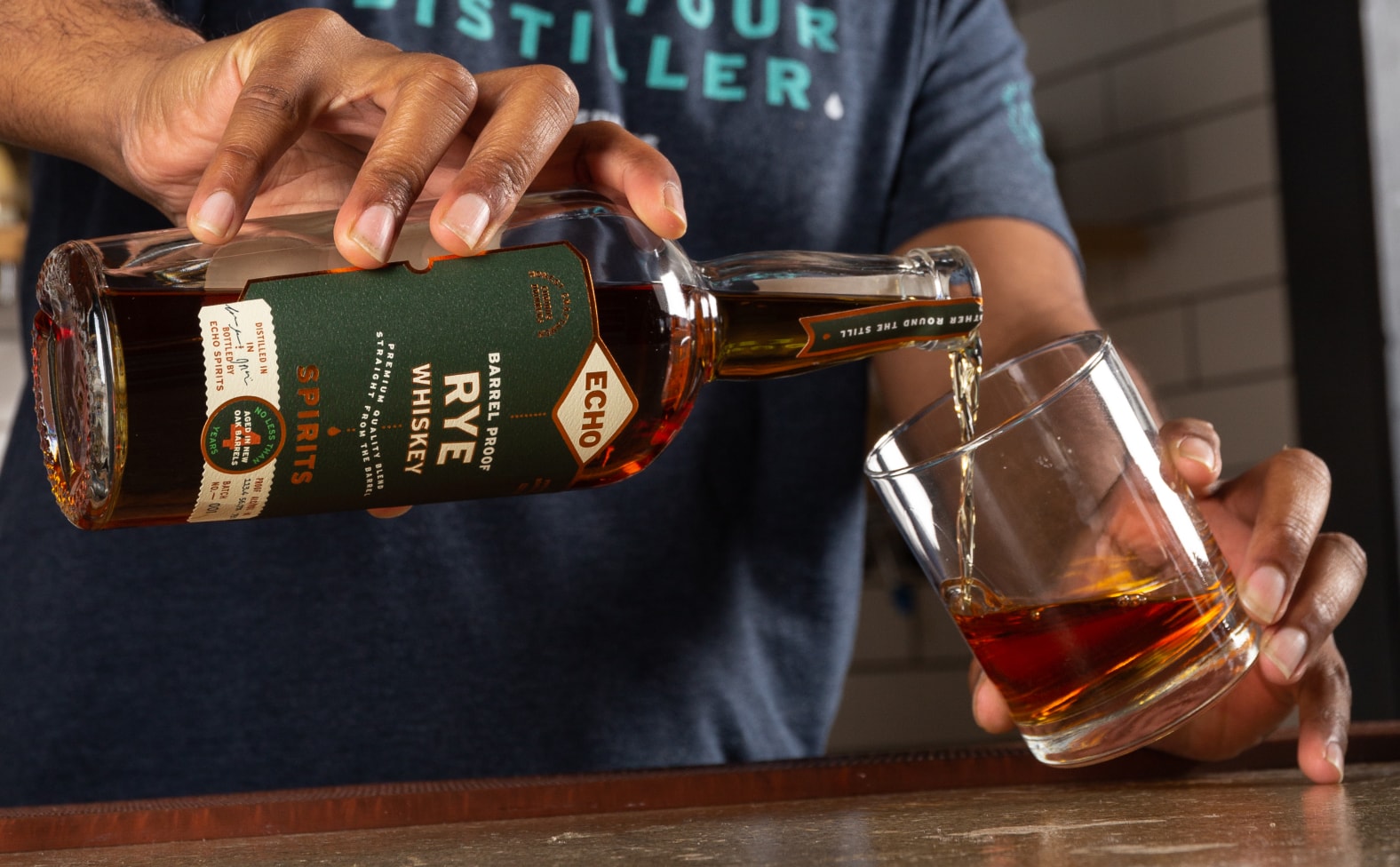
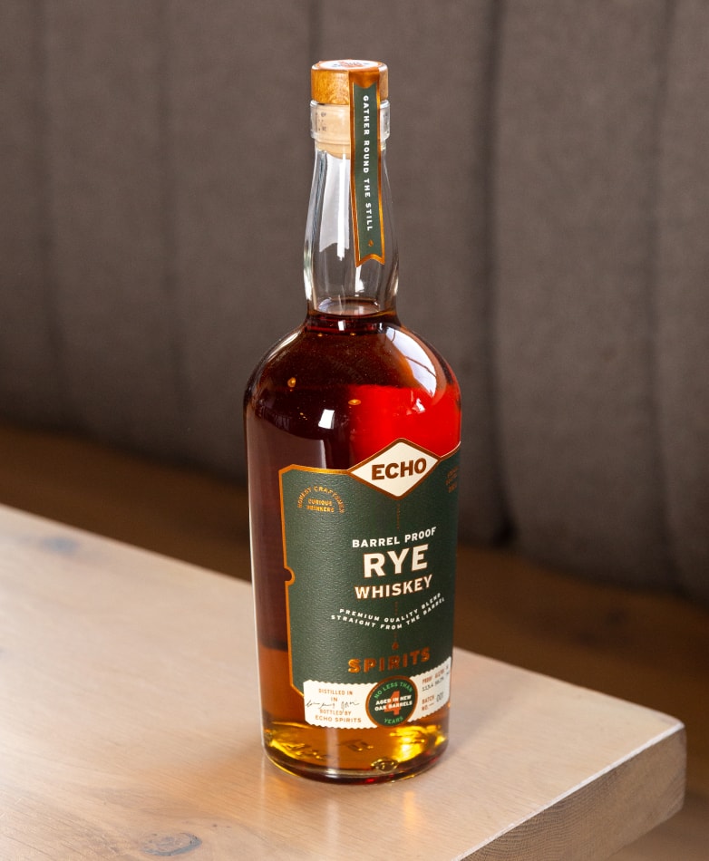
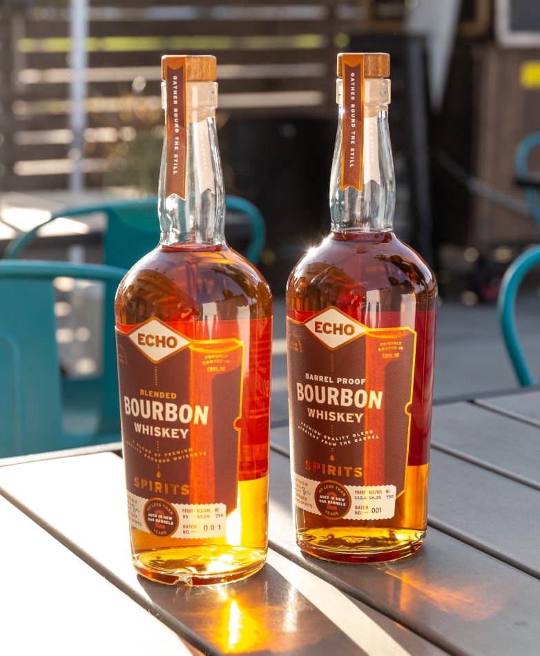
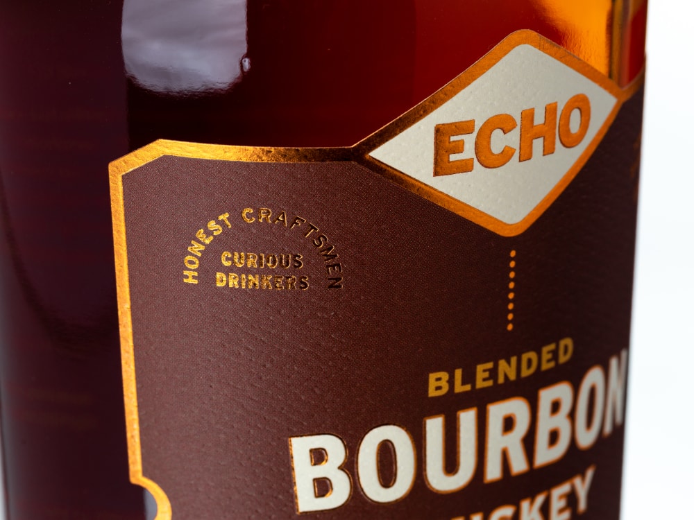
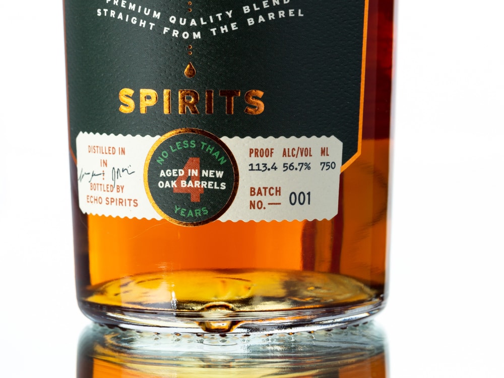
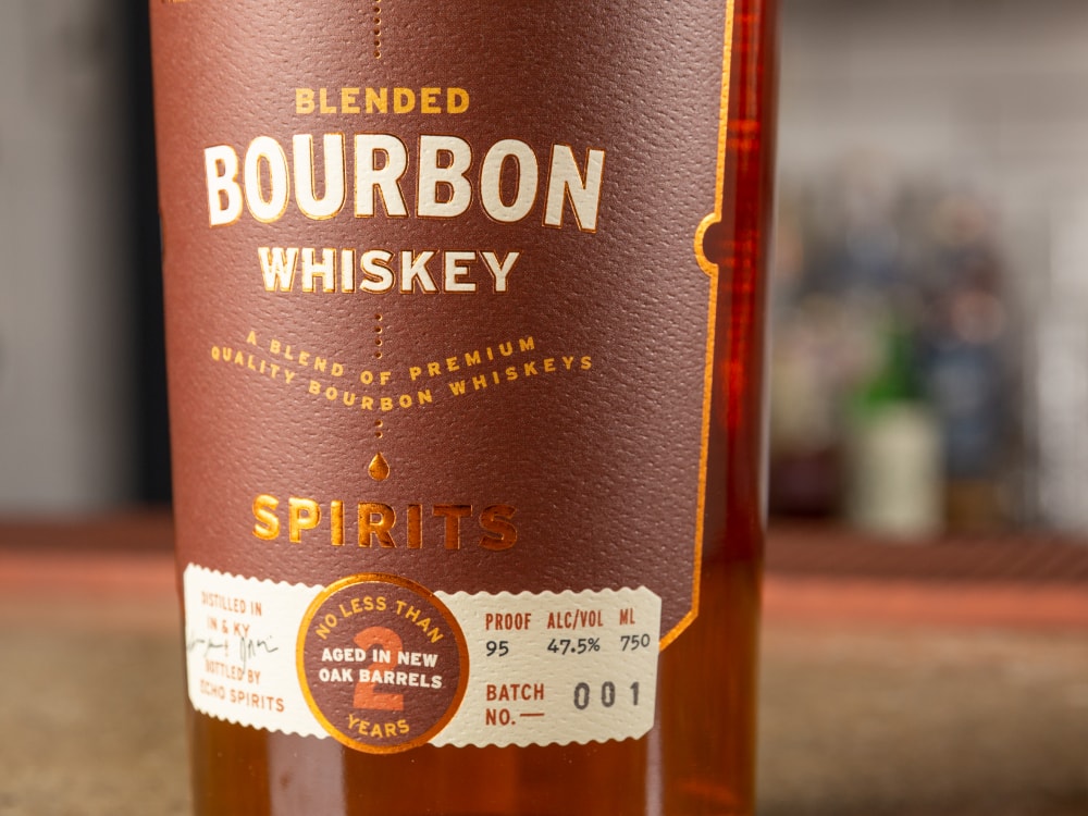
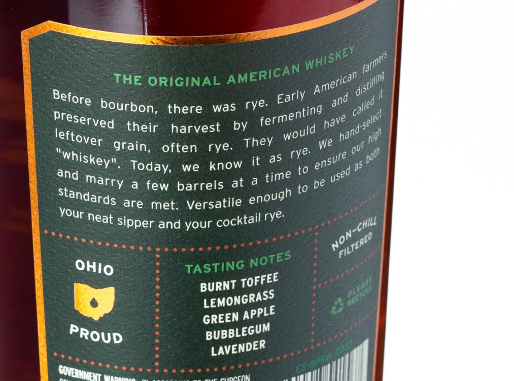
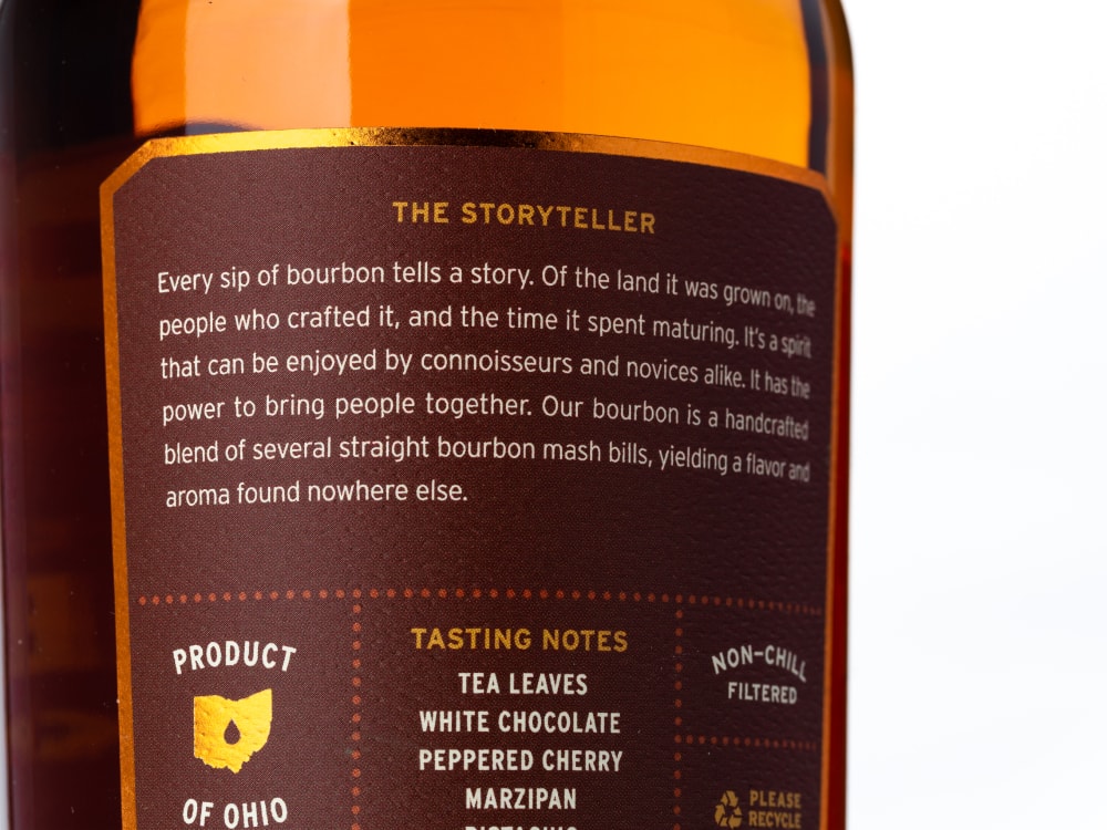
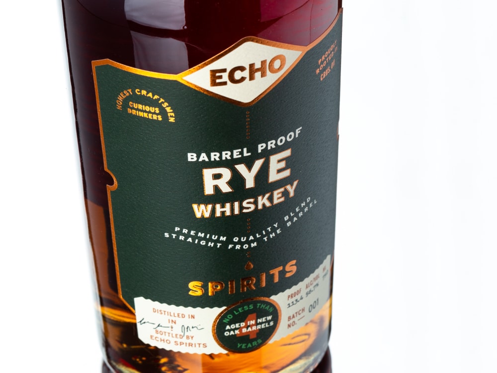
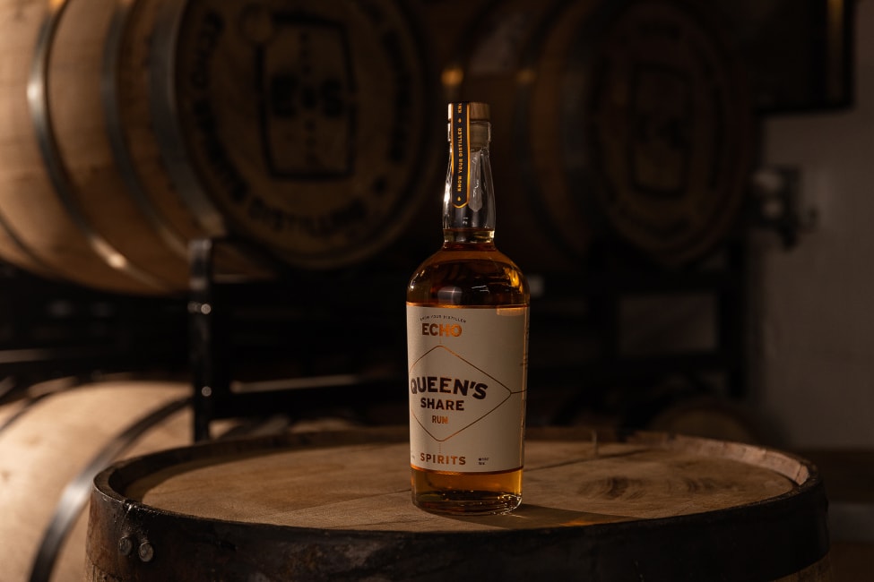
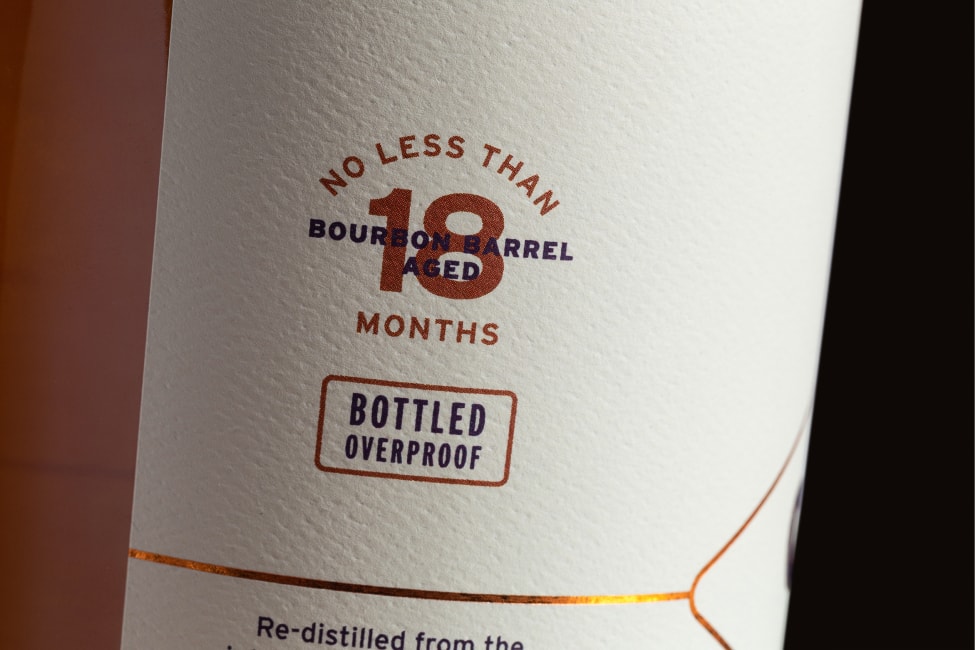
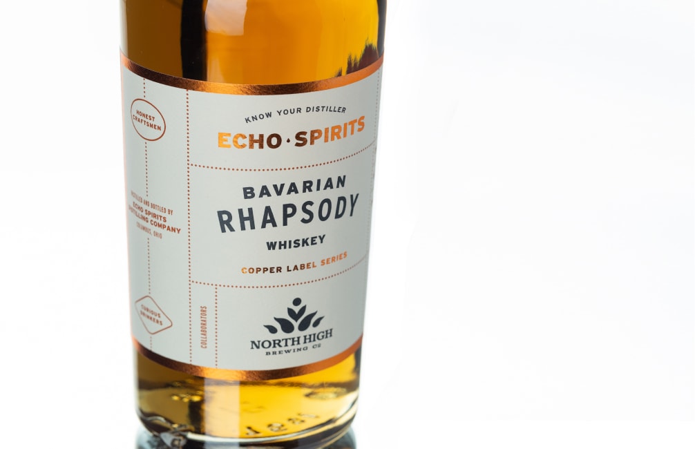
Barrel-Aged Spirits Packaging
After a few years under their belt, Echo was ready to get more fully into the whiskey game. While our approach for the original labels was working well for those spirits, Echo needed something different for the barrel-aged range of products targeted more at bottle sales than visibility in bars. As we got to know the bourbon-drinking crowd, we learned how notoriously suspicious they tend to be of anything that looks too contemporary or minimal. Our strategy for the barrel-aged labels was to design for elegance, but lean into some more of the motifs commonly found on whiskey bottles—maximalism, information overload, and a focus on details and ornamentation. All while still making them quickly recognizable as a trusted Echo Spirits product.
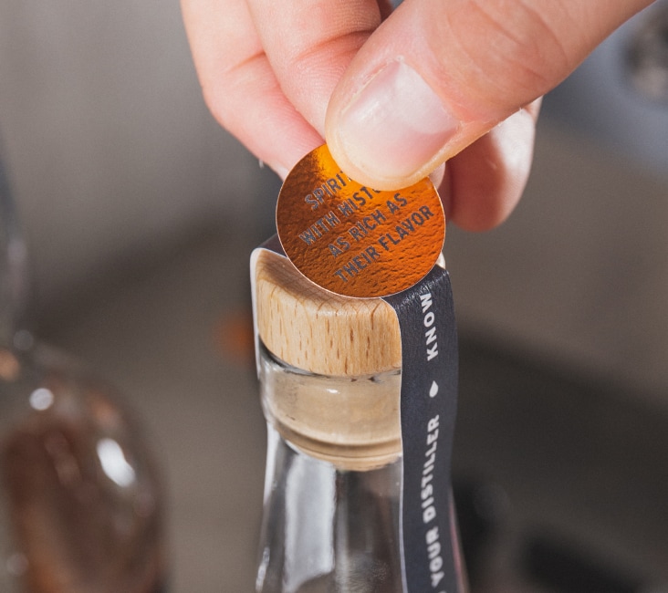
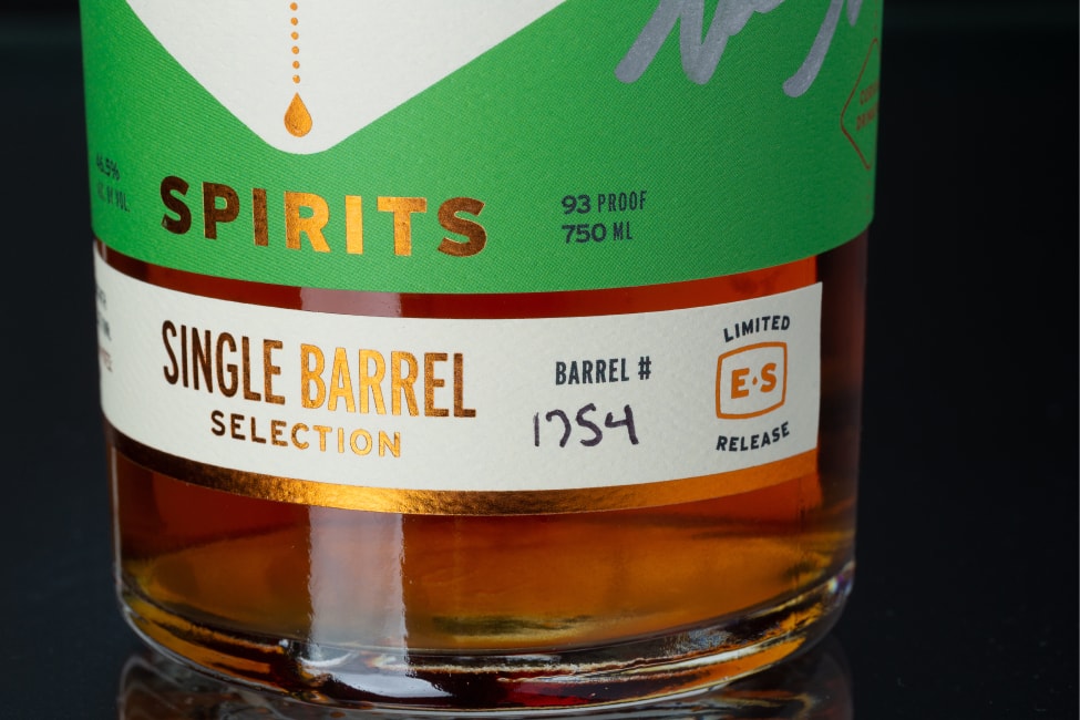
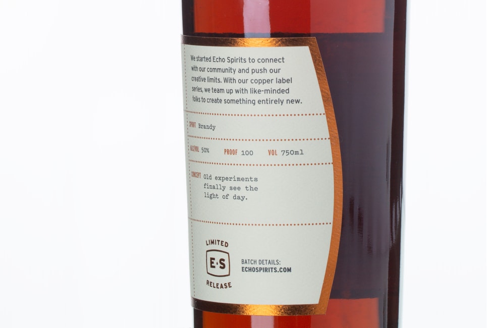
Limited Editions Packaging
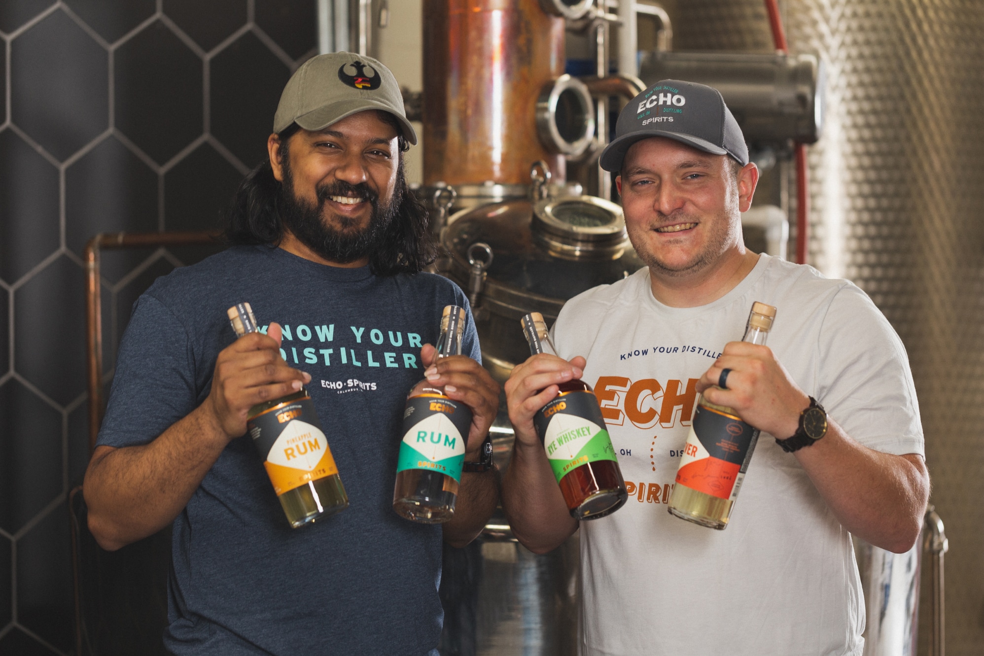
Joe and Nikhil, Echo’s founders, originally got into distilling as a creative outlet while working day jobs which were never meant to be forever jobs. As Echo has matured and the lineup of core spirits fell into place, they started to feel the creative itch again to try out new ideas that don’t make sense as normal products.
We designed a system of labels for these unique spirits—experiments, collaborations, special variations, and one-offs that aren’t likely to ever be made again. Called the Copper Label Series, the design uses our brand language a bit differently, functioning as more of a blank slate on which the team can talk all about what makes each entry interesting and unique.
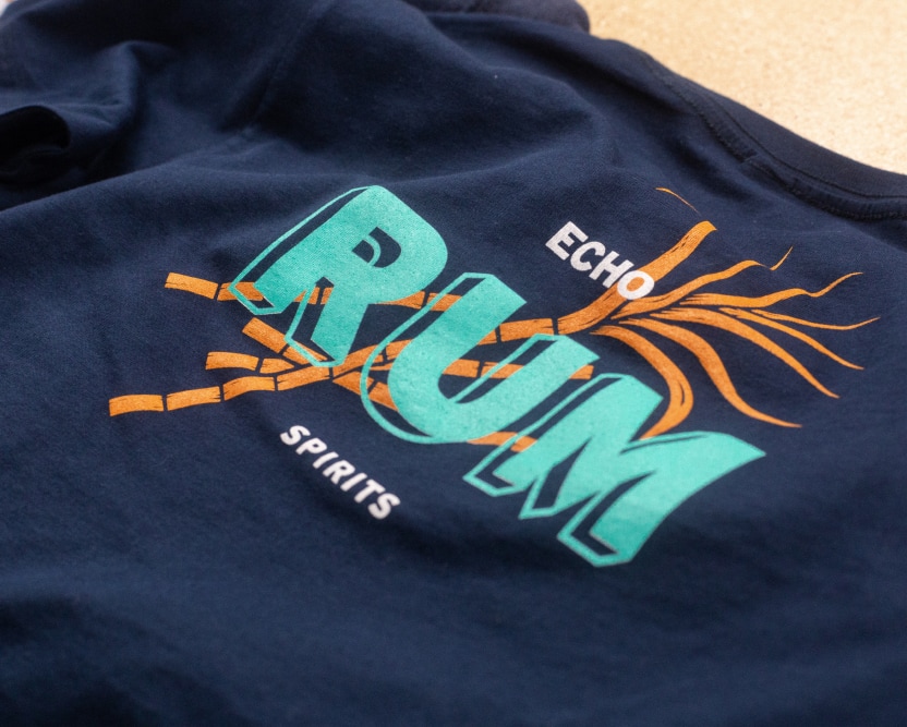
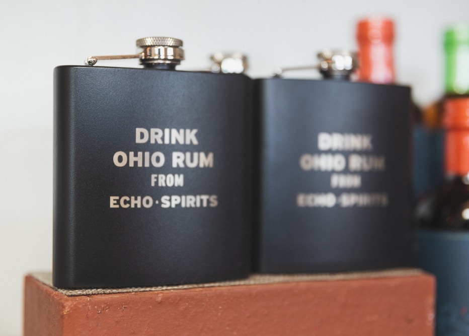
Brand Extension
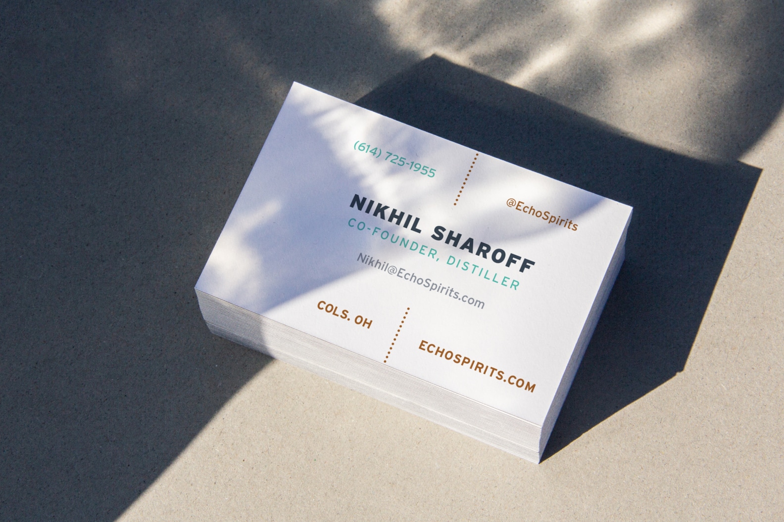
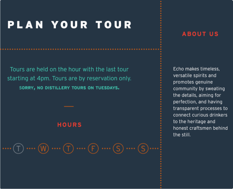
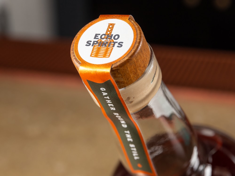
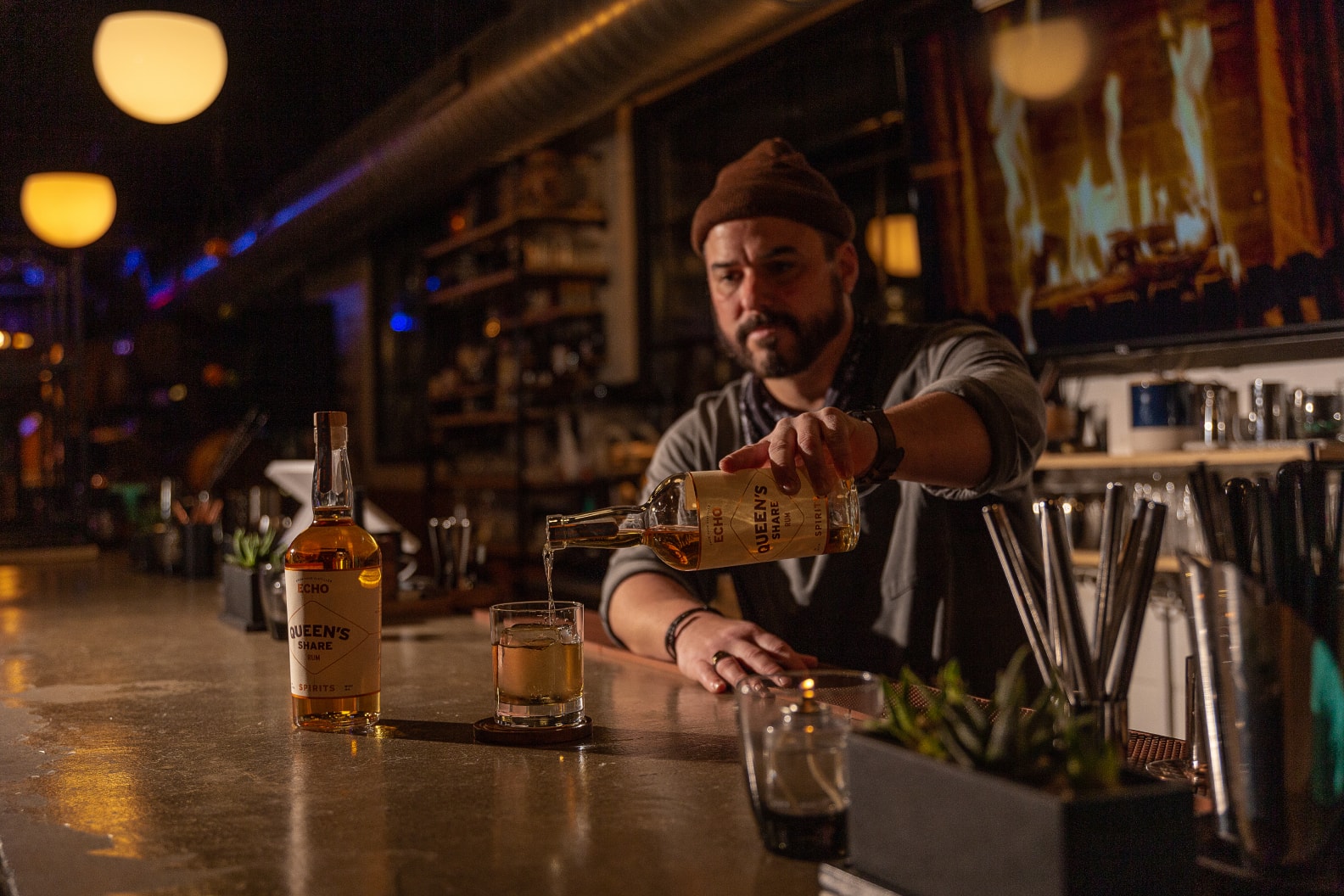
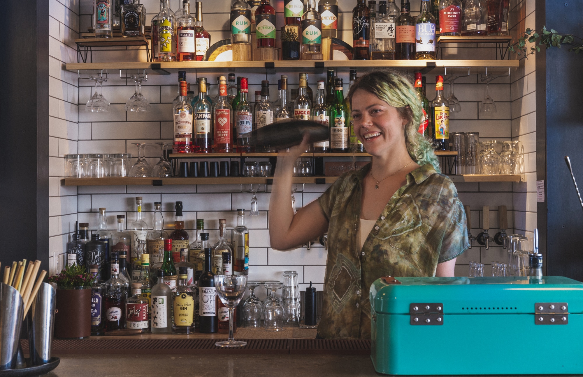
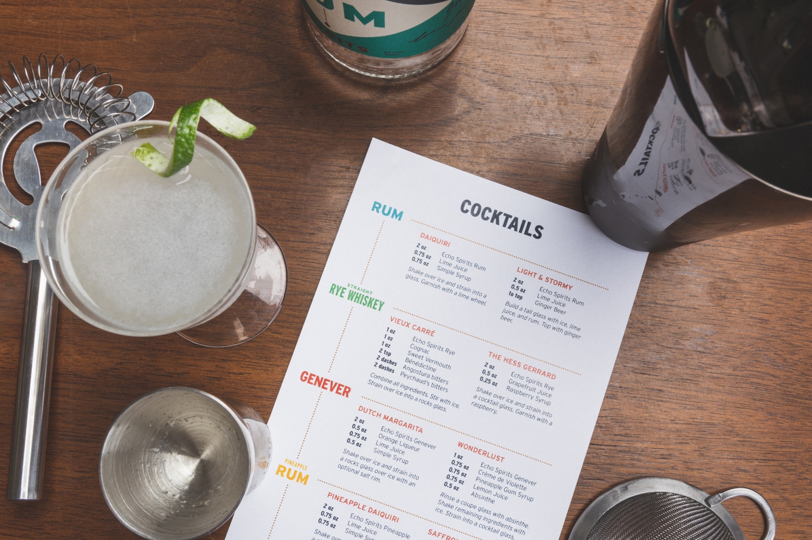
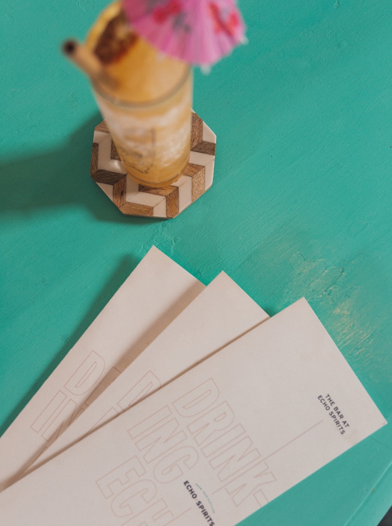
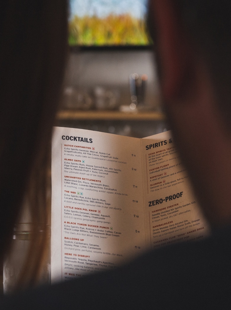
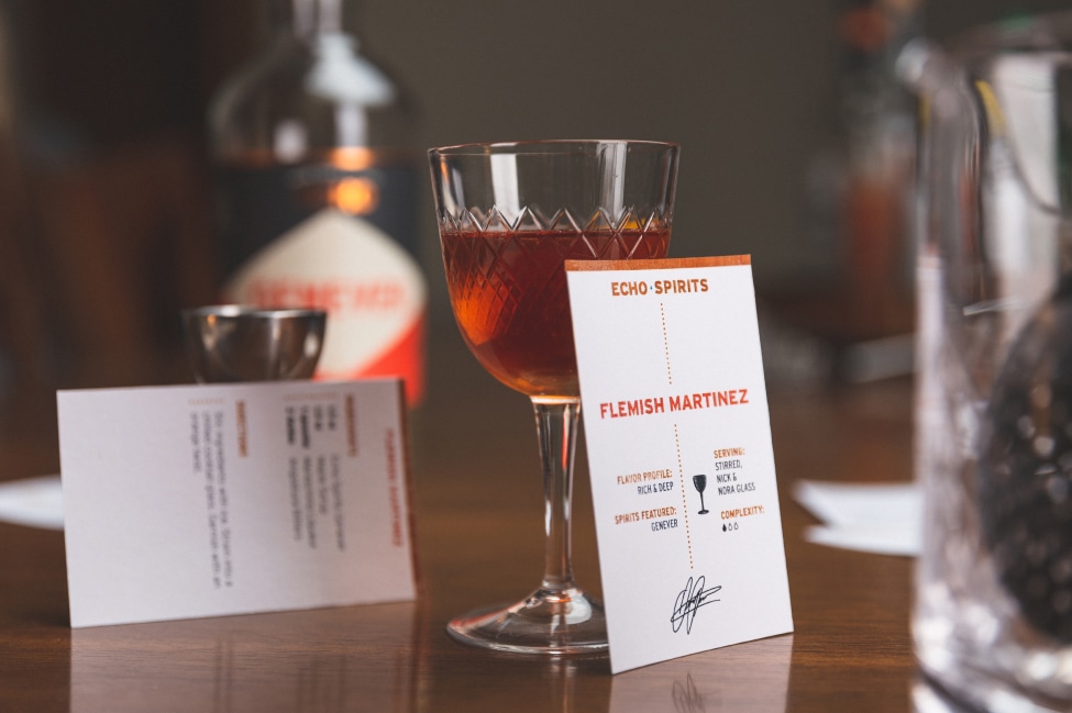
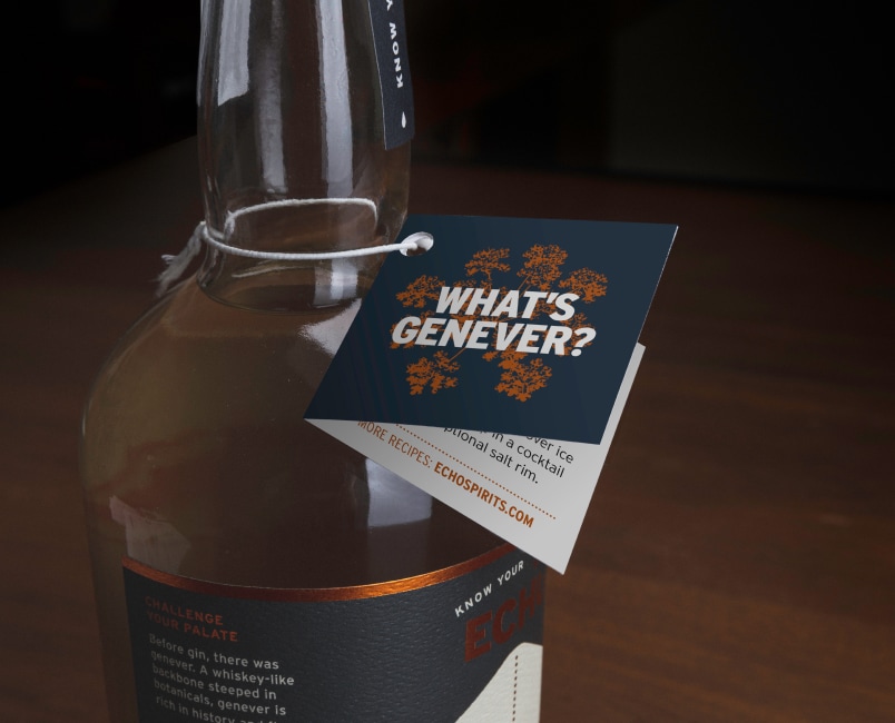
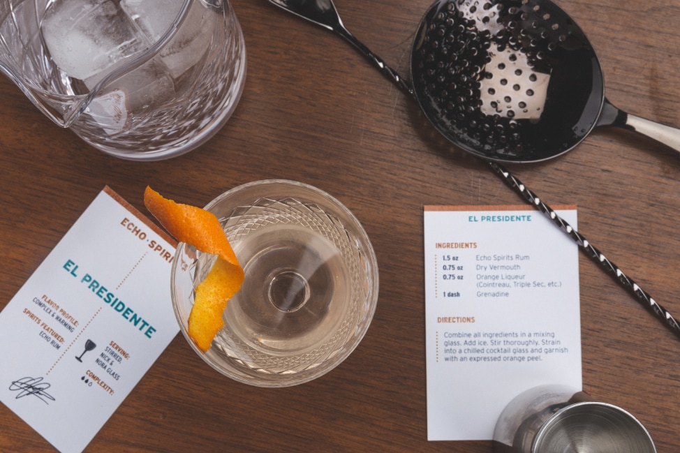
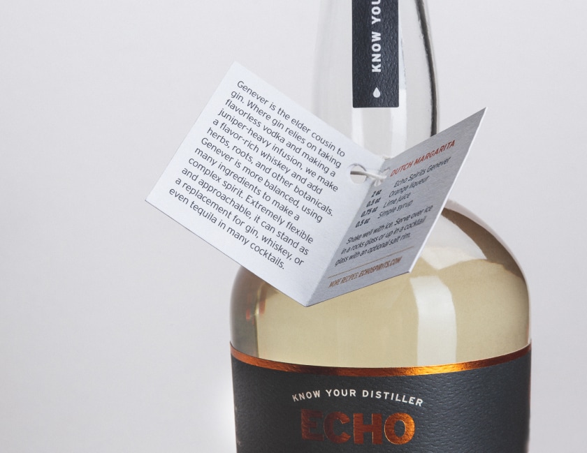
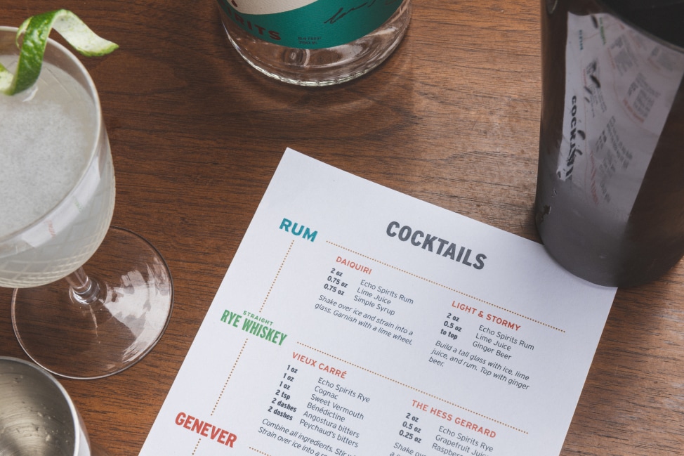
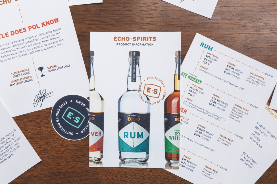
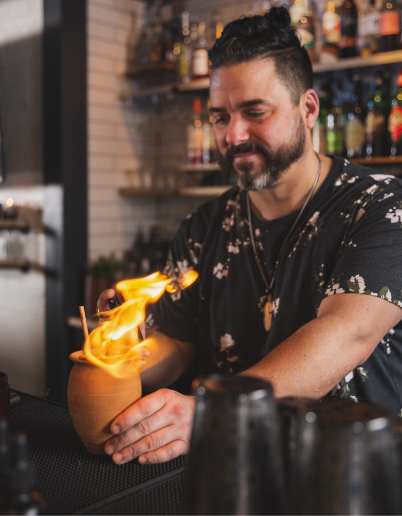
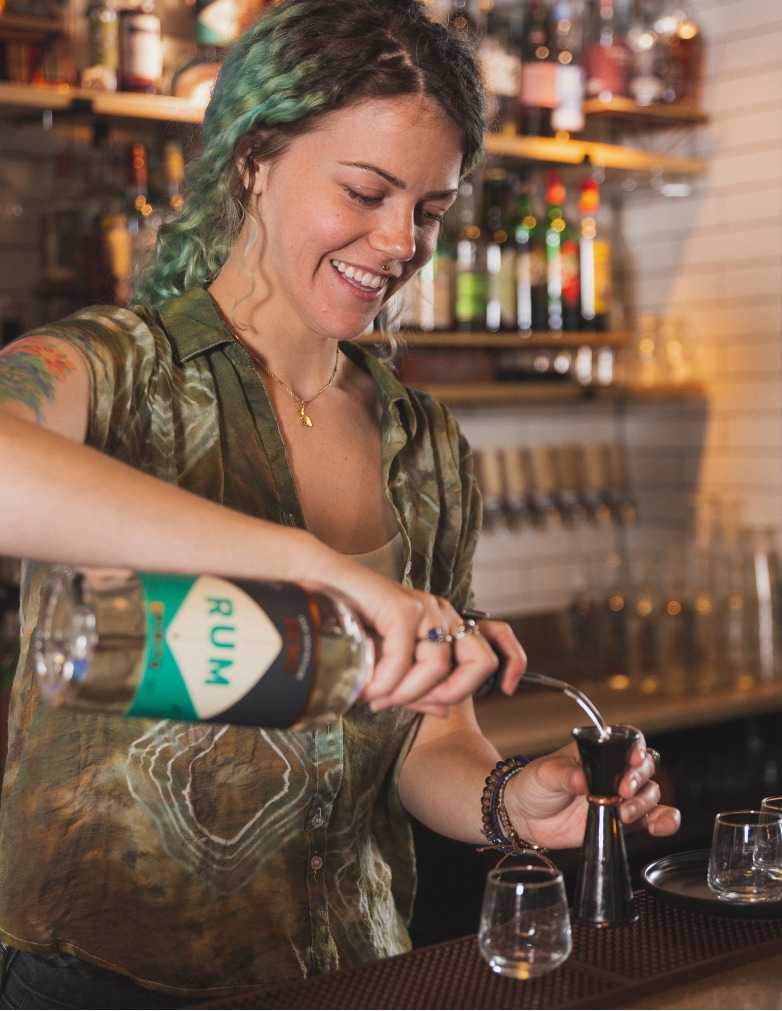
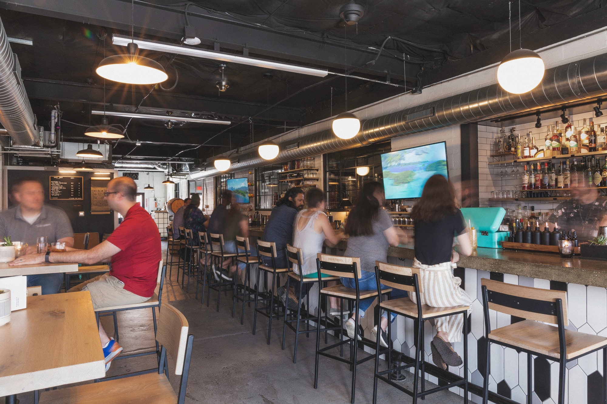
We intentionally built the brand around relationships and the positive experiences associated with them. We worked with Echo to carefully consider all aspects of the tasting room bar, including menus, recipe cards, hang tags, and sell sheets. We also art directed and shot a brand photo library.
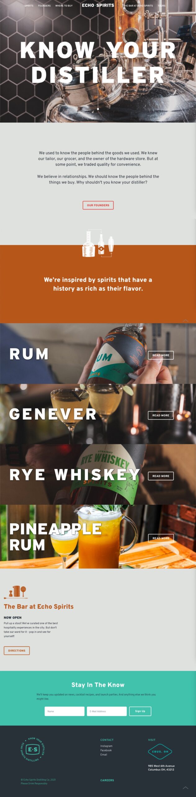
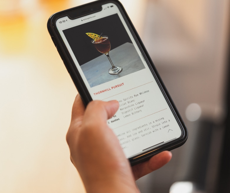
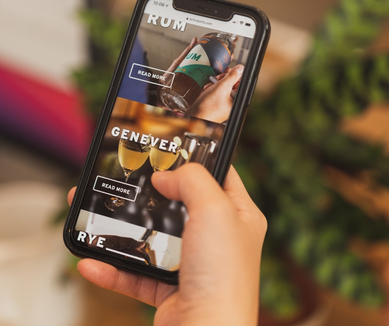
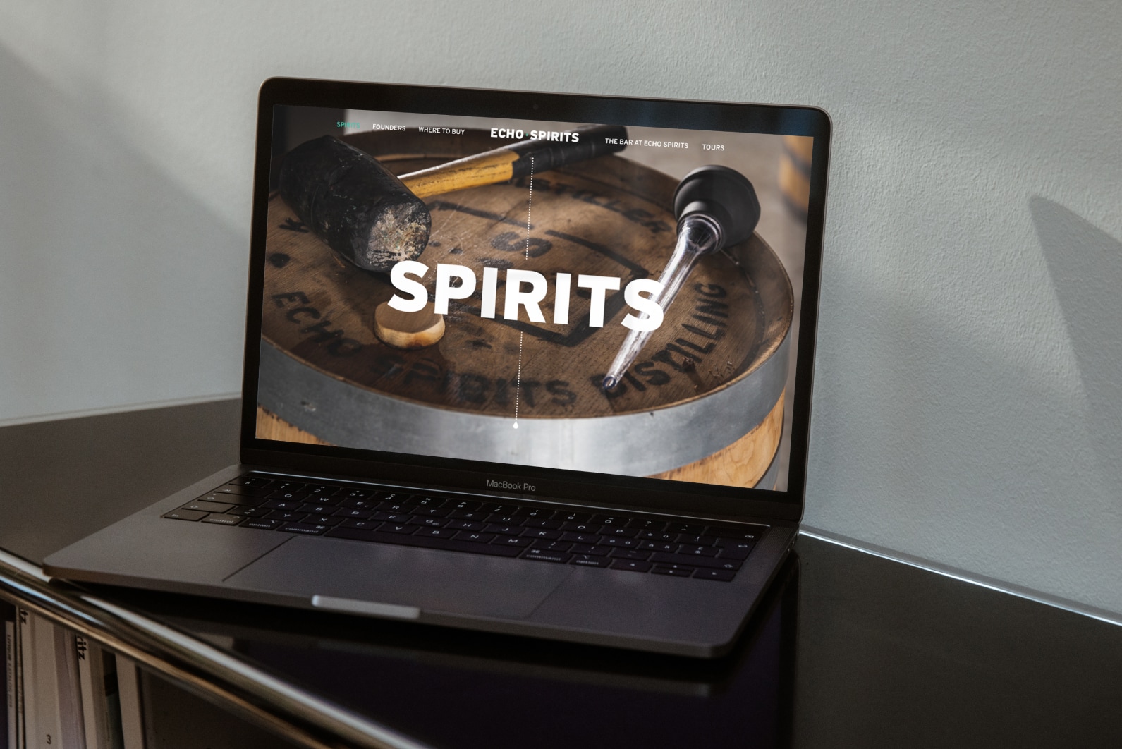
Website
We were eager to help Echo expand their brand. We approached their site design with tools in mind to help educate about less widely-known spirits, show off the new brand personality, and invite people to meet their local distillers.
Notes
Created at Nonfiction and Independently
Collaborators
Neil Wengerd — Creative Direction
Jacob Strous — Design
Kimmy Alexander — Project Management
Blue Label Packaging — Production
Tonic Studios — Production
Role
Art Direction, Design, Photography, Strategy
Date
2018—2024
© wilkeworks, llc 2026
© wilkeworks, llc 2026