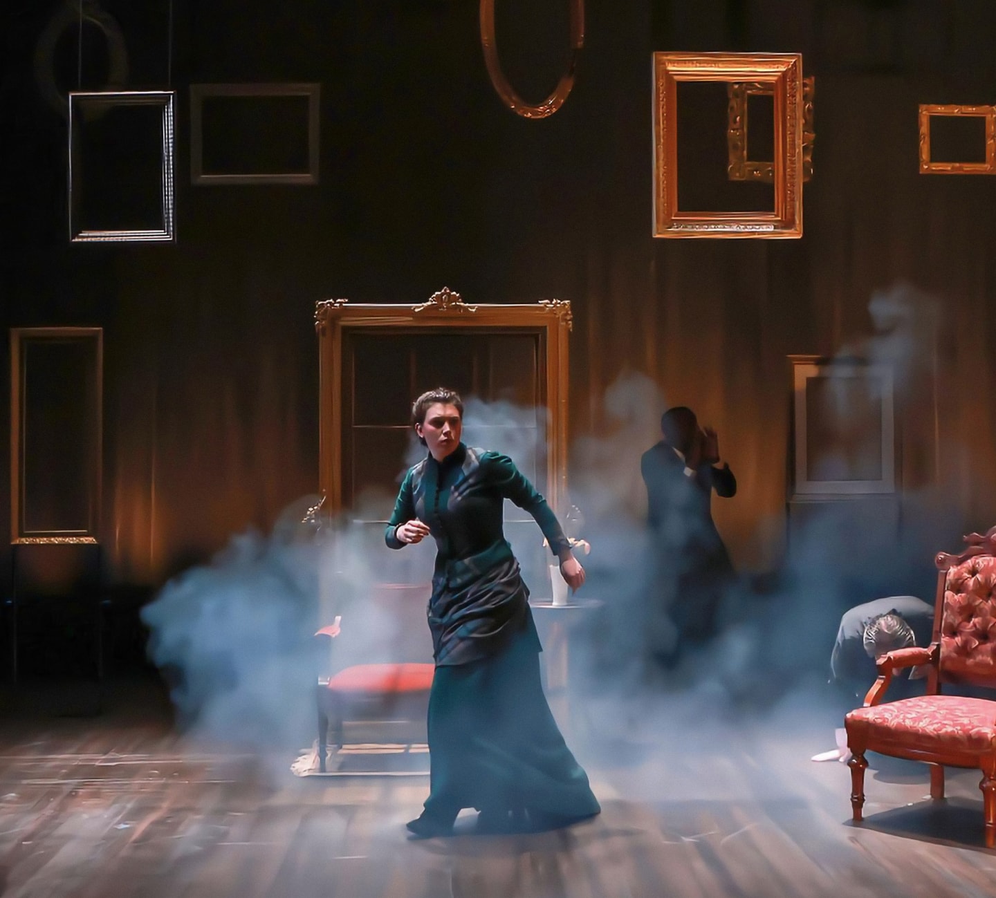
The Contemporary Theatre of Ohio
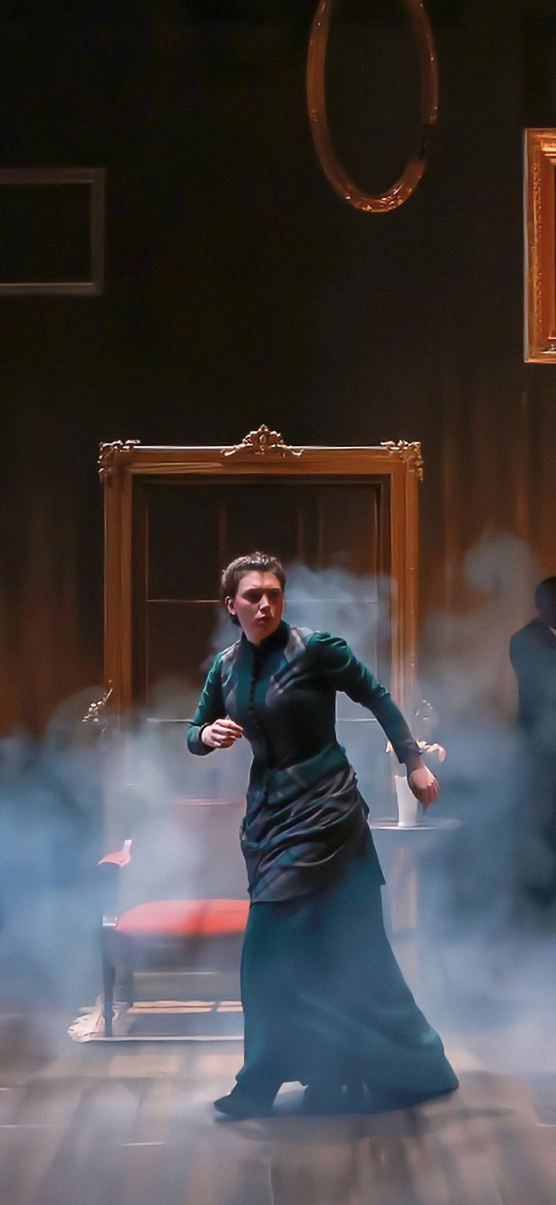
The Contemporary Theatre of Ohio
Theatre Speaks.
Client
The Contemporary Theatre of Ohio (formerly CATCO)
Scope of work
Strategy, Naming, Brand Identity, Art Direction, Print Design, Social Media
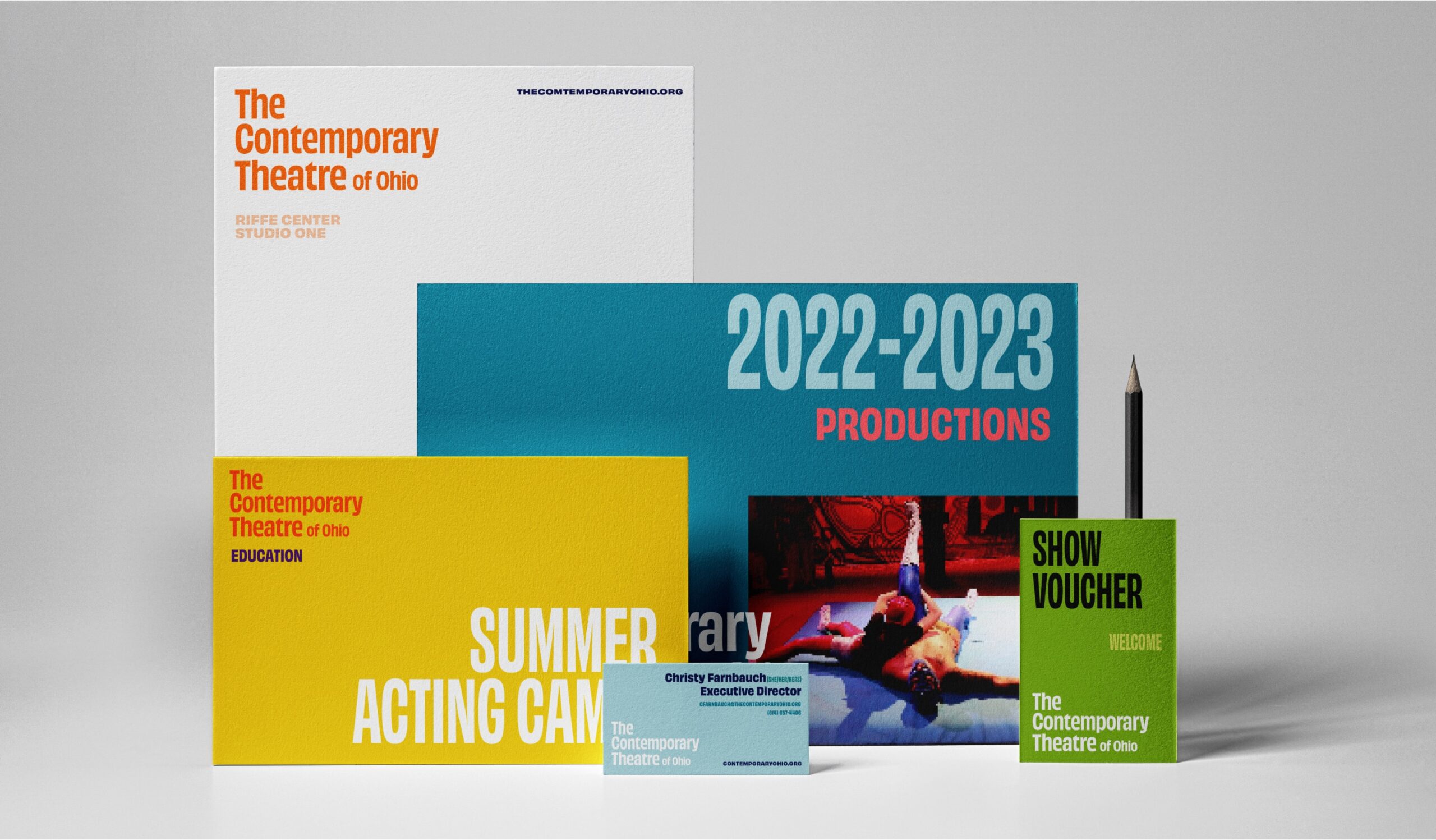
The Contemporary Theatre of Ohio, formerly CATCO, has been a pillar in the Columbus Theatre community for nearly forty years. The Contemporary harnesses the transformational power of theatre to inspire a community of empathy. They asked for help with their brand strategy and identity system, and we worked with them to keep their reputation high, rethink what they're called, and reimagine how they look. This is just a taste of the system we’ve created for them.
Naming
Started 40 years ago as the Contemporary American Theatre Company, CATCO has always been about producing theatre of and for the current moment. Over time, the abbreviation became the name, and the meaning was lost. The new name, The Contemporary Theatre of Ohio (or, The Contemporary), returns them to their roots. They produce shows that matter to Ohioans, rooted in today’s topics and ideas.
Logo
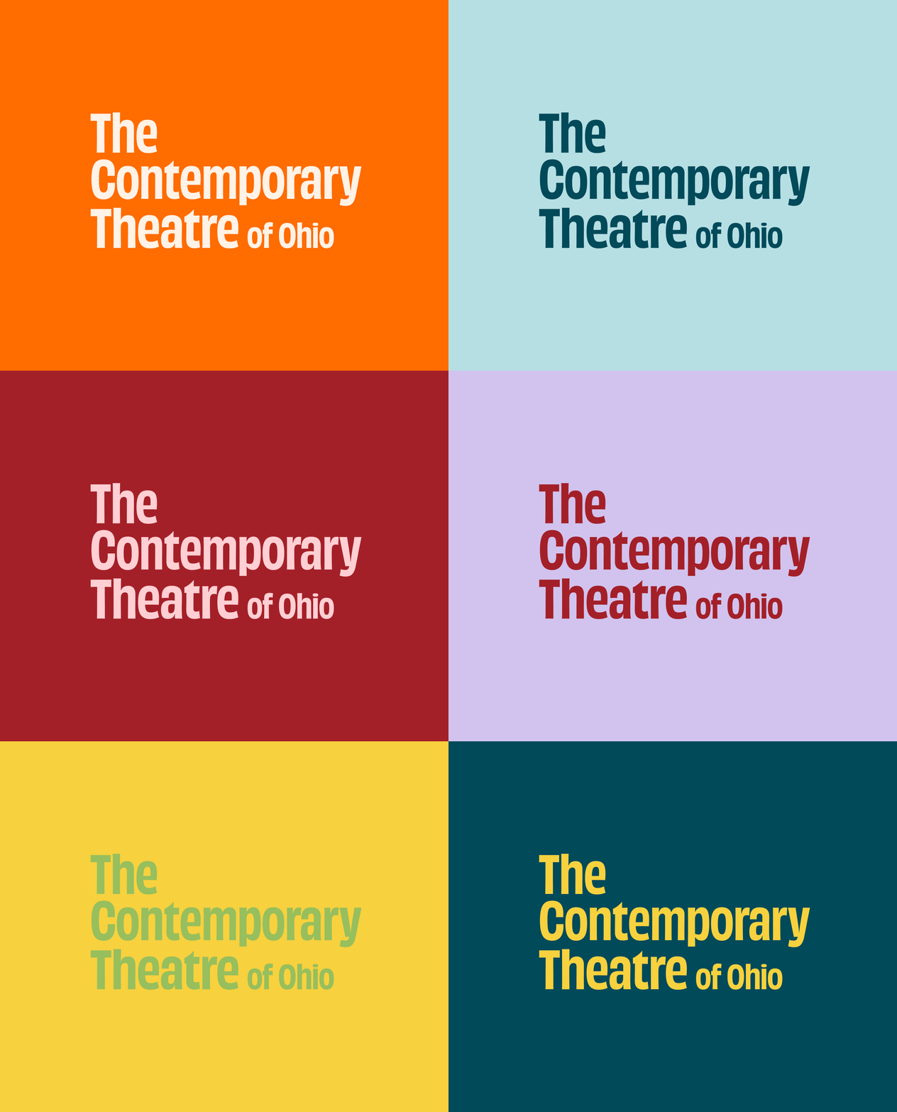
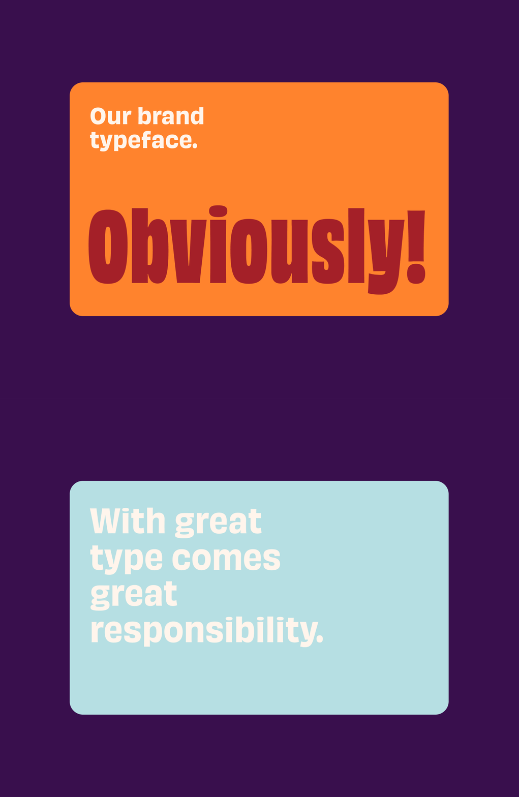
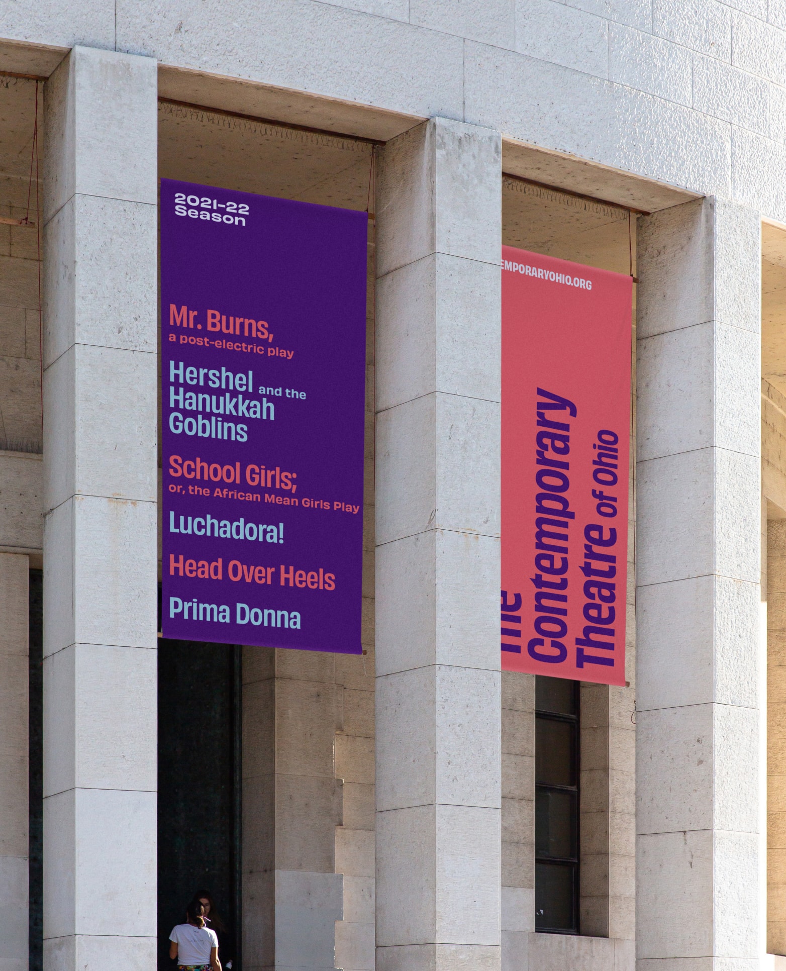
The Contemporary’s new logo is simple so the rest of the brand system can be loud. It has oopmh without upstaging the shows themselves and reflects the strong brand typography.
Strategy
Our friends at Storyforge worked with The Contemporary on foundational organizational strategy. Then, we came in to translate that strategic plan to external brand positioning and messaging and a creative platform to inspire design and voice. That creative platform became “Theatre Speaks.”
Mission
Harness the transformational power of theatre to engage with the current moment and inspire a community of empathy.
Vision
CATCO strives to become an anti-racist, nationally recognized contemporary theatre company that anchors a thriving Columbus theatre ecosystem in an empathetic, equitable world.
Brand Essence
The Contemporary brings people together through theatre.
Creative Platform
Theatre Speaks.
Brand Identity System
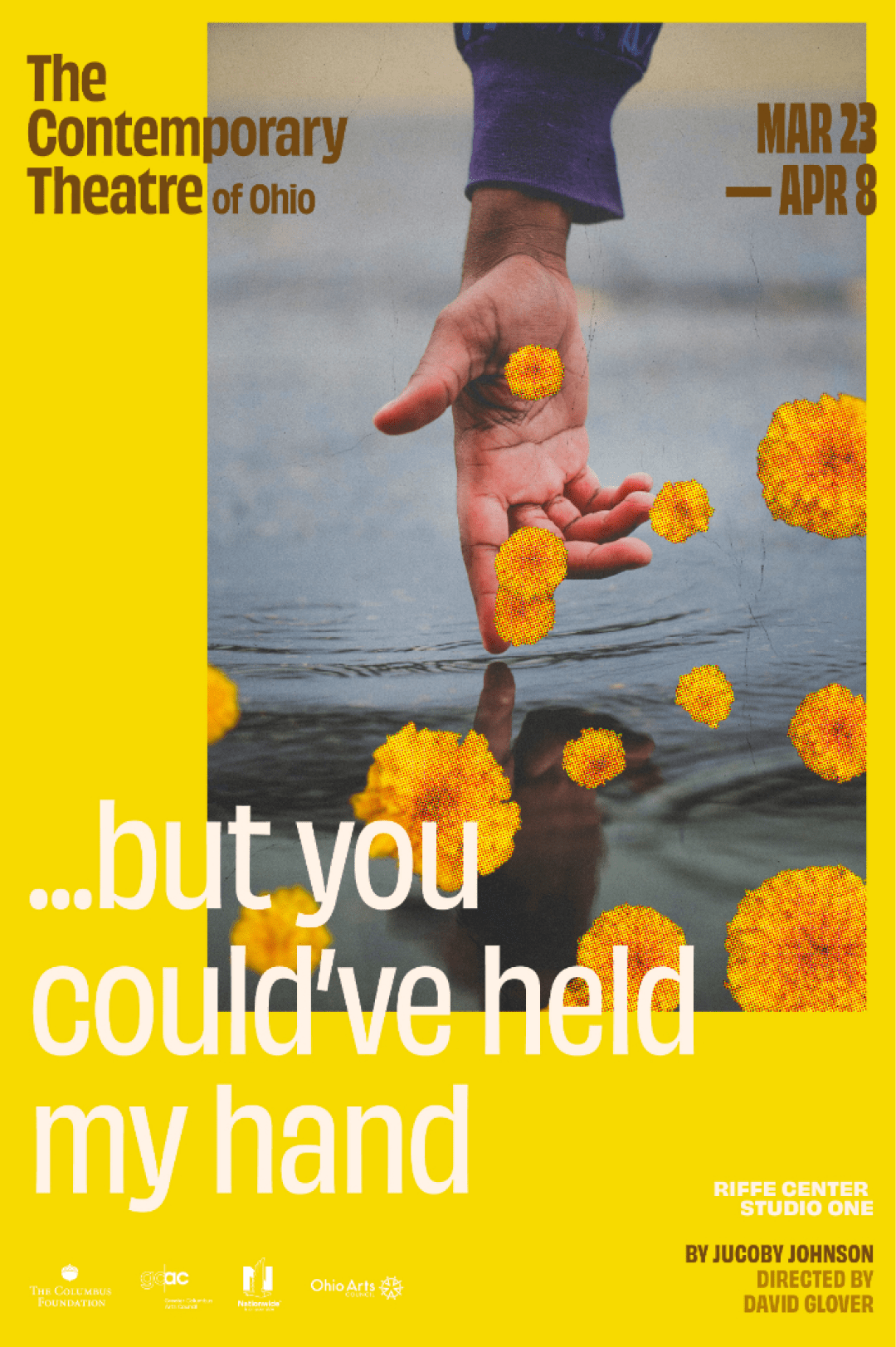
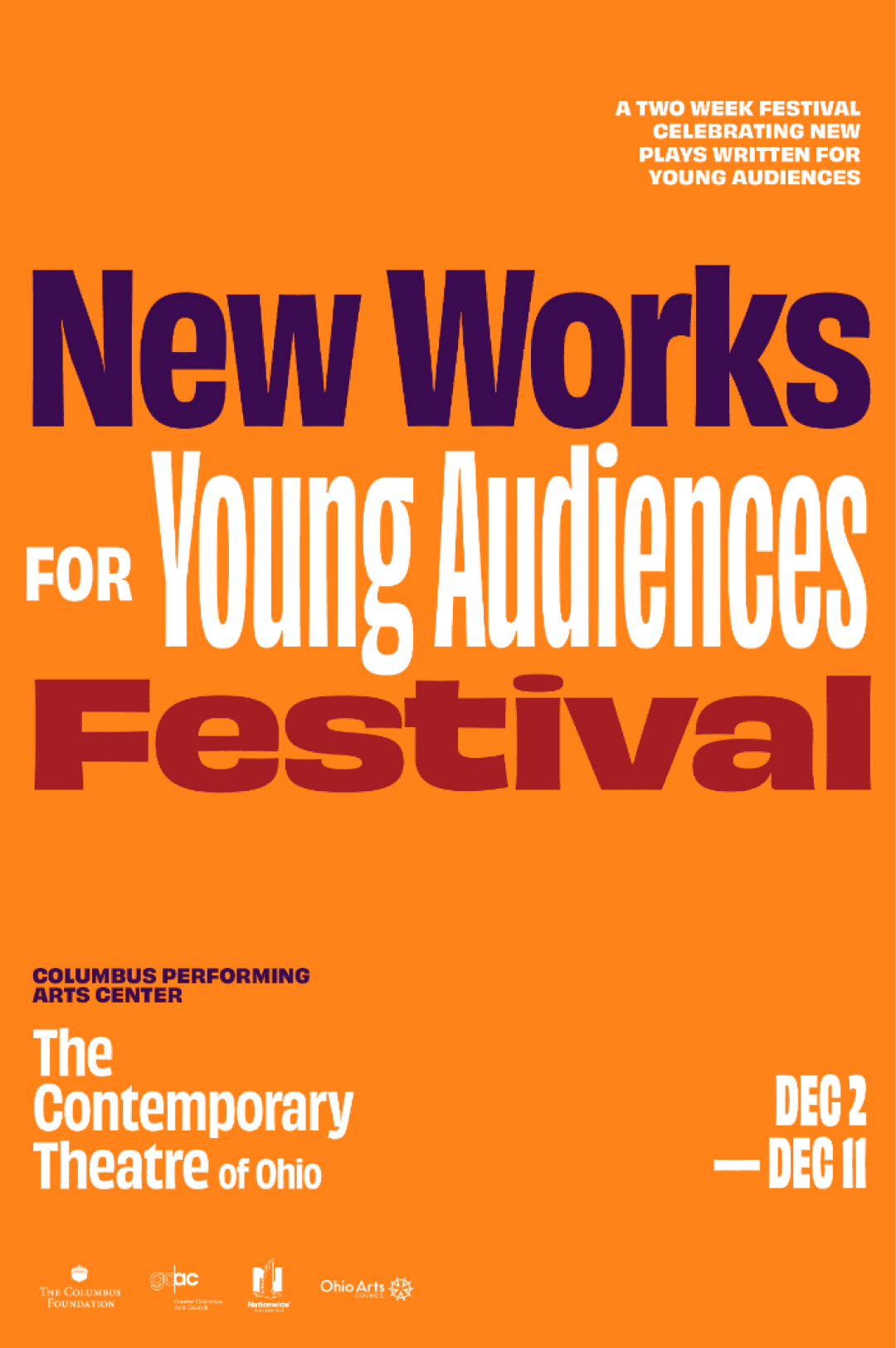
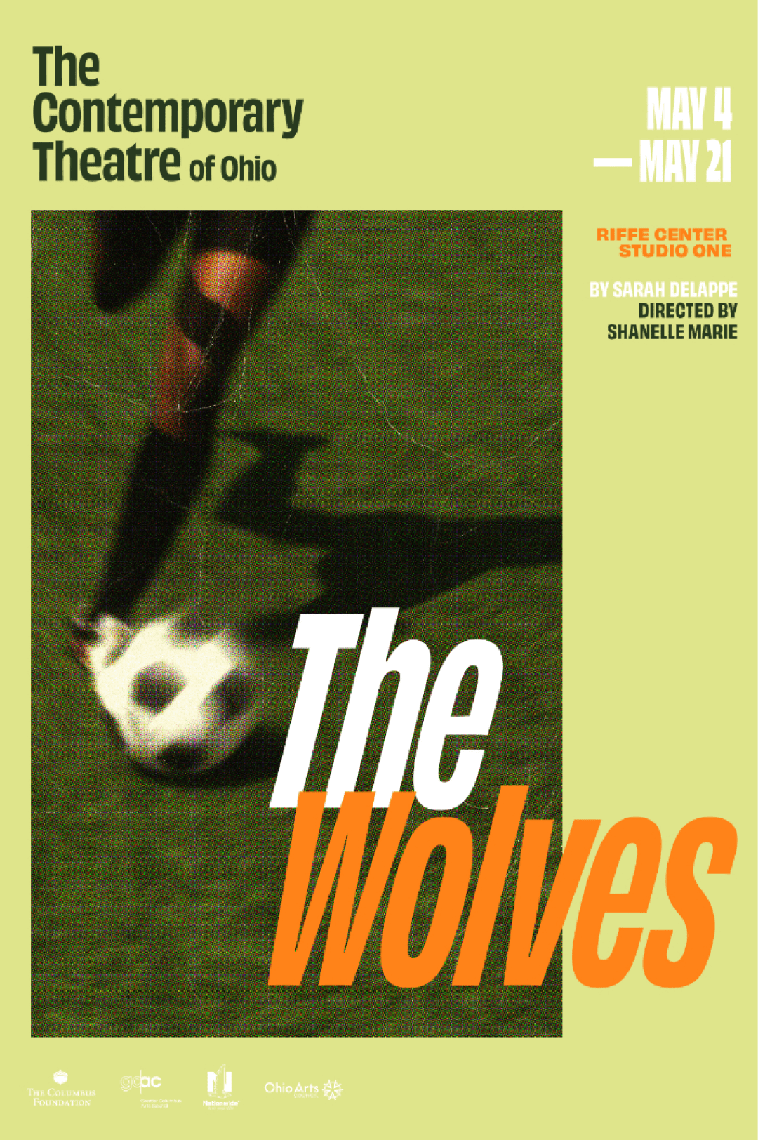
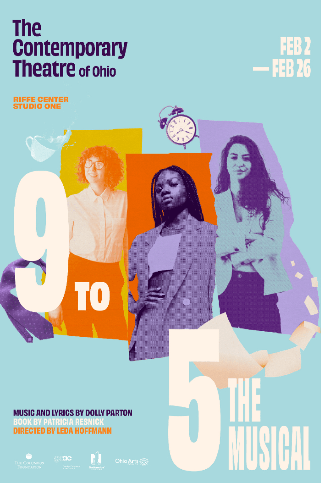
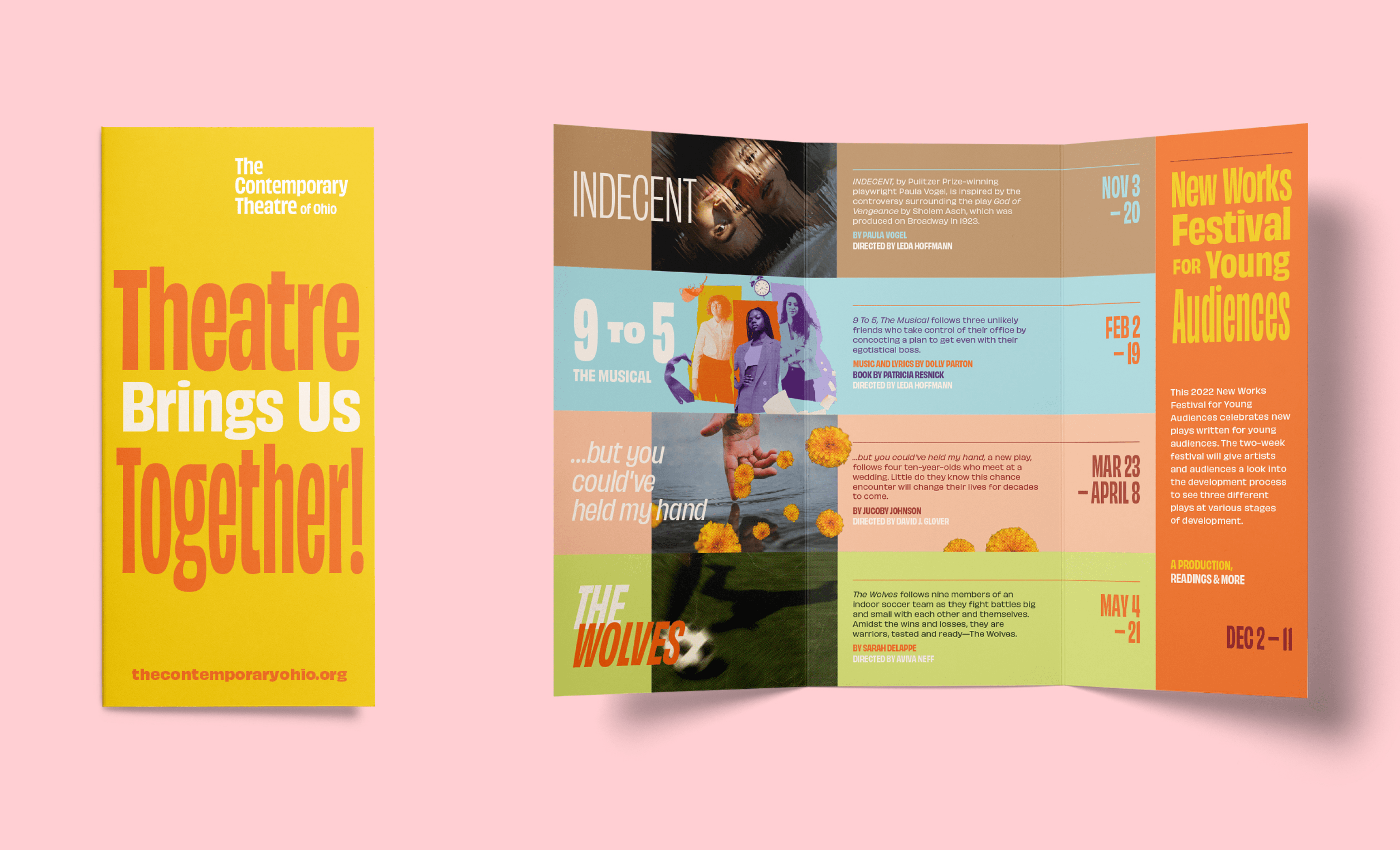
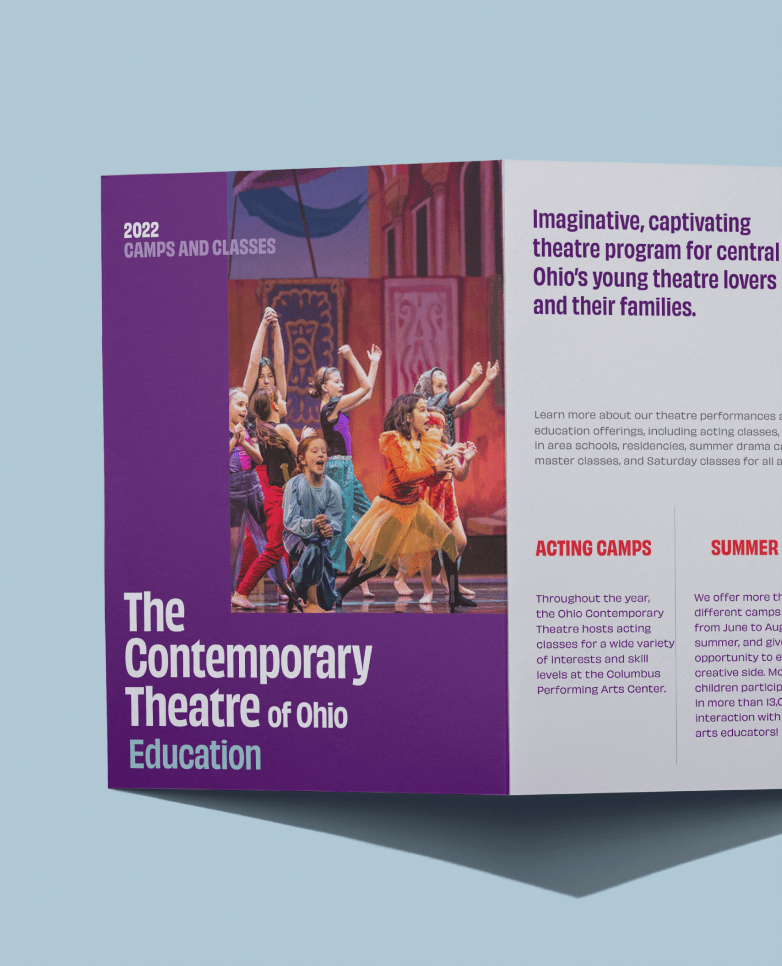
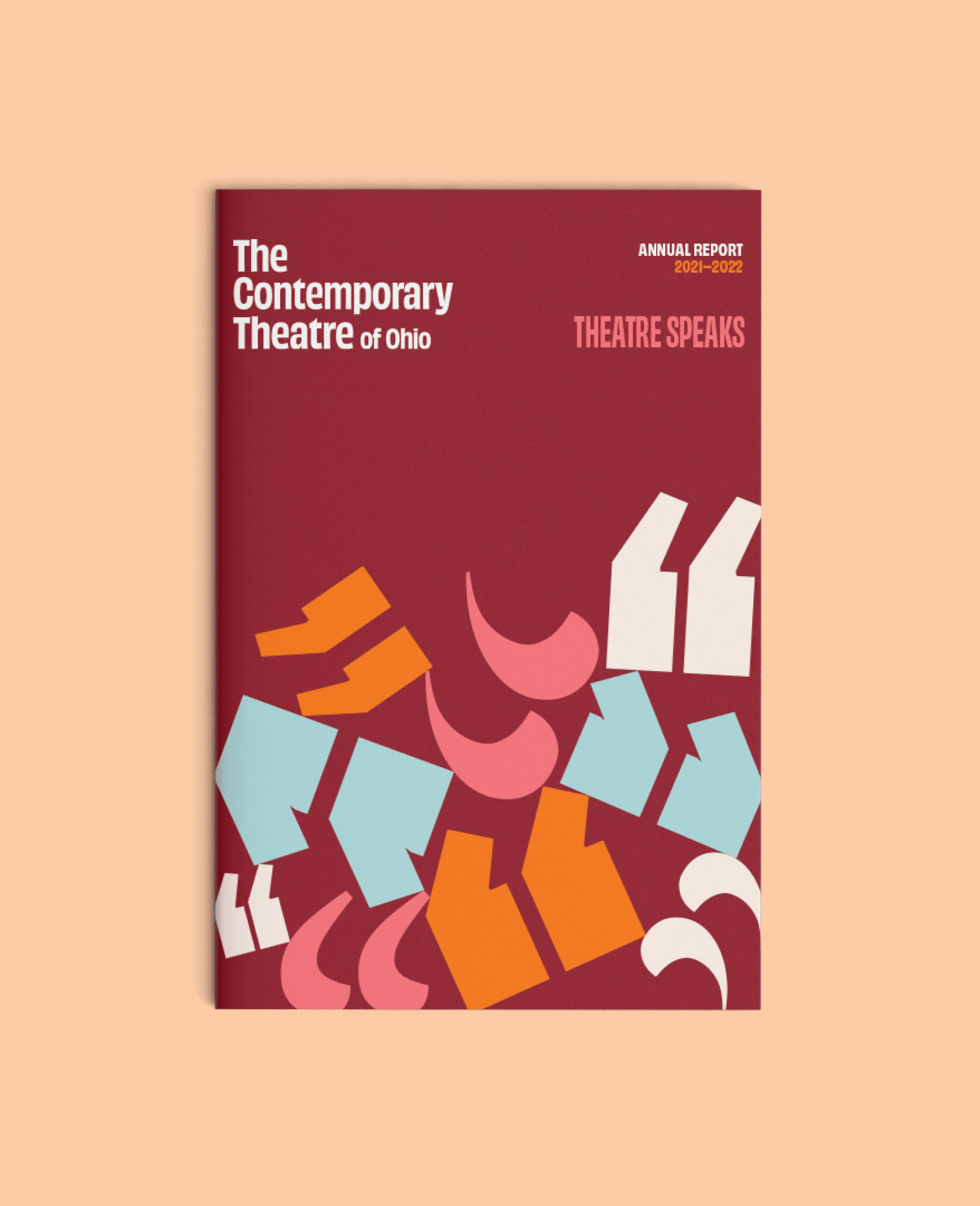
The core of The Contemporary’s branding system is diversity. A single expressive type family, a strong underlying grid, and a broad color palette form a deceptively broad kit of tools for creating that visual diversity. The design system is flexible enough to create a unique feel for each of the theatre’s productions. The primary branding sits on top, making it clear who’s producing the show.
Production Art
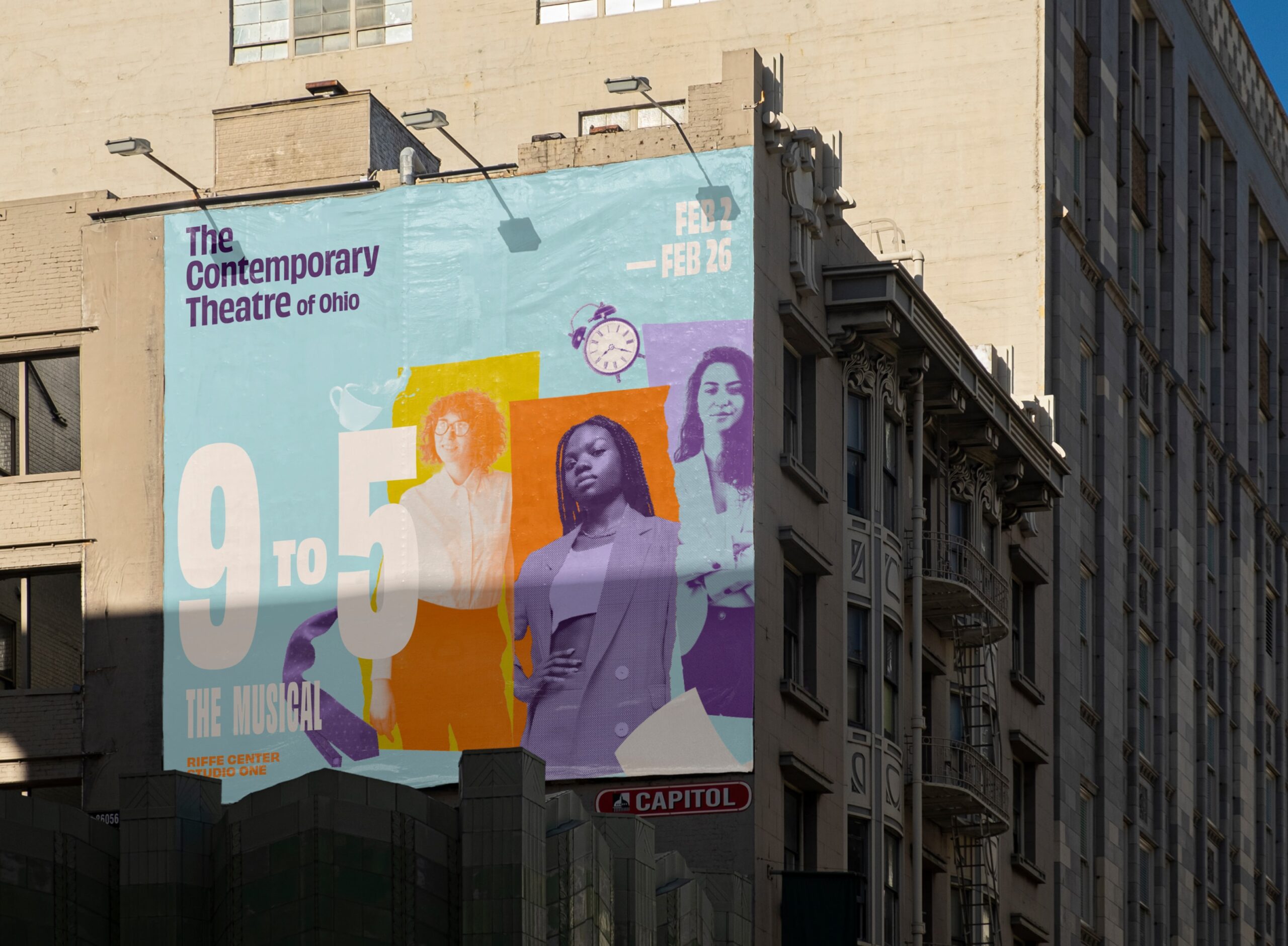
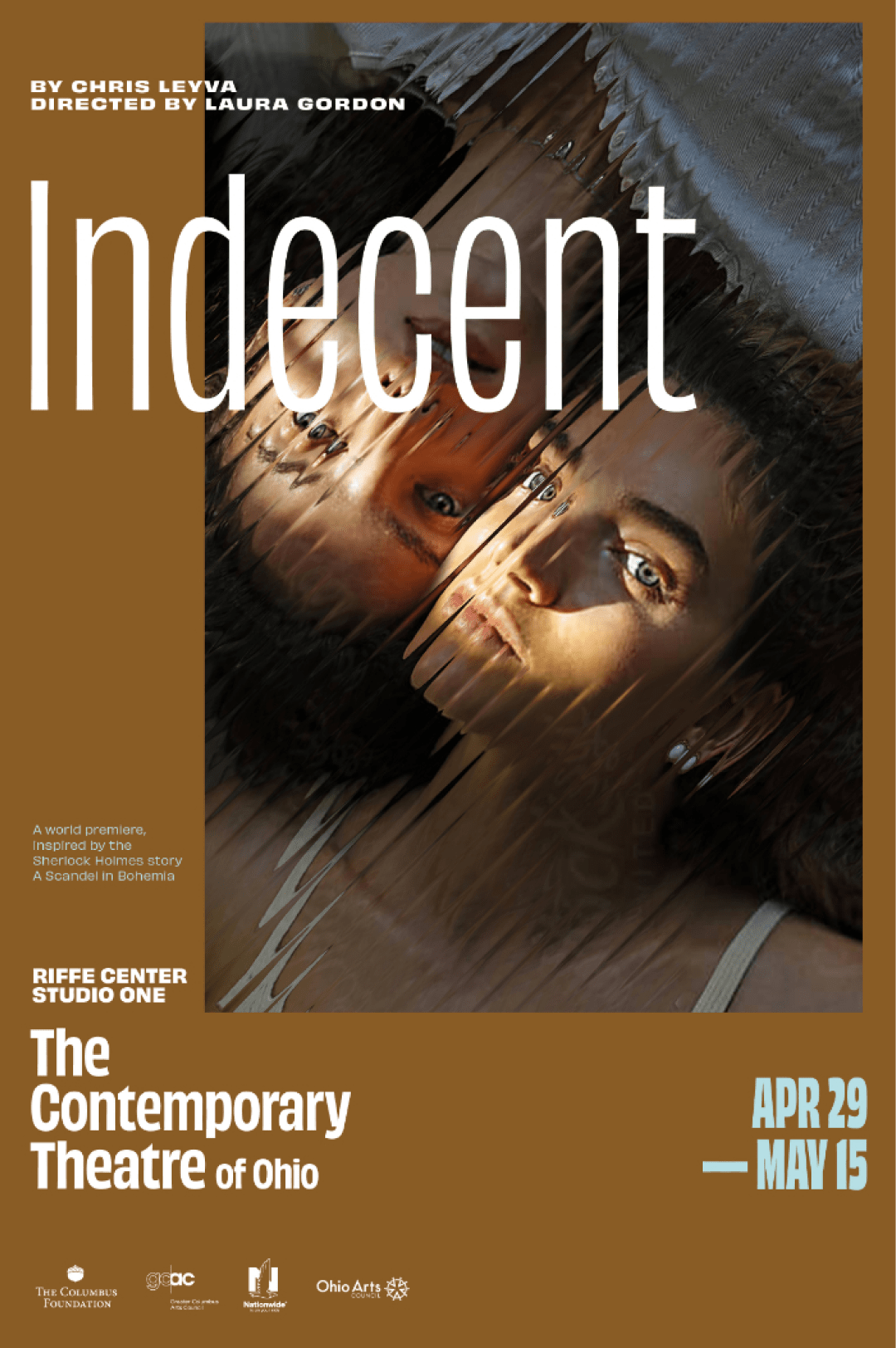
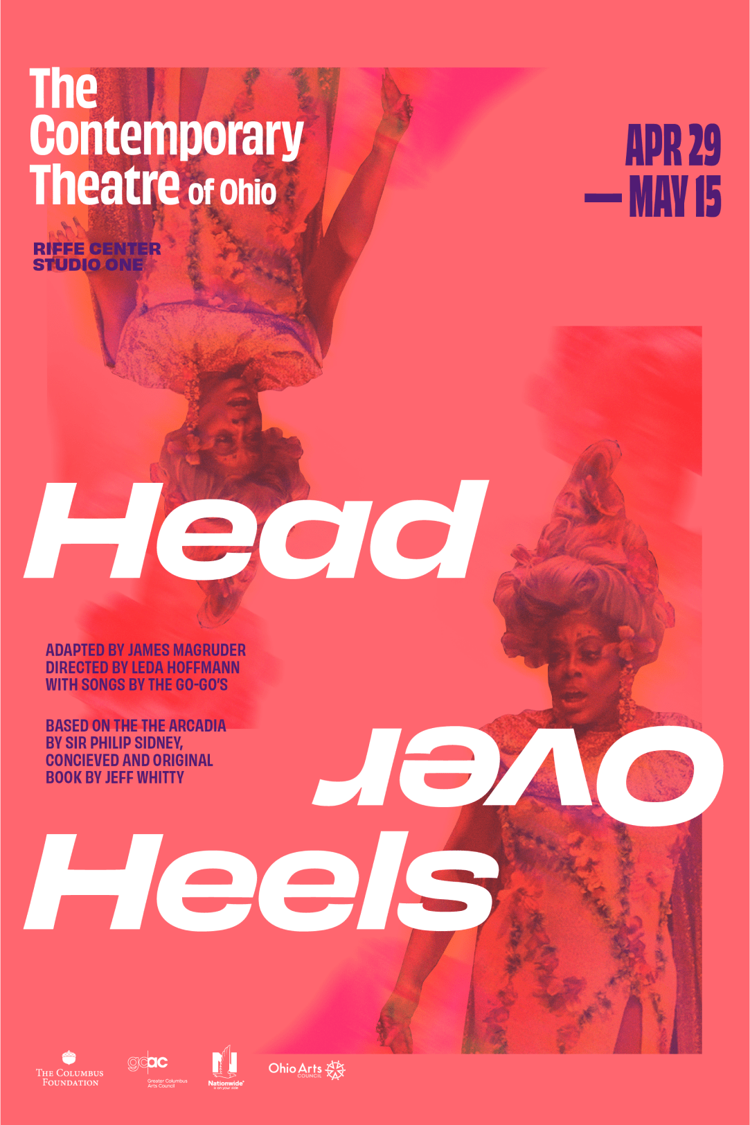
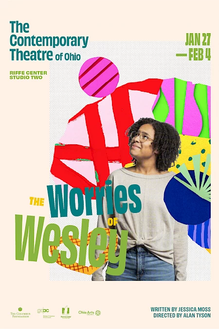
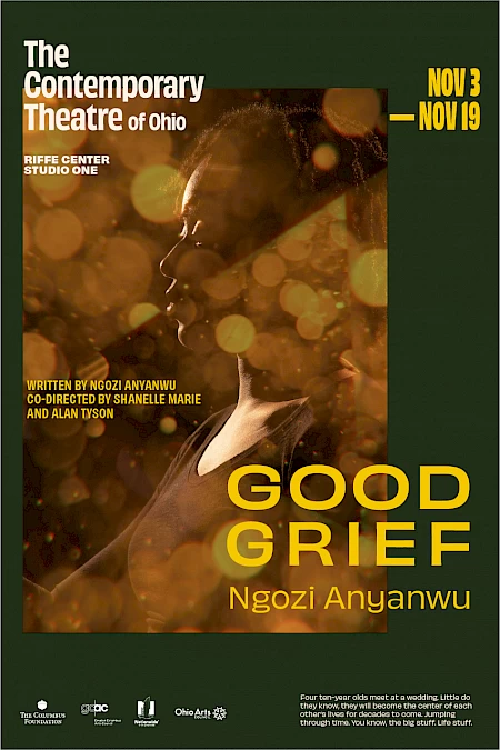
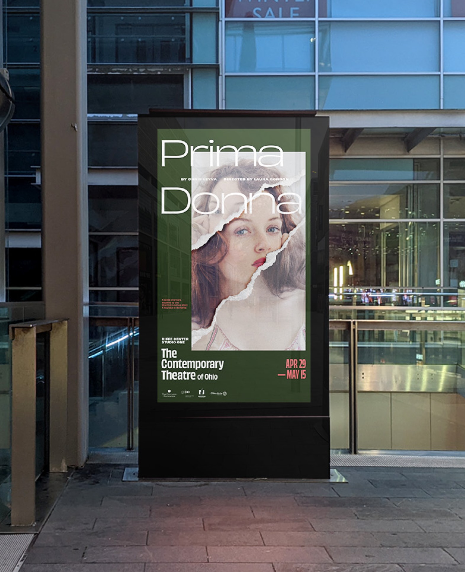
Each show uses a different visual hook that relates specifically to themes in the script. These images sit neatly into a grid with the The Contemporary’s primary branding sitting on top, unifying vastly different artwork. The system is flexible enough to feel comic or tragic, buttoned up or casual, all while clearly saying, “this is contemporary theatre”.
This system has already proven itself. In the first season, we manipulated stock images to create visual metaphors for each show. The next season used custom photography. The visual and verbal repertoire will grow with the theatre.
Notes
Created at Nonfiction
Collaborators
Neil Wengerd — Creative Direction, Naming
Jeff Packard — Strategy, Naming
Amanda Caskey — Design
Kimmy Alexander — Project Management
Role
Art Direction, Design, Naming
Date
2022—2024
© wilkeworks, llc 2026
© wilkeworks, llc 2026